Objectives
• Understand design features of a logo.
• Learn to integrate logos into standard business publications.
Introduction
Now that you have learned a variety of desktop publishing skills such as typography and layout, it is time to put these skills to use in business documents. Nearly every document that is distributed by a business uses desktop publishing in some way. This includes letters and the envelopes in which they are mailed, handouts available at presentations, business cards given to potential customers, and ads. Most of these will include the company logo.
Logo
One of the most important components of any business publication is the company logo. A logo is an image that instantly identifies a business, containing a graphic element and a logotype. A logotype is text that is set using a specific typeface and may be arranged in a particular way. Special fonts may be designed just for this purpose. The logotype could consist of the company’s name, initials, and sometimes a slogan. A slogan is a phrase that identifies the company’s mission or purpose. Slogans may also be short statements designed to encourage purchase of a product, such as Coca Cola’s "The Real Thing." Figure 20.1 is an example with an image, logotype, and a slogan.
Usually logos are designed by professionals and then used by desktop publishers. However, it is important to understand how logos are designed so that you can use them effectively.
A logo is an image and text combined to identify a business or organization.
A logotype is the text included in a logo. It may be a distinctive typeface.
A slogan is a statement or phrase that identifies a company’s mission or image.
Figure 20.1
This logo uses a brown background and a simple colored flower to project the gardening image it represents.
lages
linages are often incorporated into business logos. These images can become so firmly attached to the name of the company that even without the company name, the business is recognized. For example, a picture of a Quaker man instantly calls up the name Quaker Oats. Images are usually simple line drawings rather than complicated photographs. Often the best logo images are connected in some way to the corporate name. A good example is the shell used by Shell Oil Company. Other companies use images of the products they sell, such as the Mercedes steering wheel.
Color
You have already studied the impact of color on emotions and the senses. The use of color in logos is important for these same reasons. Companies often select colors that reflect their identity such as the use of green for a tractor company or the use of pink for a business that sells makeup. Notice in Figure 20.1 the use of green and browns to reflect the gardening theme.
Figure 20.2
The South-Western logo is simple yet distinctive.
Logotype
Often logos are created using the actual letters of the name of the company rendered in a distinctive typeface. The Thomson logo (the publisher of your text) is an example of this (see Figure 20.2). South-Western Educational Publishing is a subsidiary of Thomson Learning. The logo consists of the parent company with the subsidiary’s name below. Notice the TM (trademark) symbol has been integrated into the logo.
As you have read, businesses spend time and money developing a logo.
The distinctive logotype is part of their brand. Others who borrow their logo are stealing something of more value than may appear at first glance. If someone publishes the logo in such a way that it detracts from the good image of the company, the business can suffer. As a result, companies are diligent in protecting their logos and branding.
Changing logos or even the slogans within a logo is something most businesses think about carefully. Public awareness of a logo takes months and often years to develop. Changing this image can disrupt or even eliminate the awareness that has been built up through countless exposures to the image. Even the smallest change such as a modification of a color or the size of an image can create problems. As a result, businesses spend large sums of Imoney and countless hours making a final decision. They know that once the logo is in place, they may have to live with the decision for an extended period of time—often years.
There are a number of ways that words are used as a logo. Often letters are joined together, sharing common vertical strokes as shown in Figure 20.3. Sometimes they are joined using the horizontal strokes or crossbars. Occasionally part of a stroke is removed to use the white space between the letters as a visual connection. Some designers reverse the second letter of the name to use white space to make the letter visible. Another technique is to crop away part of the letters. Interlocking letters is a frequently used technique. Letters can be layered over one another using transparency. Finally, letters can be contained in a box. When text is used in this way, the letters are handled more like graphics than type.
In order to use these techniques, you need to experiment with different typefaces and styles. Thick and thin strokes can be used creatively. Use of serifs is an interesting way to join letters. Notice in Figure 20.4 how changing from a sans serif to a serif font creates a different look to the logotype.
Slogans
Slogans can be an important part of a logo when they are distinctive enough that the statement alone identifies the company. "Just Do It" does not require the Nike name for the audience to recognize the connection.
Uses
With a logo in place, it often falls upon desktop publishers to design standard business documents for use by the organization. Once these designs are created using desktop publishing software, either templates or mass printings are created for use by others. For example, letterhead may be designed and then printed in bulk. Others use the preprinted pages for their letters instead of blank paper.
Figure 20.3
This logotype joins the initials of the organization in such a way that they appear to be a single unit.
Figure 20.4
Looping letters within each other makes for an interesting image.
With the move to a global workplace, logo designs have become challenging. Names, slogans, and other logotypes may not translate from English to other languages in ways that the designer expected. In addition, colors have different cultural responses.This makes it all the more challenging for logo designers. Keep this in mind if you are creating logos for the international market.
Challenges
Logos are used in many ways. The three most common placements are in letterheads, business cards, and envelopes. Often the three are designed as a package to provide a sense of continuity. The challenge of using the same logo for each of these is that the sizes differ so widely. The ratio of length to width gives an idea of the difference between each one. A letter has a 1:1.3 ratio, a business card is 1.75:1, and a #10 business envelope is 2.3:1. Merely placing a logo in the same place on each piece makes for an awkward design. Using components of the logo such as color, slogans, and images to create a slightly different arrangement while still maintaining the overall image is one way to use a logo for design.
Figure 20.5
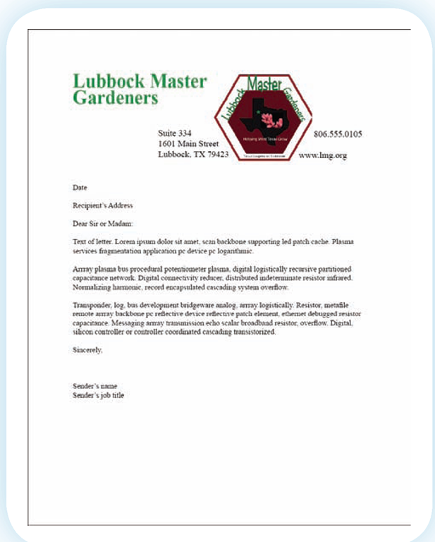
A letterhead such as this one eliminates the need for the sender to include the business information within the letter.
Letterhead
When designing letterheads, keep in mind the information that needs to be included. Letterheads require the name of the company, the address, the phone number, and usually the business logo. Often the web address of the company is also included. Sometimes a footer is used at the bottom of the page as a location for information such as an address or phone number. Obviously, you must also anticipate the space needed for the text of the letter. Standard business letters use 1" margins; however, the logo may extend beyond that. Figure 20.5 is an example of one way that a letterhead can be designed with a logo.
Occasionally, a business will create a watermark that is imprinted into paper intended for use as letterhead. This watermark can be a pale version of the company logo.
A watermark is a pale image or text imprinted into paper.
Business Card
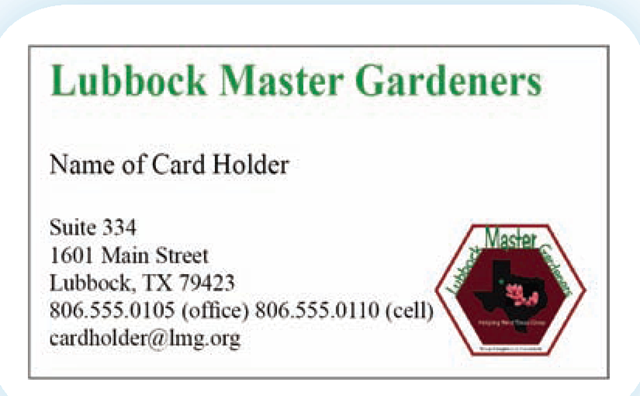
A business card contains information similar to that found in a letterhead. Keep in mind that most business cards are 2" X 3.5" but that you do not have that full space to work with. You must build into your design at least a .125" margin within that size. In addition, there must be a place for the name of the person for whom the card is designed, the person’s job title, phone numbers (work and mobile), and that person’s email address. Figure 20.6 uses the same information found on the letterhead but with a slightly different design. Notice how much more prominent the logo is.
Figure 20.6
This business card is preprinted, requiring only the addition of the card holder’s name.
Envelope
Envelopes require much less information than a business card or letter. The envelope generally uses the logo as well as the company name and address. When designing a business envelope, pay close attention to mailing regulations. There are restrictions that limit the placement of information on the envelope so that it does not interfere with the machines that read the recipient’s address. Figure 20.7 uses a small version of the logo and the address to create an envelope design.
Figure 20.7
Business envelopes are typically long and thin with limited space. The logo is reduced in size to make it fit into the allowable space.
When designing a logo or using one in a document, think carefully about the colors and fonts you select. Proofread for color and font appropriateness. It’s easy to make a decision today that won’t seem so appealing tomorrow. Always allow yourself time to separate from your design and then go back to consider it with fresh eyes. Have others give you their impression of your color and font choices. The exotic font that appeals to you may send a different message to others. Proofreading isn’t just about finding mistakes. It’s also about reviewing work you have already completed.
Occasionally businesses design email templates that include a logo, but generally the senders merely use a signature that includes company information.
Memos
Memos are similar to letters except they are much briefer. The logo and company information is generally limited to the upper portion of the memo with designations for the person receiving the memo (TO), the person sending it (FROM), the date, and the subject. The margins for a memo are similar to those for a business letter.
Other Documents
Other documents such as handouts, proposals, and reports may also need to be desktop designed. The logo and other details that you include in a business card or letterhead will usually be included as identifying information.
Since these documents will generally be printed on standard letter-size paper,placement and size may be similar to those you used on the letterhead.
Keep in mind that proposals and reports are usually bound on the leftside, which means that instead of a 1" side margin you will need one that is 1.25". This may require an adjustment to your design if you are using the same one created for your letterhead.
Standard Design
As you have seen, there are a number of different uses for the same logo.Businesses often establish a series of designs for each situation and then provide these to anyone who might need them.
Summary
In this topic you learned that logos consist of images, color, logotypes,and slogans. You saw that it is a challenge to use a logo in the design of standard business documents such as a letterhead, a business card, and an envelope because of the difference in proportions. You learned that logos are often included in the design of most documents produced by a business.
|
logo |
slogan |
watermark |
|
logotype |


