Web Thirds
Web pages do not have vertical margin limits in the same way that print does. Dividing a web page vertically into thirds is difficult, since pages can be scrolled down as far as needed. Horizontal thirds, however, are a common design choice. Often a page will be divided into two columns with one narrow column reserved for navigation and the wider column containing content. In this way the Rule of Thirds "rules" the Web.
Golden Terms
Considerable study has been done to determine why dividing a page into thirds is so appealing. The history of this study began with ancient mathematicians. These mathematicians described their conclusions as the golden ratio, which is 1.628 or n (pi). The math used to determine this ratio is quite interesting, and you may want to do further research to see how they arrived at these results. Other golden terms include the "golden triangle," the "golden mean," the "golden spiral," and the "golden rectangle." All of these terms represent efforts to use mathematical precision to describe arrangements found in nature and design.
Fibonacci Sequence
One other term that is often referenced in design is the Fibonacci sequence. This sequence is a series of numbers beginning with 1 where the next number in line is the sum of the previous two. The Fibonacci sequence is 1,1, 2, 3, 5, 8,13, 21, 34, 55, 89, etc. The farther along in the series you go, the closer you get to 1.628 when dividing the second number by the first. For example, if you divide 8 by 5, you get 1.6. If you divide 89 by 55, you get 1.618. This series of numbers appears frequently in nature, and designers often try to mimic this natural design.
Notice in our previous examples that, other than dividing the pages used into thirds, the total number of elements used does not include any of the Fibonacci numbers. Let’s try a design that includes five or eight elements within the thirds. Figure 6.9 is designed with five elements and Figure 6.10 has eight. Are these more appealing to you than those with six or seven elements? This is something to keep in mind as you begin to design pages. Just as the Rule of Thirds is not truly a rule, use of Fibonacci numbers is not a requirement (only a suggestion) for good design.
Figure 6.9
This page is composed of five elements consisting of two images, two text boxes, and white space.
The golden ratio is a number (pi). The approximate result is derived by dividing 5 by 3, arrangements often found in nature.
The Fibonacci sequence is a series of numbers beginning with 1. Each number in the series is added to the next in order to create a third number.
Businesses that hire desktop publishers are primarily looking for two skill sets—design and software. Salaries are paid based upon the size of the employer, the industry in which you are working, your credentials, and your years of experience. Salaries in 2006 ranged from $39,000 to $50,000. Desktop publishing often requires the ability to write and produce text in the form k of manuals or instructions. Sometimes even reporters are called upon to be Idesktop publishers. The diversity of this career means that you need to develop la wide variety of skills because you do not know when one will become r important in your occupation.
Figure 6.10
This page uses smaller images and more white space to create a page with eight elements.
Harmony of Design
Now that you have explored the overall design possibilities using a grid, it is time to think about where and how to place each element on a page. Your choices are based on the need to create a harmony of design. Design harmony is accomplished when all pieces work together, creating a page that is readable and interesting. The Rule of Thirds is just one way to create harmony in a design. There are a number of ways that page elements can be used to create harmony in a document. These include rhythm, organization, and consistency.
Harmony is evident when you look at a page and know that it works for the purpose for which it was intended. For example, if you are designing a business card for someone who has a childcare facility, the card has two purposes. One is to provide information and the other is to create an impression of the nature of the business. Together these two purposes must work in harmony. Perhaps you want to create a sense of playfulness as well as responsibility. This requires careful choices. In addition, the content of the card must be easy to absorb since business cards are read quickly. Knowing how to use all the page elements effectively makes it possible to create a card that meets your requirements.
Harmony of design is when all the elements on a page are arranged in an effective way.
Rhythm
Rhythm is the flow of the page similar to that which you studied in the previous topic. It is the motion that is inherent in a page that draws you from one item to another and one page to another.
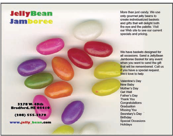
Figure 6.11 is a brochure that builds in a rhythm that is not apparent when you look at the full page. This is an example of a Z fold brochure that you studied previously in the topic. It is printed on a single side and is folded so that the left third of the page is visible (see Figure 6.12). When the brochure is unfolded, the two inside pages are visible as seen in Figure 6.13, and the entire page can be read. Notice what happens with the jellybeans. They draw your eye from page to page, creating a rhythm or flow.
Figure 6.11
This brochure is actually designed to be folded so that you can only see a third of the page.
Figure 6.12
The cover of the brochure provides basic information and invites you to open it.
Figure 6.13
The inside of the brochure folds open to complete the design.
Rhythm is the flow and movement of a page.
Proportion
Proportion is the need to make each element on the page a size that reflects its importance to the page. It is one of the reasons that focus is so important. It helps to make one element the most important. Then other elements must be made proportional to ensure the focus is not lost.
The jellybeans are the largest and most visible part of the opening page. The name "JellyBean Jamboree" is next in size, followed by the contact information. If the business’s name had been made quite large, it would have overpowered the image, distorting its effectiveness.
Organization
Organization is the logical arrangement of information and graphics on a page. A good example of failure to organize is to separate information that is related. Placing a graphic a distance away from the text it illustrates is one way that a page loses organization. Interrupting text by placing an image in the reader’s path is another way to fail to organize your document.
Compare Figures 6.14 and 6.15. Both business cards contain exactly the same information. The first one, however, has little organization. The information is placed attractively on the card, but the eye must wander all over looking for information. The second example gathers together the essential information such as Jare Thomas’ name and title. Since e-mail addresses are often the preferred means of contact, it is placed at the bottom where it can be found easily. Notice that Jare Thomas’ name is also larger than the rest of the text to give it importance.
Figure 6.14
This business card on first glance appears to be designed well. It isn’t until you look more closely that you realize that the information is a jumble.
Figure 6.15
This card is designed to make it easy to find the information you need as well as to attract your attention.
Web Organization
Web pages need organization just as much as print ones do. The dynamic nature of web documents is such that often content is placed in a haphazard manner, making it difficult for readers to find the details they need. This is partly because web design is still developing. Good designers are beginning to learn the importance of page organization.
As we continue to move into more use of the Web as a means of publication, flit’s important for designers to remember the guidelines that govern print publications. Design rules such as organization, rhythm, and consistency were developed over a period of many years. They were accepted because time proved their value to readers. Web designers need to keep in mind established guidelines from the past and incorporate these to create pages that have a sense of control and harmony that is often lost in today’s web pages.
Consistency
Consistency is attention to detail. It may mean that your type choices are consistent or the amount of space between paragraphs is the same throughout a document. It may mean that you design each page of a multipage document in a way that makes it clear that the pages are part of the same design.
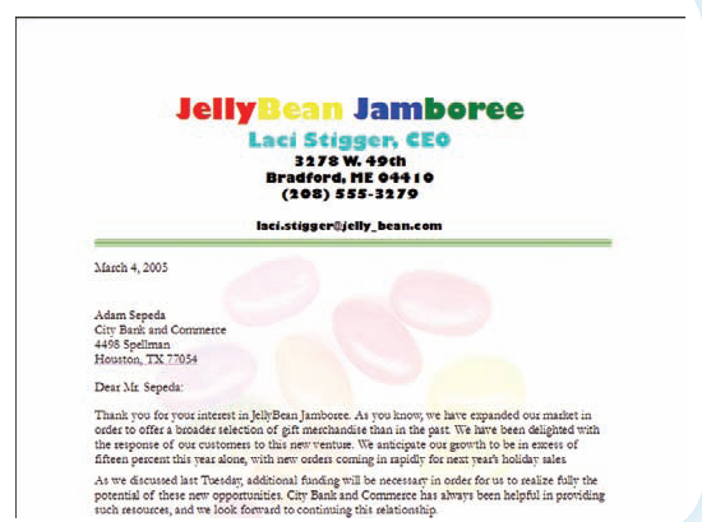
Notice that both the brochure and the business card for JellyBean Jamboree use consistent design tools. The typefaces are the same, and the same background image is used. Together these create a feeling of consistency.
Web Consistency
Consistency in web design is perhaps more important than it is even in print. There is so much happening on a web page that it is easy for a reader to get lost. Using consistent designs such as navigation links and headings improves the usefulness of the document. Since web pages are often created at different times and then linked to one another, it’s easy for consistency to get lost. Part of a designer’s task is to pay attention to details, looking for inconsistencies.
Repetition
Repetition is one way to build consistency into a document. Reusing an image from one page to another may create a consistent feel. Duplicating a dramatic line of color at both the top and bottom of a page can be a good use of repetition. Using the same image in a different size and location is another example of repetition. Repetition causes the reader to think "Ah,Consistency of design is when the same choice is made for similar parts of a page such as a typeface or spacing.
Repetition is the duplication of elements or details on one or more pages.
Figure 6.16
This letterhead repeats the jellybean image with a slight modification.
I’ve seen this before." It creates a feeling of comfort.
You have already seen how the repetition of the jellybean figure provided consistency. Notice in the letterhead shown in Figure 6.16 that the jellybeans are reused, but this time as a pale background called a watermark.
Look at a monthly wall calendar that has a different photograph for each month. Notice as you flip the pages that while the image changes, the rest of the calendar design remains the same. If each month were designed in a different way, it would lack harmony and be disruptive to the person using the calendar. The consistency from month to month is a good use of repetition.


