Objectives
• Discover how grids can help you use design components.
• Learn about design options that Rule of Thirds provides.
• Explore ways to create pages that have a harmony of design.
Introduction
Once you have decided on the focus and flow for your page, you need to make decisions concerning other design elements. Creating a good design is not just about choosing a focal point. A good design also takes into account the placement of all other components on each page. Desktop publishing requires the designer to think about where text should appear and where images should be placed on each page. This statement was true when professionals were working with moveable type, and it is still true today as desktop publishing documents are created on computers. Over the years a number of rules or suggestions have been developed to help designers make the best possible choices. This topic shows how these rules can provide the guidance needed to create well-designed pages.
Layout Components
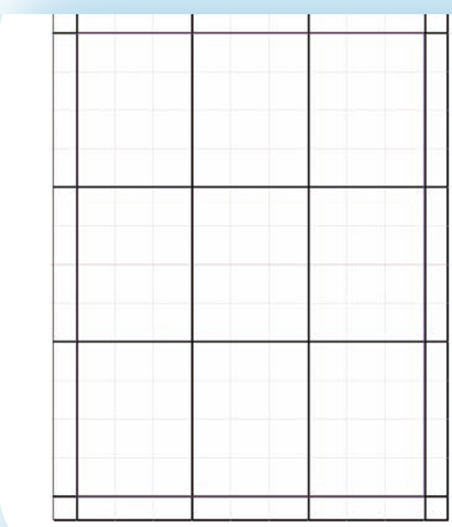
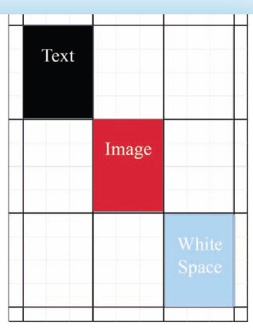
As you begin to learn about using design elements, think of a page as a grid similar to the one shown in Figure 6.1. On that grid you can place any of the three basic design elements; text, images, and white space. Some items will be larger, while others will be smaller. By moving each piece around the page you can experiment with your options and begin developing a knowledge of how the pieces work together. In Figure 6.2, there are three frames—one for each element. These frames do not fill up the page so they must be enlarged or additional ones added.
A grid is the division of a page into a design on which text, figures, or white space are placed in order to design a page.
Figure 6.1
Grids can be of any size as long as they are regular in shape.
Figure 6.2
The three basic components of page design are text, images, and white space.
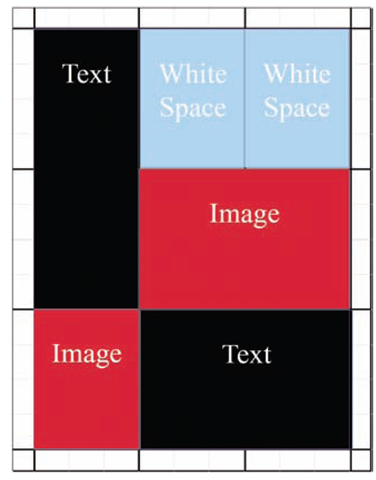
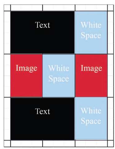
Figure 6.3 demonstrates how elements can be enlarged or duplicated to fill the page. There are countless ways to arrange the three basic elements of text, images, and white space. Figure 6.4 shows just one more variation.
Figure 6.3
Pages can be created with an infinite number of designs.
Figure 6.4
Designs such as this one help you to see if placement of white space is appropriate.
You are not limited just to rectangles. In Figure 6.5 you can see that allowing one element to invade the space of another adds interest.
By including white space as one of the components, you begin to see how it becomes an important part of the total design process. No longer is it merely unused space. It is now space placed intentionally to create a designed effect.
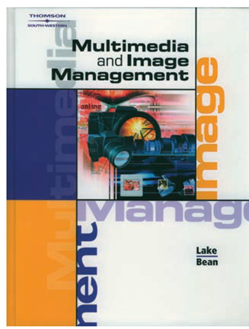
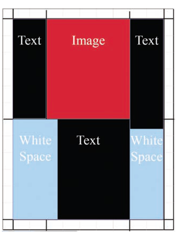
Looking at an example from the previous topic (Figure 6.6), you can see how each of the components would fit into a grid. The blocks of color can be considered images even though they contain text. Although the large words, such as "image." are text, they also function as images. As a result, most of the grid is filled with images with white space to the outside. The only significant text is the topic title. The authors’ names and the publisher stand out amid blocks of white space.
Notice that this grid is not an exact duplicate of the actual design. Its purpose is not to force you into matching your design exactly as you have outlined it in a grid. Instead, a grid is a means of planning ahead, allowing for changes once you have begun the actual design process.
Figure 6.5
While your grid begins with squares or rectangles, your final design does not have to adhere to those edges. In this case the image has an irregular shape.
Figure 6.6
The cover of this text was clearly created using a grid.
Figure 6.7
The complexity of this design becomes very apparent when you replace the content with a grid arrangement.
Web Grids
Frames and tables are frequently used design tools for web pages (see Figure 6.7). As a result, it is very easy to explore your design options using the same tools you would for a printed page. The difference between print and web documents is that the way a web page is viewed is often out of the designer’s control. Some computer monitors may be oriented vertically and some horizontally. Some may be quite large while others may be small. The solution is often to design a page so that the content is limited to a percentage of the screen size, which maintains the proportions you intend.
Rule of Thirds
One thing you may have noticed while looking at the various grid possibilities was how often the pages were divided into thirds. This is a common design that is quite pleasing to the eye and is used so often that it has been given the name the Rule of Thirds. This rule, which is not truly a rule but rather just a strong suggestion, states that pages arranged in thirds are more effective than those designed in halves or fourths. The Rule of Thirds was present in the grids shown in Figures 6.3, 6.4, and 6.5. Compare any of those figures to Figure 6.8. In Figure 6.8 there is no sense of order, and the two major blocks of text and image are taking up half a page. This design might serve a purpose in some instances, but generally it will be jarring to the reader.
Figure 6.8
This grid arrangement would result in a page that is not in harmony.
The Rule of Thirds states that a page (or image) that is designed in thirds is more appealing to the eye than other designs.
