Introduction
The theory of color - how we see it, how to use it, and how it may be created, analyzed, and represented – truly deserves an entire topic, rather than just a single topic, and there are of course any number of excellent texts on the subject available. (Several of these are listed in the bibliography of this topic.) However, color is also such an important factor in electronic displays, and especially in terms of understanding many of the constraints which must be considered in designing an adequate display interface, that we would be remiss not to at least attempt coverage of the fundamentals here. The reader is cautioned that this will by necessity be a superficial and in some aspects simplified treatment, and reference to those works dedicated to the subject is highly recommended if one is to gain a complete understanding of the subject.
The first, and possibly the most fundamental, understanding that one must gain in a study of color is that color does not really exist; it is not, contrary to what would be indicated by lay usage of the term, a fundamental physical property of any object. Instead, color is a perception. It truly exists only in the mind of the viewer, and is simply the response of the eye/brain system to stimulation over an extremely narrow (slightly less than one octave) range of electromagnetic (EM) radiation. Visible light is fundamentally no different than any other EM wave; the fact that humans are equipped to directly perceive this particular band of the spectrum does not alter that. The perception that we call color, therefore, actually results from the interaction of a rather large number of factors, among them the spectral make-up of the illuminating light source, the reflectivity of the object in question over that same range, the sensitivity of the viewer, and so forth. Typically, few if any of these factors behave in a nice, regular, linear manner, and so color and its behavior under varying conditions becomes a rather complex thing to analyze.
As was discussed in the previous topic, human color perception abilities come from the fact that we have multiple types of light receptors within our eyes, each of which has its own unique sensitivity curve across the visible spectrum. This gives us a good place to start in our discussion of how best to represent color in electronic display systems.
Figure 3-1 The visible spectrum.
Color Basics
The slice of the EM spectrum referred to as visible light covers a range of wavelengths from approximately 770 nm at the low-frequency end, to around 380 nm or so at the high (Figure 3-1). In terms of the common names for the colors of the spectrum, this range is from the deep reds to the blues, respectively; the common grade-school mnemonic for the colors of the rainbow (“Roy G. Biv”, for red, orange, yellow, green, blue, indigo, violet) in fact labels the spectrum from the low-frequency end to the high. But as noted above, these terms actually describe perceptions. There is no real physical difference, other than frequency, between a light source at 770 nm and one at 560 or 390 nm. We perceive these as markedly different colors only because our brains interpret and present the information collected by four different types of light receptors in the eye – the “rods” – which have a relatively flat response across the spectrum, and the three types of “cone” cells which have very different and irregular response curves.
With the sensitivities of those receptors known, we have identified one of the three major factors which determine the perception of color. The other two are, of course, the characteristics of the illuminating light source, and the reflectance or transmission characteristics of the object being viewed. These combine to give the resultant total response of a given type of receptors to a stimulus:
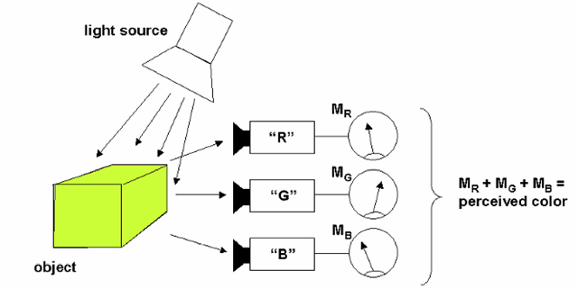
In other words, we must multiply the spectral distribution of the light source energy (L) by the reflectivity characteristics (R) of the object in question, and by the sensitivity of the receptor type in question (Sr), over the full spectral range of visible light, and integrate the response to determine the “output level” of those receptors given this stimulus. The brain synthesizes the responses from all of the various types of receptors to produce the perception that we call color. But note that this perception is basically obtained from a few parameters – what might be seen as the “meter readings” from each of the different receptor types (Figure 3-2) of different wavelengths matters, not how much of each is reflected by the object being viewed, or the specific response of the receptor at any given discrete wavelength. It is the small set of values which result from combining all of these, across the visible spectrum, per the above formula. This has several interesting implications.
Figure 3-2 A model for the perception of color. In human vision, the perception of color may be viewed as the summation of the responses, shown here as “meter readings” (Mx), from the three types of color receptors (cones) in the eye. The values obtained from each “meter” depend not only on the reflectance characteristics (across the visible spectrum) of the object being viewed, but also on the spectral characteristics of the illuminating light source and the sensitivity curves of the three receptors. It is tempting to refer to these receptors as “red,” “green,” and “blue” (as has been done in this model, but in reality the response curves of the actual receptor cells in the human retina are fairly broad.
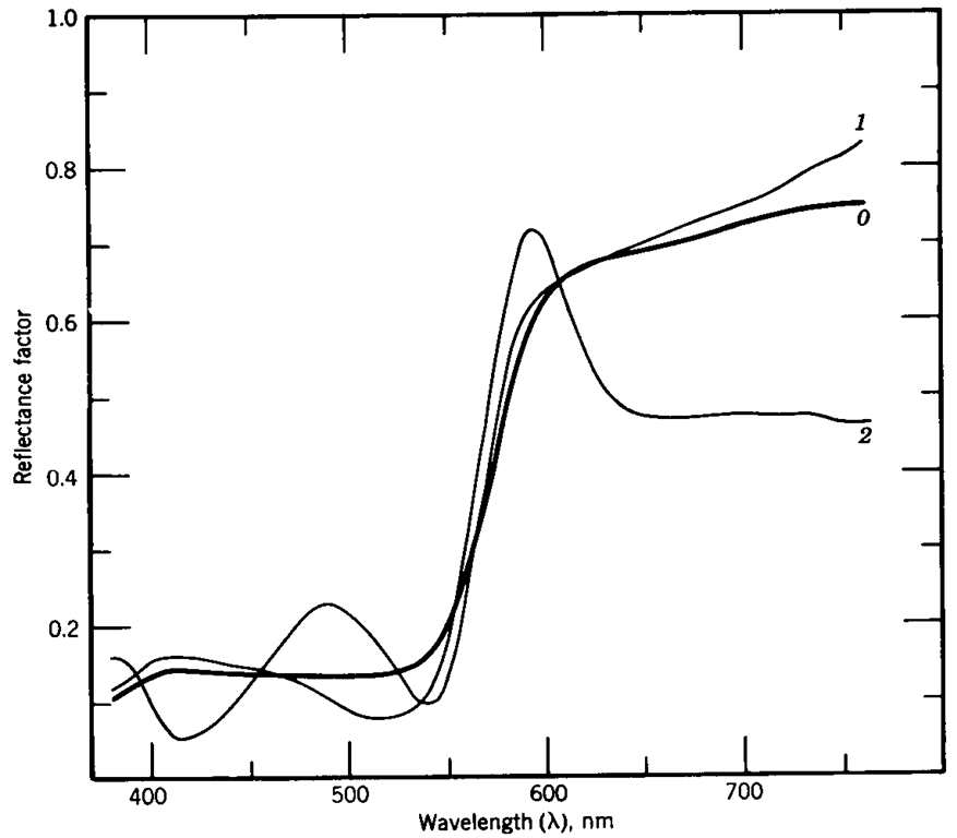
Objects with very different reflectivity curves might appear to be the same color, if illuminated by a light source of the proper spectral profile (Figure 3-3); such objects, or rather their spectral reflectivity curves, are said to exhibit metamerism under those lighting conditions. Similarly, two objects supposedly of the same color might look radically different if illuminated by different light sources, or a single object could appear to be different colors depending on the nature of the light source at any given moment. Further complicating the situation is the fact that even the sensitivity of a given individual viewer is not a constant, but varies with the light level, other objects and backgrounds in the field of view, and of course the viewer’s health and age. Again, we are reminded that color is a perception, not by any means a physical property. If, for a given viewer, two visual stimuli result in the same set of outputs from the various color receptors – for whatever reason – then they will be perceived as being the same color.
This has a profound impact on how color can be achieved in electronic display devices. Edwin Land (the inventor of the Polaroid camera) showed that varying amounts of light from two or three light sources at discrete wavelengths, viewed in sufficient close spatial proximity, will be perceived as a single “intermediate” color – a color which, in the supposed “color space” describing the range of possible perceived colors, exists “between” the colors of the actual sources. For example, if a red source and a green source are both directed to a uniformly reflecting (“white”) surface, the surface will appear yellow. There is, of course, no light energy being produced or received at a wavelength corresponding to “yellow” – but the important thing is that the receptors of the eye are being stimulated to produce the same outputs as they would if exposed to a “true” yellow source.
Figure 3-3 Metamerism. This graph shows the reflectance curves of three objects which, despite having clearly different reflectance characteristics, will be perceived as being the same color when viewed under the proper illumination (in this case, a light source conforming to the “D65” illuminant specification, which is a standardized “daylight” white.).
This phenomenon goes beyond simply combining two different sources to produce the perception of a third, intermediate color. Since there are three types of receptors responsible for distinguishing color in the human eye, we might expect that selecting the proper set of three sources, and combining these in varying amounts, could result in the perception of any desired color. This is, in fact, how “full-color” images are produced in electronic displays -through the combination of three primary color sources. The primaries for this purpose are generally referred to as red, green and blue, or “RGB” (although there may be considerable variation in the specific colors of each primary between any two real-world displays). These are the additive primaries – those that are used to create color through the addition of light. Those involved in the print media or artistic endeavors typically learn a different set; sometimes, these are given as “red, yellow, and blue”, but more properly are labelled magenta, yellow, and cyan, respectively. This is the subtractive primary set, those colors which are used when dealing with the absorption of light – as in printed or painted pigments. (These are also properly referred to as the “CMY” set, more commonly seen as “CMYK.” The “K” represents black, which is generally added to the basic three as practical printing devices cannot produce an acceptable black from the CMY primaries alone.) The use of two very different sets of “primary colors” is the source of considerable confusion and misunderstanding between engineers and artists!
However, the above turns out to be an oversimplification of the way we actually perceive color and the range of colors which can be detected. Due to the details of how color vision works, it turns out to be physically impossible to realize a color display based on a limited, finite set of discrete primary colors that can reproduce the entire range of possible colors. The reasons for this will become clearer as we look at how color is represented and analyzed, mathematically and in more detail. At this point, however, we should take some time to look at how the effects of various light sources, or illuminants, can be handled and specified.
Color Spaces and Color Coordinate Systems
The term color space refers to a three-dimensional model covering the possible range, in terms of both color and brightness, of light that can be perceived by human vision. Since the eye possesses three types of receptors, in terms of distinguishing color, it should not be surprising that a three-dimensional space is required to cover the range of possible color perceptions. Before looking into the color-specification systems in common use within the industry, it will be useful to look at the question of color from a more intuitive perspective.
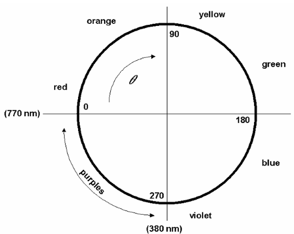
When speaking of color in everyday speech, it is common to use words like “red” or “green” or “purple” – which are simply names for what in color-theory terminology is called hue. Hue is the property which most closely corresponds to the wavelength of the light – as you move through the visible spectrum, you are changing hue. When used as part of a system to describe any arbitrary color, however, we must extend the concept of hue to include colors which cannot be defined as a single unique wavelength. Combinations of two light sources at the ends of the spectrum – red and blue – are perceived as various shades of purple, a color which cannot be generated as a single wavelength (or monochromatic, meaning “single color”) source. One way to complete the concept of hue, then, is to view it as giving the position around the circumference of a circle, one in which most of the circumference corresponds to the visible spectrum. The remainder then covers the purples, those colors which appear “between” the blue and red ends (Figure 3-4). Hue in this model becomes the angular portion of a polar-coordinate system.
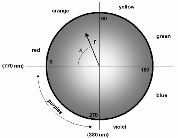
The next concept in our “intuitive” model of color relates to the “purity” of the color, or to what degree the color in question really does correspond to a single wavelength of light. If red and white paint is mixed, for example, the expected result is pink – a color in which red predominates, but (through the white) all wavelengths of light are present to some degree. The quality which has varied in this case is called saturation, a measure of where the color in question is between being a purely monochromatic shade (100% saturation), and white (zero saturation, all wavelengths present in equal amounts). If saturation is added to the “circle” model with hue, it may be represented as the radial distance out from the center. This revised model, with white in the center and the pure (fully saturated) colors located around the circumference, is shown in Figure 3-5.
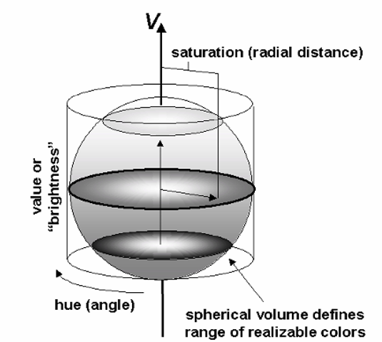
The last question to be addressed, is the “brightness” of the color – the difference between, for example, a bright, vivid red and the dull shade of a brick. The intuitive concept of brightness becomes, in standard terminology, lightness – or, more commonly, value. Adding value to the two-dimensional hue circle is achieved through the addition of an axis perpen- dicular to the plane of the circle, such that the complete HSV model represents a cylindrical coordinate system (Figure 3-6).
Figure 3-4 The beginnings of a system for specifying color numerically. Here, the wavelengths of the visible spectrum (770-380 nm) have been mapped to an angular measurement clockwise around a circle, with zero degrees arbitrarily set to equal 770 nm wavelength, and 270° equally arbitrarily set to correspond to 380 nm. The remaining quarter of the circle corresponds to the purple colors, those hues which do not correspond to any single wavelength of light, but rather are perceived when the eye is presented with varying amounts of red and blue light.
Figure 3-5 Adding saturation to the color model. In this diagram, saturation, or the “purity” of the hue, is indicated by the radial distance r outward from the center. Points on the circumference of the circle now represent “pure” colors, i.e., those which may be represented by a single wavelength, while the closer a point is to the center, the closer it is to white (all wavelengths present equally).
Figure 3-6 The completed HSV color model. At this point, a third dimension, labelled V (value) has been added as the axis of a cylindrical coordinate system; the two-dimensional, circular space defined earlier now appears as a cross-section of the full HSV space. However, the range of realizable colors does not fill the cylindrical space thus defined. This restriction has been (arbitrarily) shown here as a spherical volume within the full HSV cylinder, and results from the fact that color perception is greatly restricted (and in the extreme, fails completely) at very high and very low levels of perceived brightness. As will be seen, this simplistic model suffers from being perceptually non-uniform; that is to say that equal-distance translations within the defined space do not correspond to color changes perceived to be equal in magnitude by a normal observer.
Moving along the axis itself, at the center of this volume, represents changes between white and black – with no “color” in the common sense of the word at all. Moving out from the axis increases saturation – “adding color” to the white or gray, with the color becoming “purer” as the distance from the axis increases. And finally, moving around the axis changes the hue – we can move through the spectrum from red to yellow to green to blue, and then back through the purples to red. Note that the range of possible colors does not occupy the full cylinder defined by these three values, but instead appears in this case as a sphere within it. This is our first, crude attempt to account for the effect of luminance – or value, in this model – on the color sensitivity of human vision. Remember that in low-light conditions, color vision ceases to function. Similarly, at very high brightness, colors cannot be discriminated as the receptors “overload.” This gives the range of realizable colors, within this HSV color space, its spherical shape – the difference between “white” and “black,” and the fully saturated colors, decreases as we approach the extreme ends of the “lightness” axis.
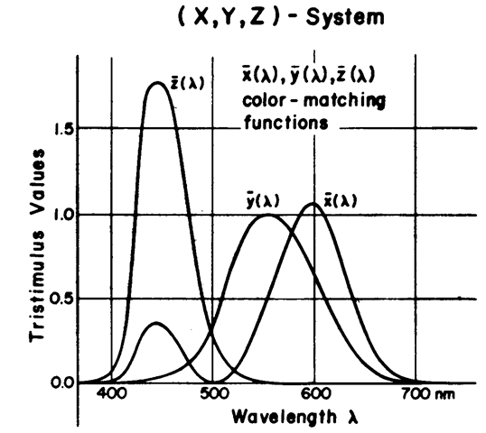
While this simple HSV model provides an easy-to-use means of identifying color, which corresponds well to our everyday concepts, it is not very useful as a tool for precise colorimetry. In order to develop a better model, we must first develop a more accurate definition of exactly how the human eye responds to the visible spectrum of light. A standard model for the sensitivity of the eye’s three types of color receptors, referred to as the “Standard Observer”, was defined in 1931 by the Committee International de l’Eclairage (CIE, or in English, the International Color Committee). This model defines three sensitivity curves as functions of wavelength across the visible spectrum: x^), γ(λ), and z(X), for the “blue,” “green,” and “red” receptors, respectively (Figure 3-7). Note that the curves of this model do not correspond directly to the actual sensitivity curves of the cones of the eye; they have been modified somewhat due to practical concerns of the model. These are properly referred to as the color-matching functions of the CIE model, as they were derived through experiments in which observers were asked to match the colors of various sources. There are actually two sets of “Standard Observer” curves: the “2 degree” and the “10 degree” observer. These names refer to the area of the visual field covered by the test color in the color-matching experiments; of these, the “1931 CIE 2° Standard Observer” set is by far the more commonly used, although the difference between them is generally not important except in the most serious color work.
Figure 3-7 CIE color-matching functions. The three functions χ(λ), ^(λ), and z^) are themselves derived from standardized visual sensitivity functions (τ(λ), g(X), and b(X)), but avoid certain practical difficulties in those functions (such as negative responses in some portions of the spectrum). Integrating the response per these functions (the product of the function itself and the spectral distribution of the light being viewed) over the visual spectrum gives the tristimulus values, XYZ.
The CIE color-matching functions lead directly to a space defined by the CIE tristimulus values XYZ, which are simply measures of the integrated response to a given light source by receptors of these sensitivities. The tristimulus values for a given color certainly provide an unambiguous means of defining any color, but they are not often used. One reason for this is the fact that, while X, Y, and Z can each be considered as “primaries,” this set is not itself physically realizable – they exist as mathematical constructs only, and lie outside the range of real-world colors. A much more useful means of expressing color was also defined by the CIE, based on the XYZ values. This is the Yxy color space, among the most widely used in electronic display work.
In this model, only the Y of the original XYZ set is retained; as the original functions were defined, the Y value corresponds to “lightness,”, or the perceived brightness of the source. In the absence of “color” in the common sense of the word, Y can be thought of as defining the level of brightness in a “black and white” view of the world. The remaining two values, x and y, may be calculated from the X, Y, and Z values as
Figure 3-8 CIE xy chromaticity diagram. This chart is a two-dimensional slice of the threedimensional xyz space derived from the CIE color-matching functions. The “pure” single-wavelength colors are located around the curved perimeter of the area (the numbers around this line are wavelengths, in nm); the straight line across the bottom, rising slightly from the lower left corner, is the limit of the region of purple shades obtained by various combinations of blue and red light. Whites are roughly at the center of the diagram, with the point labelled “E” being the so-called equal energy white, at x = 0.3333, y = 0.3333. As will be seen, the xy coordinates are a very popular means of specifying colors, but still this space still suffers from being perceptually non-uniform.
These are actually two of a set of three chromaticity coordinates, with the final coordinate (z) derived from the Z value in a similar manner (which also results in z = 1 – x – y). However, the full xyz set is rarely used. The x and y values, however, define a two-dimensional space which is very useful in visualizing various aspects of color relationships.
Specifying the CIE (x,y) coordinates along with the luminance (Y) provides a very easy and practical means of describing the appearance of a wide range of light sources. The standard CIE xy chromaticity diagram, based on the 1931 2° standard observer, is shown in Figure 3-8. (Note that the xyz coordinates, given as such, refer specifically to the 2° Observer; the corresponding set based on the 10° values are properly identified as x10, y10, and zi0.)
The CIE xy diagram shares several characteristics with the two-dimensional slice of the HSV space presented in Figure 3-6. First, we again have the line of purely saturated colors around the curved periphery – moving around this edge again represents achange in hue. (Unlike the HSV model, however, the line between the extreme ends of the visible spectrum – the range of purples between red and blue – appears as a straight line. The reason for this will be clear shortly.) Whites are roughly in the center of the diagram, so again we see saturation increasing as one moves from the center to the periphery. (If any point can claim to be the “center” of this diagram, it might be the “equal energy” white point, the color of a flat spectral power distribution; this is at x = 0.333, y = 0.333.) Finally, we should again note that the xy diagram is just one slice through a three-dimensional color space. Perpendicular to the center of the diagram is where the Y axis can be imagined, representing luminance or “lightness”. As with the HSV space, the two-dimensional diagram is the cross-section at the “widest” part of the space. The range of perceivable colors, and therefore the relative crosssectional area, decreases at high and low luminances.
The Yxy system, and the related xy diagram, remain very widely used for specifying and plotting colors, despite a major shortcoming which is discussed shortly. There are several other color coordinate or color space definitions in common use, but before moving to those we can use this one for introducing several key concepts.


