BEYOND BULLET POINTS (BBP) gets dramatically better results than the conventional bullet point approach because beneath the simple, clear, and compelling visual stories is a sophisticated foundation that determines everything you say, show, and do during a presentation. This topic will explain why BBP works so well and why the conventional approach so often falls short of expectations.
Three Bedrock TooIs of PowerPoint
Throughout its 20 years of existence, PowerPoint software has always offered the ability to work on your presentation in three key views: Normal view, Notes Page view, and Slide Sorter view. Although the rest of the PowerPoint features added since then are nice to have, these three views continue to be the bedrock tools you need to create your presentations.
This topic focuses on the three views you use when you prepare your slides in advance of a PowerPoint presentation. For more information about the two views you can use when you present slides to an audience—Slide Show view and Presenter view.
Normally when you create a text slide in PowerPoint with the standard bullet point approach, you first start in Normal view, as shown on the left in Figure 2-1, where you click to add a title to the title area and then click to add text in the content area below. If you have more to say verbally about the slide but can’t fit the extra words in the content area, you might be one of a few people to visit Notes Page view, shown in the middle in Figure 2-1, where you see the slide area at the top and an adjacent text box in the notes area at the bottom that does not appear on screen during a presentation. And after you’ve created your slides, you might visit Slide Sorter view, shown on the right, to take a look at all of your slides together as small thumbnails.
FIGURE 2-1 The three working views in PowerPoint: Normal, Notes Page, and Slide Sorter.
This ordered sequence of using PowerPoint in Normal, Notes Page, and then Slide Sorter views is the norm today. The secret to unlocking the power of BBP is to flip this sequence and always work in PowerPoint in Slide Sorter view first, then in Notes Page view, and finally in Normal view. As this topic explains, when you discover this new order for using the same features that have been around for two decades, you will teach an old PowerPoint dog new tricks. And when you apply the new sequence to your own presentations, you’ll see how BBP taps into the powerful potential of PowerPoint that has been waiting for you all along.
Realignment 1: Use slide sorter View to Manage the Volume of Information in Your Presentation
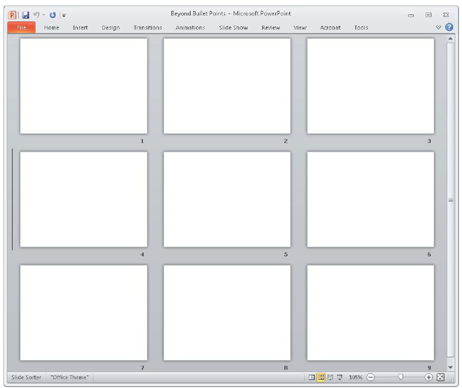
Open a new, blank PowerPoint presentation, and on the View tab, in the Presentation Views group, click Slide Sorter, as shown in Figure 2-2. Although you might be used to looking at Slide Sorter view only occasionally, if ever, the first trick of BBP is to always begin working in PowerPoint in this view.If you’re wondering why it’s so important to elevate the status of this little-used view from the least important to the most important way to look at your presentations, you need to step out of the PowerPoint mindset altogether for a bit and ask some uncommon questions first.
FIGURE 2-2 Slide Sorter view, displaying all of your slides as small thumbnails.
In search of "Research Reality"
In most conversations about PowerPoint, the discussion usually focuses on which size font to use, how to insert a video clip, and whether the background of a PowerPoint template should be blue, black or another color. One thing you never hear is a conversation about any research related to PowerPoint presentations. Despite the widespread use and influence of PowerPoint software in many professions, you would be hard pressed to find research that demonstrates that the underlying theory, impact, or effectiveness of the conventional bullet point approach is better than any other approach.
For example, you won’t find research indicating that presenting with bullet points on a PowerPoint slide is more effective than presenting without them, or studies showing that using a PowerPoint design template to make every slide background the same produces better learning than not using a design template, or a quantitative justification and rationale for commonly accepted PowerPoint design guidelines such as the 6-by-6 rule, which states that every slide should have six lines of text with six words per line.
This lack of comparative studies on PowerPoint approaches has created a void in terms of research-based guidelines on how best to use the software, and this void has been quickly filled with popular myths and cultural habits. In other words, the main reason we approach PowerPoint the way we do is simply because that’s the way that we’ve always done it, and not because any research says it’s better than any other way.
Although there is little research specifically comparing PowerPoint approaches, there is a significant body of research that has direct relevance to those who use spoken words and projected images to communicate. Researchers in the fields of cognitive science and educational psychology have been studying for decades the best ways to help people learn new information using narration and images. Their work is a treasure trove of information that is directly relevant and applicable to you when you use PowerPoint to create presentations.
The only problem is that currently the research dots are not connected to our PowerPoint bullet points. That is what you’ll do now as you apply three key parts of this research to the three views of PowerPoint. As you do that, you’ll see how these three "research realities" quickly dispel the myths and break the habits that stand in the way of effective presentations. These three research realities also will show clearly why BBP works so well and why the conventional approach to PowerPoint does not deliver results as effectively.
Research on Multimedia Learning
This topic is inspired by the work of Richard E. Mayer, Ph.D., a professor of psychology at the University of California, Santa Barbara. Ranked as the most productive researcher in the field of educational psychology in the world.In his topics and related articles and papers, Mayer proposes a way to understand the use of multimedia that promotes meaningful learning and lays out a set of principles for designing any multimedia experience based on his own research and that of others.
Research Reality 1: You Have to Respect the Limits of Working Memory
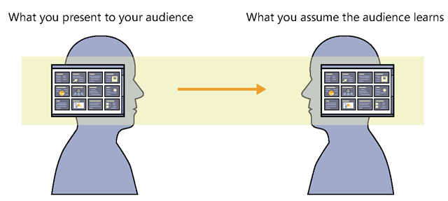
Whether or not you think about it consciously, you probably accept fundamental assumptions about communication that literally shape your thinking in ways large and small. If you commonly talk about communication in terms of a "sender" who transmits a "message" to a "receiver," you might assume that you "send" information through an unobstructed channel, like a pipeline, and the audience will "get it," fully intact, at the other end of the pipeline, as shown in Figure 2-3.
FIGURE 2-3 The pipeline concept assumes that there is an unobstructed channel between you and your audience.
With the pipeline in mind, you assume that you can produce a PowerPoint presentation in whatever way you like, as shown on the left in Figure 2-4. After you send this PowerPoint presentation through the pipeline, you assume that its receivers will "get it" on the other side, as shown on the right. Under this assumption, your work is then done. The only criterion for success is that you "delivered" the PowerPoint presentation through the pipeline. If for some reason the audience didn’t get what you delivered, of course, it’s not your fault as a presenter—after all, you delivered the PowerPoint presentation, and what they did with it is their problem, not yours.
The pipeline assumption is at work when people make statements like, "We showed them the facts, but they just didn’t get it," or, "The presentation went right over their heads." When a verdict in a legal trial goes against one party, it is common for people to say the jury just didn’t "get" the evidence, or when a sales presentation does not succeed, the presenter might say the audience just didn’t "get" the benefits of the product or service.
It is hard to separate the pipeline metaphor from our thinking because it is woven into the words and expressions we use commonly every day.
FIGURE 2-4 With the pipeline in mind, you assume that your audience will "get" whatever you "deliver" to them.
Although the pipeline metaphor is convenient, in practice it does not deliver what you might assume it does. According to leading educational psychologist Richard E. Mayer, if you give a multimedia presentation to an audience, there are three possible outcomes, as shown in Figure 2-5. The first possible outcome is that your audience experienced no learning (upper right). This is the worst-case scenario—in spite of your work in preparing your presentation and your audience’s time and effort in showing up and paying attention, no learning happened to make the experience worthwhile.
FIGURE 2-5 In reality, audiences do not automatically get what you send through the pipeline.
A second possible outcome is that your audience remembered perhaps the bullet points on slides 12 and 33 and the diagram on slide 26—but that’s all they remembered. In this scenario, they remember only bits and pieces of the presentation because they experienced fragmented learning (middle right). In fragmented learning, the audience members remember at least some things; but from a presenter’s perspective, you have no control over what they learned because the fragments could be any pieces of information among many, and you don’t know which ones.
The third possible outcome is that the audience remembered exactly what the presenter intended—they experienced meaningful learning (lower right). Meaningful learning is what any group wants to achieve in their time together—the people in the audience understand what the presenter intended, and they are able to apply the information after the meeting.
Audiences routinely report that PowerPoint presentations today are "Forgettable!" and "What’s the point?" It’s rare to hear an audience and a presenter agree that meaningful learning has occurred. In order to turn the situation around, you literally need to change the shape of the metaphor that guides the way you think about human communication.
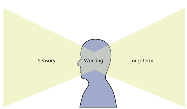
During a PowerPoint presentation, the memory of an audience member is the critical human element that determines how well new information is received, processed, and stored in the human mind. Researchers who study the mind generally accept that there are three types of human memory, as shown in Figure 2-6.
FIGURE 2-6 The three types of human memory: sensory memory, long-term memory, and working memory.
The first type is sensory memory. Sensory memory is the part of the mind where your audience members briefly store the initial impressions of sights and sounds as they look at and listen to the environment around them. Sensory memory is potentially unlimited in capacity, although sights and sounds might persist in sensory memory for less than a second.
The second type is long-term memory—the part of the mind where your audience members store information over an extended period of time, from as little as 30 seconds to as long as a lifetime. In a presentation context, this is where you would like your audience to store the new information you intend to communicate to them. Beyond just remembering the new information, you also would like them to be able to access and apply the information from long-term memory when needed. Like sensory memory, long-term memory is also potentially unlimited in its capacity.
The third type is working memory (sometimes called short-term memory)—the part of the mind where your audience members hold their attention. The theories underlying working memory are complex, but essentially, working memory is a temporary holding area for information. As sensory memory briefly holds sights or sounds, working memory then pays attention to some of them and holds them for a matter of seconds while it works to integrate them into long-term memory.
While sensory memory and long-term memory each have unlimited capacity, working memory is severely limited in its capacity to process new information. In an influential paper published in 1956, George A. Miller observed that people could hold a small number of "chunks" that they mentally form in what we now understand as working memory. Although the capacity of chunks was thought to be around seven for most people, depending on the type of information, working memory expert Nelson Cowan recently revisited Miller’s classic work and now estimates the capacity of working memory for new information at three or four chunks.
Although the limits of working memory have been acknowledged for 50 years, the concept has never been fully absorbed or integrated into our day-to-day practice and understanding of human communication. The pipeline metaphor has such a strong grip on our collective consciousness that we have effectively resisted the adoption of the research that contradicts it. Yet as much as you might want to believe that there is an unobstructed pipeline between sender and receiver, the reality is that the limits of working memory put a major crimp in that metaphor.
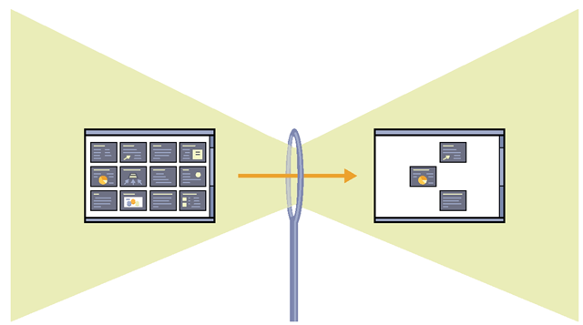
In order to align your own assumptions about communication with what researchers accept about the way human memory works, you’ll need to drop the old pipeline metaphor and pick up a new metaphor—the eye of the needle, as shown in Figure 2-7.
FIGURE 2-7 The limited capacity of working memory to process new information creates a narrow passage—much like the eye of a needle—that stands between the information you present sensory memory and the information that is integrated into long-term memory.
Keeping this new metaphor in mind when you create presentations, you know that you have a potentially unlimited amount of new information that you could show someone’s sensory memory (left). You want the new information to be retained in long-term memory (right). But working memory is so constrained in its capacity to process new information that it creates a narrow passage, much like the eye of a needle (center). This extremely small space of the "eye" of working memory constitutes the most formidable challenge you face as a presenter.
This new metaphor visually explains why audiences report either no learning or fragmented learning. If you present working memory with more new information than it can handle, as shown on the left in Figure 2-8, the eye of the needle is easily overloaded and will process and integrate into long-term memory what it can—only bits and pieces out of the entire presentation, as shown on the right. As much as you might want your audience to learn the new information you present, they will never be able to learn it unless you help that information properly pass through the eye of the needle.
FIGURE 2-8 When you show more information than working memory can handle, audience members remember only bits and pieces.
The impact of reducing excess load on working memory has been documented by researchers including Mayer, who conducted a study using two multimedia presentations. The first presentation featured interesting but irrelevant graphics, and the second presentation provided the same information, but without the interesting but irrelevant graphics.
Mayer measured the impact of the two approaches on audiences in terms of two criteria: retention, the ability of the audience to simply recall the information, and transfer, the ability to creatively apply the new information. Audiences who experienced the second presentation retained 69 percent more information and were able to apply 105 percent more creative solutions using the information than those who experienced the first presentation. This study offers research-based evidence to support the saying "Less is more"—the less you overload working memory with extraneous information, the more learning improves.


