Area Plots
The area function will generate a filled area plot from either a vector of data, or the columns of a matrix. When creating an area plot with a vector, the data points defined by the vector are straight line connected. Then the area between the lines and the y axis at 0 (by default) will be filled in. To change the y-axis value to which the plot is filled, you can use the form area(Y,ymin) or area(X,Y,ymin), where the ymin argument specifies the location to which the plot is filled. The area plot is generated from a patch object.Therefore, the visual attributes of the area plot can be changed using valid patch properties and property values.For example, Figure 3.49 shows a blue area plot in which the area is filled to the value 2 on the y-axis. This plot was generated using,
Figure 3.49 An area plot of a vector.
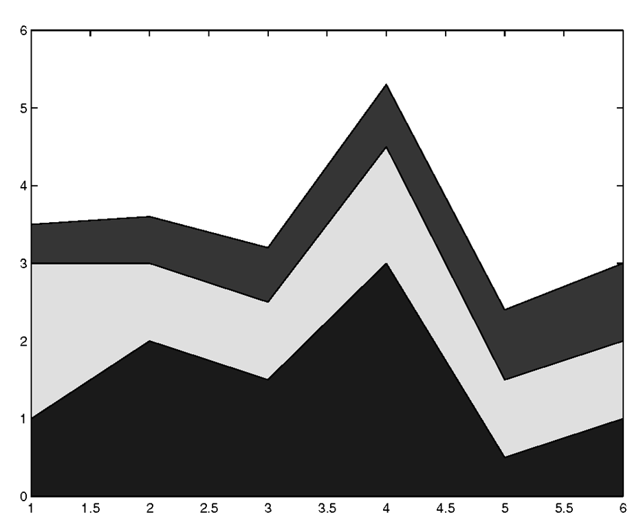
When using matrices, a layer in the area plot is drawn for each column in the matrix. The height of ith layer in the area plot is determined by summing the values in each row from the 1st to ith column in the matrix (ie., sum(Y(:,1:i)’) where i is the ith layer) . You may get some strange looking plots if your data values have negative values, but the rule used to determine the height still holds true. The colors for the area plot representing each column is automatically chosen from equally spaced intervals in the colormap. For example, we can generate the 3-layered area plot seen in Figure 3-47 with the following matrix.
Figure 3.50 Area plot of a 3 by 6 matrix.
Working with Complex Data
Complex data consists of both real and imaginary components and is commonly encountered in many engineering disciplines. In MATLAB, the complex term![tmp8414259_thumb[2][2] tmp8414259_thumb[2][2]](http://what-when-how.com/wp-content/uploads/2012/06/tmp8414259_thumb22_thumb.png) can be represented by either of the built-in definitions I or j (depending on whether you are a mathematician or an engineer!). MATLAB knows you are giving it a complex value when the interpreter sees either one affixed to a number, that is unless you have used them as variable names and assigned another value to them. As an example, the complex number 1+3i can be entered as 1+3j; MATLAB is perfectly content with each. In fact, since both are built-in to MATLAB, 1+3*j works too. MATLAB supplies three built-in 2-D plotting functions that are especially applicable to use with complex data. These are the plot, compass, and feather functions. Although you have already seen the plot function, we will discuss its use in the case of complex data. The other two functions will follow. In most cases you can use the other MATLAB plotting functions with complex data, but the result might not be what you expect. For instance, what does it mean to plot a bar graph of complex data?
can be represented by either of the built-in definitions I or j (depending on whether you are a mathematician or an engineer!). MATLAB knows you are giving it a complex value when the interpreter sees either one affixed to a number, that is unless you have used them as variable names and assigned another value to them. As an example, the complex number 1+3i can be entered as 1+3j; MATLAB is perfectly content with each. In fact, since both are built-in to MATLAB, 1+3*j works too. MATLAB supplies three built-in 2-D plotting functions that are especially applicable to use with complex data. These are the plot, compass, and feather functions. Although you have already seen the plot function, we will discuss its use in the case of complex data. The other two functions will follow. In most cases you can use the other MATLAB plotting functions with complex data, but the result might not be what you expect. For instance, what does it mean to plot a bar graph of complex data?
To use the plot command with complex data, be sure that your data is in a complex variable. The code
demonstrates this and is shown in Figure 3.51.
Figure 3.51 Visualizing complex data with plot.
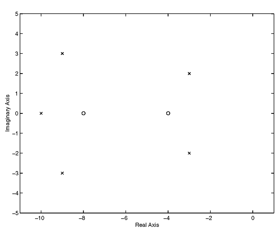
As you can see, complex data points are placed in the axes with the assumption that the x-axis and y-axis respectively correspond to the real and imaginary components of the vector z and then connected by lines. You could also use plot(real(z),imag(z)) to generate the same results. As another example, let’s say you wanted to create a plot that illustrates the complex data points, e.g., the poles and zeros of system transfer function.
The results of which are shown in Figure 3.52.
Figure 3.52 Combining complex and real data in a plot.
The feather function produces a plot of vectors that emanate from equally spaced points along the horizontal axis. Each arrow’s length corresponds to the magnitude of a data element and its pointing direction indicates the angle of the complex data. The general form of this function is feather(u,v) where u contains the x-axis components and v the y-axis components, each in relative coordinates. You can call the function with feather(Z) where Z is complex. As with plot this is equivalent to feather(real(Z),imag(Z)). The line type can be chosen in the same way it was when using the plot command with the form feather(…, linetype_string). For an example, the following code creates some complex data by first creating some angles and corresponding magnitudes. Then it puts that in Cartesian format with pol2cart, and converts that result to a complex representation with complex. Note that this would work exactly the same with feather(u,v).
The result is the data plot with dashed cyan lines shown in Figure 3.53. You may have noticed that the arrowhead’s size is proportional to the length (or magnitude) of the line and that they are not solid or filled in. When we explore more about object properties and Handle Graphics, you will learn how to modify the arrows to suit your needs.
Figure 3.53 A feather plot of complex data.
![tmp8414255_thumb[2][2] tmp8414255_thumb[2][2]](http://what-when-how.com/wp-content/uploads/2012/06/tmp8414255_thumb22_thumb.png)

![tmp8414257_thumb[2][2] tmp8414257_thumb[2][2]](http://what-when-how.com/wp-content/uploads/2012/06/tmp8414257_thumb22_thumb.png)

![tmp8414261_thumb[2][2] tmp8414261_thumb[2][2]](http://what-when-how.com/wp-content/uploads/2012/06/tmp8414261_thumb22_thumb.png)

![tmp8414263_thumb[2][2] tmp8414263_thumb[2][2]](http://what-when-how.com/wp-content/uploads/2012/06/tmp8414263_thumb22_thumb.png)

![tmp8414265_thumb[2][2] tmp8414265_thumb[2][2]](http://what-when-how.com/wp-content/uploads/2012/06/tmp8414265_thumb22_thumb.png)

