The most basic, yet often the most useful, graph that you may wish to create is a simple line plot of numeric data. The MATLAB language provides a set of high-level commands that are used to create these simple line plots. In order to simplify the discussion and descriptions of 2-D plots, let’s take a moment and list relevant graphics objects and fundamental graphics terminology. Essentially, graphics objects are the basic elements which, when assembled and drawn on your monitor’s screen, generate pictures and visual information. Even the most elementary plot consists of several graphics objects. The window in which the plot appears, the lines, the axes, and the labels that make up the plot are all examples of graphics objects.
The following objects and terms are occasionally referred to in this section:
• figure: the window in which other graphics objects are placed
• axes: a graphics object that defines a region of the figure in which the graph is drawn
• line: a graphics object that represents the data that you have plotted
• text: a graphics object that is comprised of a string of characters and terms
• title: the text object that is located directly above an axes object
• xlabel: the text object associated with the x-axis
• ylabel: the text object associated with the y-axis
These objects and terms also happen to be the names of some of the plotting functions that can be used while creating 2-D plots.
To start, the MATLAB command plot will be examined in detail. Then we will look at a group of three commands (semilogx, semilogy, and loglog) that are variations of the plot command with respect to the axis scaling. After these are presented, a group of plotting commands that are more specialized in terms of their application are presented. We’ve placed these specialized plotting commands in the broad category of Specialized 2-D Plotting, since these are easily created with simple high-level MATLAB commands. Finally we will discuss how to edit a plot once it is created and examine the MATLAB Figure Window and its various parts as it has undergone quite a few changes in the recent releases of MATLAB.
A General Overview of the Plot Command
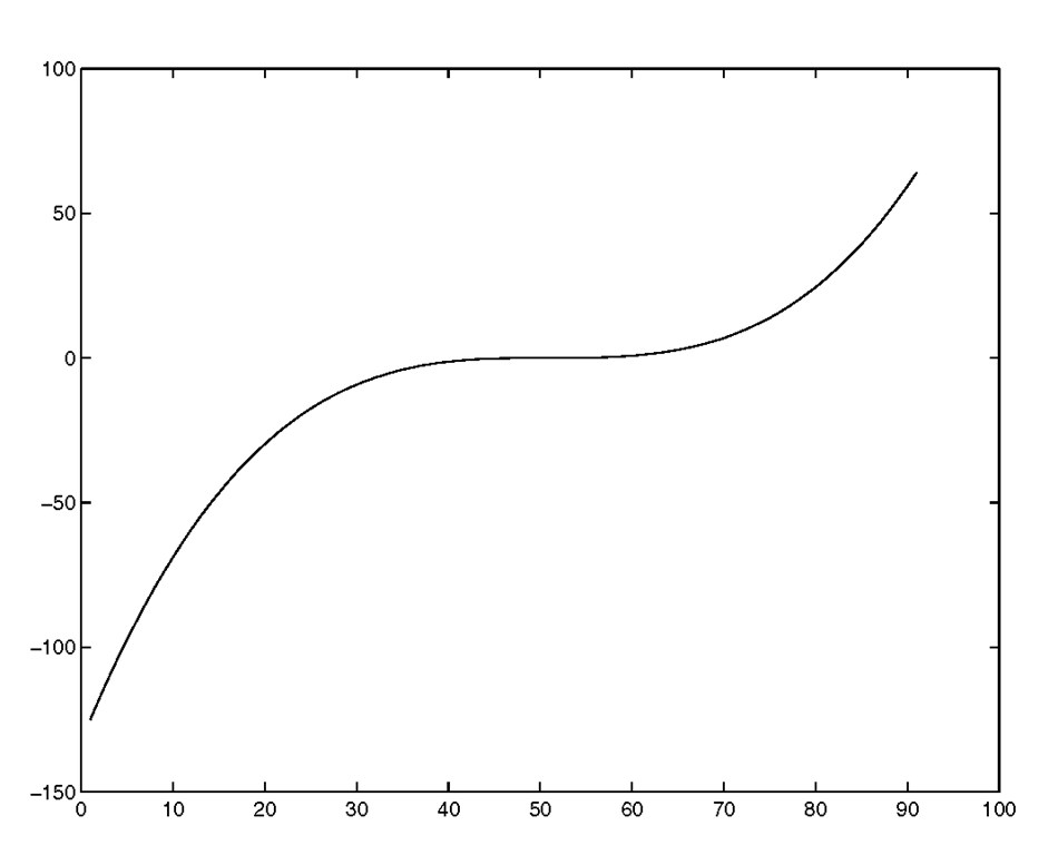
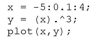
Most of the MATLAB graphics commands are straightforward and intuitive (or at least they become intuitive fairly quickly as you move along the language’s learning curve). The plot command is the first one that we will explore. For example, a graph of an arbitrary set of data values assigned to the variable y can be generated using the command plot(y). Let’s say that your data set was the cubic of the numbers from negative five to four in step increments of one tenth. This data can be generated and plotted by typing
at the command prompt. You will obtain the figure shown in Figure 3.3.
Notice that the x-axis labels are not the numbers that were cubed, rather they are the subscript or index numbers of the vector y. MATLAB automatically plots your data versus the index number when only one argument is passed to the plot function. You can verify this by typing
and seeing that
is returned. In the figure, you can see that the last point defining the line (in the upper right-hand corner) is at the point 91 on the x-axis and 64 = y(91) on the y-axis.
Figure 3.3 Plot of y = (-5:0.1:4).
Although there may be instances in which having the indices of the plotted data displayed along the x-axis is useful, in many cases it will be more informative to display the value of the input or parameter that was responsible for the data output. In order to accomplish this for our previous example, we can use
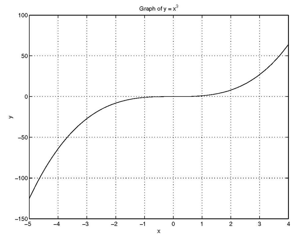
and the Figure Window will contain the plot that appears in Figure 3.4.
Figure 3.4 Use plot(x,y) where y = χ.
Now we can add some labels to the x- and y-axes, a title to make the graph more informative, and a grid to assist in estimating values from the line in the graph. We will create the label "x" for the x-axis, "y" for the y-axis, and put "Graph of y = xA3" as the title to the graph. MATLAB makes adding these very simple; just type the following at the command prompt:
Figure 3.5 shows the results of applying these commands.
Figure 3.5 Adding labels, a title, and a grid.
The plot command arguments are not restricted to being vectors; the inputs may also be matrices. When passing inputs to the plotting function, there are several simple rules to keep in mind so that the appearance of the graph is what you expect. The rules can be summarized as follows:
• plot(y)
- If y is a vector, you will generate a line of y versus the index numbers of y.
- If y is a matrix, you will generate a set of lines where each line corresponds to the graph of one of the matrix columns versus the row number.
• plot(x,y)
- If x and y are vectors of the same length, a graph of y versus x will be displayed.
- If x is a vector and y is a matrix, the rows or columns of y will be plotted against x. If a column of the y matrix has the same length as vector x, then the columns will be plotted versus x. If the rows have the same length as vector x, then the rows will be plotted versus x. If the number of rows and columns of y are the same, the columns will be plotted versus x.
- If x is a matrix and y is a vector, y will be plotted against either the rows or columns of x. If a column of the x matrix has the same length as vector y, then y will be plotted versus columns of x. If the number of rows of x is equivalent to the length as vector y, then y will be plotted versus the rows of x.
- If the number of rows and columns of x are the same, y will be plotted versus the columns of x.
- If x and y are matrices which have the same number of rows and columns, the columns of y will be plotted against the columns of x.
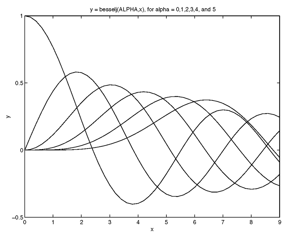
We have already looked at plotting a simple vector by itself or versus another vector. Let’s look at a few examples which illustrate these rules. In the Command Window, type
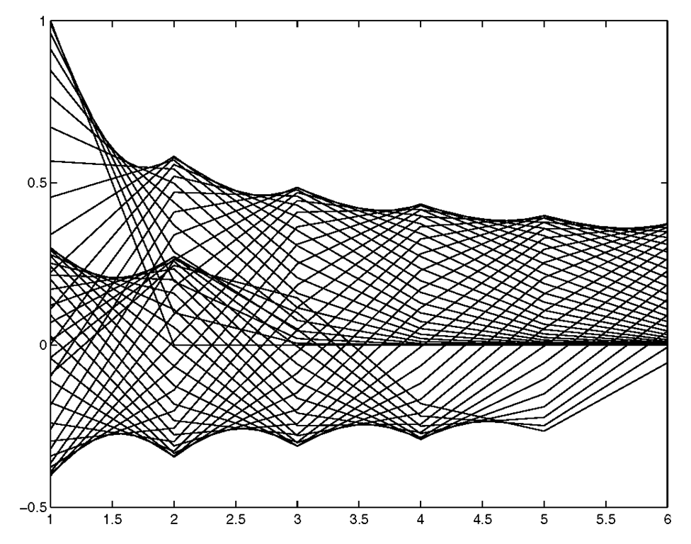
The y variable is a 46-by-6 element matrix and x is a vector with 46 elements. The plotting results are shown in Figure 3.6. For this example it does not matter to the plot command if y is transposed or not; MATLAB recognizes the size of the two input variables and appropriately plots y in the orientation that matches the dimensions of x. However, the besselj function does require that alpha have as many columns as rows in x.
Figure 3.6 Plotting the matrix y versus the vector x.
Try the same example but substitute plot(y) for plot(x,y). Here columns of y are plotted, so you end up with essentially the same figure, but with the x-axis labels representing the row index number of y. You could also plot the rows of y by using plot(y’), but in this example the graph, Figure 3.7, may look interesting but doesn’t provide much in the way of information.
Figure 3.7 Plotting the rows of a 46 by 6 element matrix.
If you have a color monitor, you may have noticed in the previous examples that when multiple lines are plotted, they will have various colors automatically assigned to them. As you will read later on in this section, one of the ways by which the line types (e.g., solid, dashed, etc.), plot symbols (e.g., circles, stars, etc.), and line colors can be defined is by passing a string argument directly to the plot function. However, for any of the cases in which more than one line is created and where you have not defined the color in the plot statement, the color of the lines will be cycled through a specific set of colors. By default, there are six colors that MATLAB will automatically cycle the lines through. Later you will learn how to change line colors to accommodate your needs.
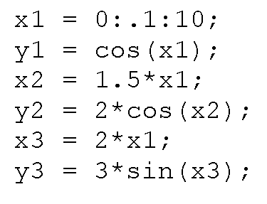
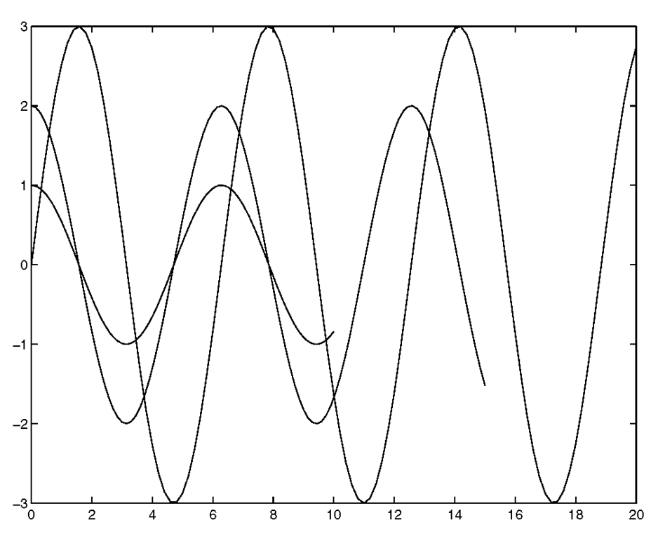
The number of inputs can also be extended. You can use the format plot(x1,y1,x2,y2,… ) where the rules mentioned above apply for each x and y pair. For example, if you wanted to plot three lines representing the data sets
you could use
If the x1, x2, x3 and y1, y2, y3 data had been, respectively, in an X and Y matrix (in this example it is possible because the sizes of the individual vectors are the same and can be used to build a larger matrix)
you could have also used plot(X,Y)
Both of these plot commands would give you the exact same plot shown in Figure 3.8. Be aware of the fact that depending on the situation, there are usually many ways to achieve the same end result. If the x1, x2, x3 and y1, y2, y3 vectors could not have been used to build a larger matrix, the plot(x1,y1,x2,y2,x3,y3) would be more appropriate. As you continue through this topic and your MATLAB vocabulary grows, you will see that there are other methods that can be used to get the same three lines on your display.
Figure 3.8 Using plot(X,Y) or plot(x1,y1,x2,y2,…).
If you were able to visualize the data in your mind’s eye and expected something that was close to the results in Figure 3.8, or if you were able to look at the data and associate a line with one of the data set combinations, it was most likely due to the fact that the data sets were fairly simple. In many cases this would probably not be easy to do. On your screen the lines are in color, so if you memorized the fact that by default MATLAB currently cycles through the colors blue, green, red, cyan, magenta, yellow, and black when creating multiple lines with a plot command, you would have known that the blue one corresponds to the (x1,y1) combinations, the green line corresponds to the (x2,y2) combinations, and the red line corresponds to the (x3,y3) combinations. Realistically, if you are presenting your plots to others, your audience is probably not likely to have memorized the MATLAB color cycle and unless you are some kind of savant, you probably aren’t going to want to memorize it either! Of course you can always look it up in the reference guide, type help plot, set your own default, look at the axes ColorOrder property,or even run a quick test. But in any event, if you print out a figure with a black and white printer, you are still going to be out of luck unless you make use of MATLAB’s line types or plotting symbols. Also, since defaults may change from version to version (as the color cycle did from version 4 to version 5), if it matters what color a plot is displayed as on your monitor, it is always best to specify exactly what you want.
Fortunately, the plot command accepts a color-linestyle-marker string, which is a character string argument by which you can specify line types, plot symbols, and colors. For instance, if you wanted to plot a red dashed line with the vectors x and y, you could simply type the command
The string that you create to define the characteristics of the line may use any combination of characters shown in Table 3.3.1 for the line type, symbol, or color. As you can see, your string may have from 1 to 4 characters. The order of the character sets does not matter. Later we will see how to alter the line properties using the Property Editor from the Figure Window itself.
Table 3.3.1 Line Color, Marker Style, and Line Style Strings
It is important to realize that when you are using plot symbols, the symbols will appear centered on the data points. Lines, however, will interpolate (linearly) between the data points. Therefore, if you are plotting a continuous function (such as sin(x)), the relative smoothness of the line may depend on the number of samples being passed to the function and the spacing between the samples. Also bear in mind that the colors that have been listed in Table 3.3-1 are not the only colors that can be used.
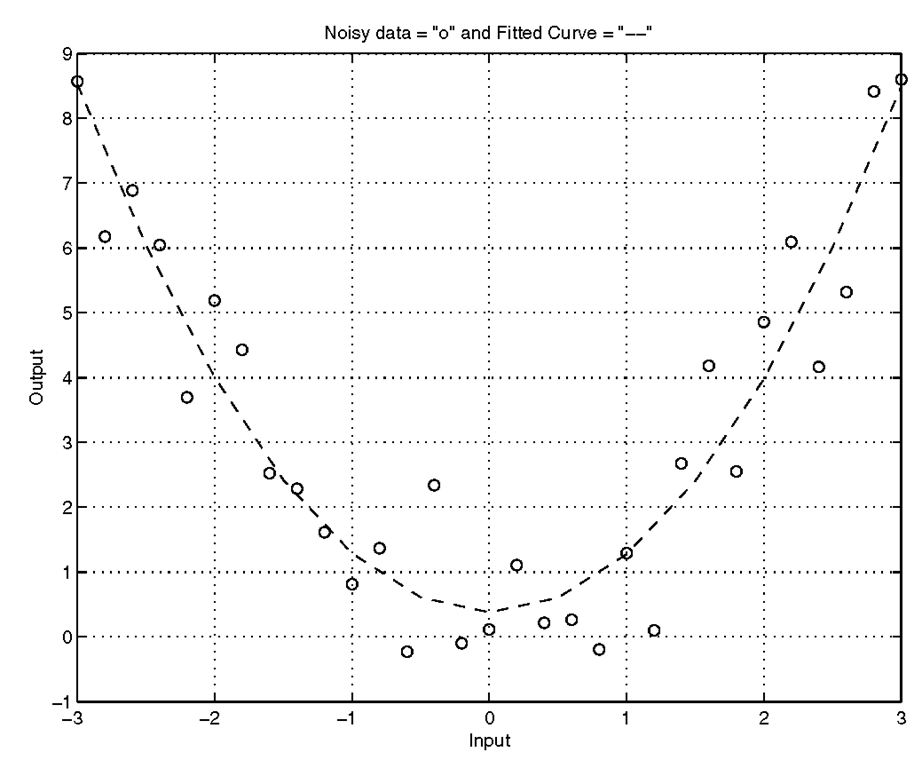
Let’s look at an example of how a combination of line styles and symbols can be informative. First, we will create some data by squaring a range of values and adding some normally distributed random noise:
Given the input and noisy output, let’s say we want to fit a 2nd order polynomial curve to the data. To do this we can use the MATLAB functions polyfit and polyval in the following manner:
Now we shall plot the data which was used as input to our curve fitting routine as green circles, and the fitted curve as a cyan dashed line.
And for a flourish, add some informative labels and a grid with
and voila, we have quickly created the combination plot of our results shown in Figure 3.9.
Figure 3.9 A combination plot.
Logarithmic Plots
Not all data lends itself to a linear scale representation. Sometimes, the range of the data to be plotted is so great that it is difficult to see just what the data is doing. MATLAB provides three forms of the plot function that let us view data that is better represented with a logarithmic scale, namely semilogx, semilogy, and loglog. Each is used just as the plot function, but use a logarithmic scale (base 10), for either the x-axis, y-axis, or both axes respectively.
As an example, consider the data generated by the following code.
The x-axis data is clearly linear but the data computed from it isn’t. If we use our familiar plot function with
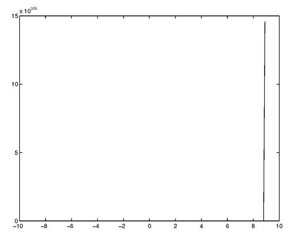
we will get the plot shown in Figure 3.10.
Figure 3.10 Using plot is ineffective when the data scale varies greatly.
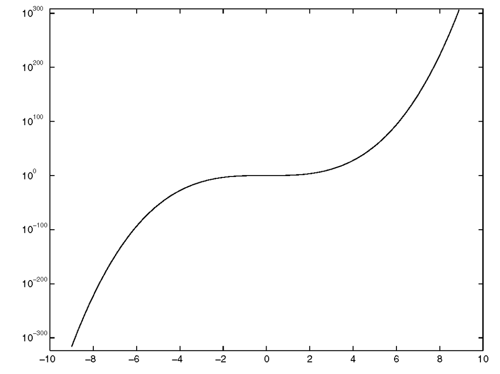
In this case our plot looks much like a straight line and we would be hard pressed to read any values off of it. However, using semilogy reveals much more about the nature of the data. Simply plot the data again using,
and you will get the plot shown in Figure 3.11.
Figure 3.11 Using semilogy reveals details about the data.
If our x-axis data was better represented with a logarithmic scale, we would use semilogx. If both need logarithmic scales, then loglog could be used.


