Some people think that they can pick up a map and immediately start using it. If you don’t have a lot of experience using different types of maps, that’s a little like thinking just because you can read, you can sit down and understand a topic that’s written in French, German, or Spanish even if you’ve never had a foreign language class in your life. Yes, you may make a little sense of the topic by picking out a few words you recognize or by looking at the pictures, but in the process, you’re missing out on some important information.
Maps have their own language and a number of dialects depending on the type of map. To use paper or digital maps effectively, you need at least a tourist’s understanding of their language. The more you know, the better off you are.
That’s what this topic is all about — different types of maps, basic map concepts and principles, and the various kinds of digital maps that you can access on a computer. By the end of the topic, you’ll have a handy enough grasp of conversational map-speak that you can ask the right questions to avoid getting lost.
Anatomy of a map
Most maps have elements in common. Here are some, along with the terms that cartographers (mapmakers) use to describe them:
Citation: This is information about data sources used in making the map and when the map was made.
Collar: This is the white space that surrounds the neatline (see the upcoming definition) and the mapped area.
Compass rose: A map has either a simple arrow that shows north or a full compass rose (an image that indicates all four directions) so the user can correctly orient the map to a compass.
Coordinates: Maps usually have either letters and numbers or coordinates (such as latitude and longitude values) marked along the borders so users can locate positions on the map.
Legend: This is a box that shows an explanation of symbols used on the map. Some maps show all the symbols; others rely on a separate symbol guide.
Mapped area: This is the main part of the map, displaying the geographic area.
Neatline: This is the line that surrounds the mapped area.
Scale: This distance-equivalence information (such as "one inch = one mile") helps you estimate distances on a map and is typically found at the bottom.
Title: This is usually the name of the map, but it also tells you which area it’s mapping.
Begin by looking at the basic types of maps that you can use to navigate and better understand your surroundings. (Although there are maps for traveling under the ocean, visiting the moon, or zooming around in space, it’s unlikely that you’ll need these anytime soon.)
An important point to consider is that no one universal map type does it all. Different map types display the different features and details that are suited for a particular use — or user. A skilled map user always selects a map that meets his or her specific needs.
Maps are almost always oriented so the top of the map is facing north. If a map doesn’t follow this convention, a good mapmaker places an arrow on the map that points north.
Land
Because we spend most of our time with our feet or tires on the ground, land maps are pretty important to know how to use. In general, the two types of land maps are topographic and planimetric.
Topographic maps
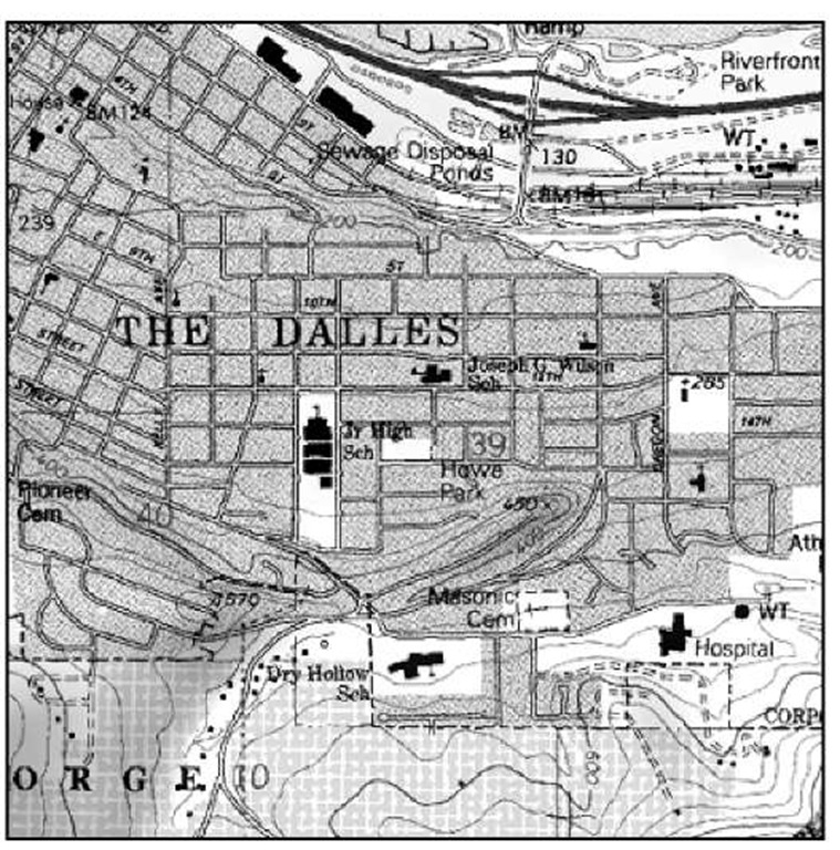
Topographic maps show natural land features such as lakes, rivers, and mountain peaks as well as man-made features such as roads, railroad tracks, and canals. These maps also have contour lines that trace the outline of the terrain and show elevation. Contour lines suggest what the land looks like in three dimensions.
A contour interval is the distance between contour lines. For example, if a contour interval is 20 feet, every time you go up one contour line, the elevation increases by 20 feet. Conversely, every time you go down a contour line, the elevation decreases by 20 feet. When the contour lines are close together, the terrain is steep. When they’re spread apart, the terrain is closer to flat. Different maps have different contour intervals and the distance is usually noted in the map legend.
The most popular topographic maps for use within the U.S. are made by the United States Geological Survey (USGS). These maps cover different sizes of area; the smaller the area, the greater the detail. Topographic maps are often called topo maps. The topo maps that show the most detail are sometimes called quad sheets or 7.5 minute maps because they map just one quadrangle (geographer-speak for rectangular shaped piece of land) that covers 7.5 minutes of longitude and latitude. Figure 2-1, for example, is a topographic map of The Dalles, Oregon.
A compass uses degrees to tell direction. North is 0 or 360 degrees, west is 90 degrees, south is 180 degrees, and east is 270 degrees.
Figure 2-1:
A topographic map showing contour lines and other features.
Most topographic maps show magnetic declination. Compass needles point to magnetic north, but most maps are oriented to true north. Because the earth’s magnetic field varies from place to place, magnetic north usually isn’t the same as true north; in the continental United States, the difference can be as much as 20 degrees. If you don’t account for the magnetic declination, you can get far off-course trying to navigate someplace with a compass. The declination tells you how many degrees you need to adjust your compass: If the declination is west, you subtract the degrees from 360 to get true north; if it’s east, you add the degrees.
Magnetic declination changes over time, and older USGS maps can have incorrect declination information printed on them. Using the wrong declination can cause all sorts of navigation problems, so check the current declination for your area at the following Web site: www.ngdc.noaa.gov/cgi-bin/seg/ gmag/declinationl.pl.
If your job or hobby takes you off the beaten path, you definitely need a topographic map. If you’re staying in your car, driving on paved roads, you probably don’t need a topographic map.
Planimetric maps
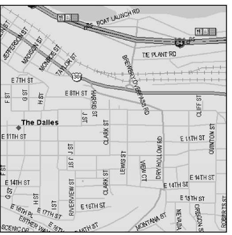
Planimetric maps don’t provide much information about the terrain. Lakes, rivers, and mountain pass elevations may be shown, but there isn’t any detailed land information. A classic example of a planimetric map is a state highway map or a road atlas. Planimetric maps are perfect in cities or on highways, but they’re not suited for backcountry use. Figure 2-2 is a planimetric map of The Dalles, Oregon, area.
Figure 2-2:
A planimetric map lacks terrain features and contours.
When using planimetric maps, you’ll often encounter these terms:
Atlas: An atlas is a collection of maps, usually in a topic.
Gazetteer: A gazetteer is a geographical dictionary or a topic that gives the names and descriptions of places.
Marine
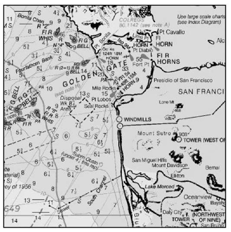
Marine charts are maps for inland, coastal, and deep-water navigation. Charts from the National Oceanic and Atmospheric Administration (NOAA) are commonly used for boating. They provide such important information as water depth, buoy locations, channel markers, and shipping lanes.
Marine charts aren’t available for all bodies of water. If you’re boating on a lake or a river, you’ll probably use a topographic map for navigation.
This topic focuses on land maps, so there isn’t much detail about marine charts. Part of a marine chart of San Francisco Bay, California, is shown in Figure 2-3.
If you’re more of a sailor than a landlubber, check out Marine Navigator at www.maptech.com. This commercial marine-navigation program displays NOAA charts, aerial photographs, 3-D ocean-bottom contours, and tide and current tables.
Figure 2-3:
A NOAA nautical chart, showing important features for mariners.
Aeronautical
Maps designed for aviation use are charts (a term that can also refer to their marine counterparts). These maps provide pilots with navigation information including topographic features, major roads, railroads, cities, airports, visual and radio aids to navigation, and other flight-related data.
You can find such aeronautical chart types as
VFR (Visual Flight Rules)
IFR (Instrument Flight Rules) Enroute
Terminal Area Charts
You can find more about aeronautical charts by visiting the Federal Aviation Administration (FAA) National Aeronautical Charting Office (NACO) at www. naco.faa.gov.
Figure 2-4 shows a pilot’s-eye view of the Seattle area.
FAA aviation charts aren’t freely available for download. The FAA offers a monthly service that provides all charts and updates on DVDs for a year, but the cost is over $300. A number of companies such as Jeppesen (www.jeppesen.com) and Maptech (www.maptech.com) make commercial flight-planning software packages that include digital charts, or you can try the www.aeroplanner.com, a Web service that provides digital charts and other services to pilots. Another noncommercial source of FAA sectional charts is http://aviationtoolbox.org/raw_data/FAA_sectionals.
Figure 2-4:
A sectional aeronautical chart for the Seattle area.


