Graphics Reference
In-Depth Information
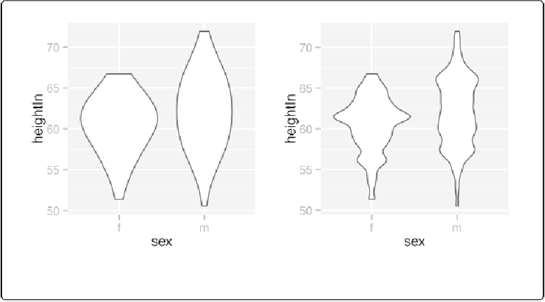
Figure 6-25. Left: violin plot with more smoothing; right: with less smoothing
See Also
To create a traditional density curve, see
Making a Density Curve
.
To use different point shapes, see
Changing the Appearance of Points
.
Making a Dot Plot
Problem
You want to make a Wilkinson dot plot, which shows each data point.
Solution
set:
library(gcookbook)
# For the data set
countries2009
<-
subset(countries, Year
==
2009
&
healthexp
>
2000
)
p
<-
ggplot(countries2009, aes(x
=
infmortality))
p
+
geom_dotplot()