Graphics Reference
In-Depth Information
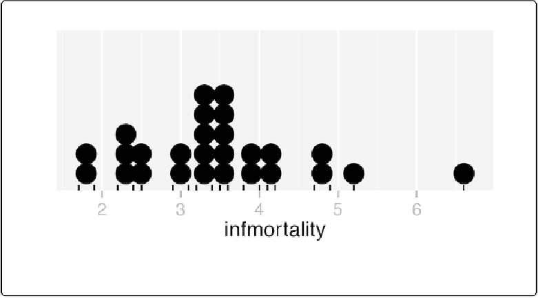
Figure 6-26. A dot plot
Discussion
This kind of dot plot is sometimes called a Wilkinsondot plot. It's different from the Cleveland
dot plots shown in
Making a Cleveland Dot Plot
.
In these dot plots, the placement of the bins
depends on the data, and the width of each dot corresponds to the maximum width of each bin.
The maximum bin size defaults to 1/30 of the range of the data, but it can be changed with
bin-
width
.
By default,
geom_dotplot()
bins the data along the x-axis and stacks on the y-axis. The dots
are stacked visually, and for reasons related to technical limitations of ggplot2, the resulting
graph has y-axis tick marks that aren't meaningful. The y-axis labels can be removed by using
scale_y_continuous()
. In this example, we'll also use
geom_rug()
to show exactly where
each data point is (
Figure 6-27
):
p
+
geom_dotplot(binwidth
=
.25
)
+
geom_rug()
+
scale_y_continuous(breaks
=
NULL
NULL
)
+
# Remove tick markers
theme(axis.title.y
=
element_blank())
# Remove axis label