HTML and CSS Reference
In-Depth Information
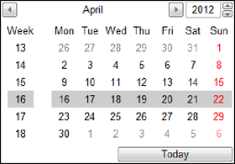
Figure 2-17.
The date picker selecting an entire week
Both the Start Date/Time and Current Time fields include a time control that allows the hour and minute to
be entered separately. You can also use the up/down arrows to increment the hour or minute portion depending
on which is currently in focus.
Phone
The feedback form includes a Phone field that uses the new
tel
input type. At the time of this writing, none of the
desktop browsers support this type. I included it in the exercise with the hope that by the time you read this you'll
have a browser that will support it. As with all non-supported types, the browser treats this as a standard textbox
control.
Range
The next control uses the new range input type. This allows you to slide the indicator across the extent of the
control, providing a relative value. This is similar to a fuel gauge in a car where the specific value is not as
important as the relative value such as ¾ full. I defined this with a width of 300 and height of 30 so the control was
generated to slide horizontally. If the height was greater than the width, the slider would move vertically, like a
thermometer.
There are some other attributes of the range control that you can manipulate in HTML that are not
supported in ASP.NET. You could still specify these in the
.aspx
page and they would be passed to the generated
HTML just like the placeholder attribute. However, I will show you another way to configure the range control
later in this chapter.
Color
The color control includes a small square that displays the selected color. If you click the dropdown icon, you can
select a color from the default pallet as shown in Figure
2-18
.