Database Reference
In-Depth Information
Tips for Hand-Drawn Prototypes
Following are some tips to keep you from spending too much time preparing hand-drawn screens.
Neatness doesn't count (much).
Paper prototypes should be just neat enough to be legible, but
no neater. It's fine to draw freehand instead of using a ruler. If someone else can read your writing,
it's good enough. Resist the temptation to redraw something just to "neaten it up." Chances are,
you'll want to change it as soon as you've tested it, so you might as well wait until you know what
problems you're trying to solve. Don't refine a design you haven't tested because much of that
effort will be wasted. See
Figure 7.2
for an example.
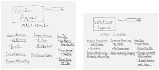
Figure 7.2:
Although messy, the version on the left is legible enough to get user feedback.
The extra time needed to create the neater version does not provide sufficient benefit to justify
the effort.
Monochrome is okay.
As the saying goes, "You can put lipstick on a pig, but it'll still be a pig."
Color can't save an inherently flawed design. In fact, it's a good strategy to design an interface in
monochrome first. Color and other visual refinements can be added later once you're sure your
design isn't a pig. But if you want to stick with black, that's fine too.
Even if you aren't adding color to the design until later, you can still have some fun with it
now. If you're the type who writes with a fine-point mechanical pencil (like I did during my
engineering days), getting a package of colorful art markers might help you to think more
creatively. Choose a color or two that suits your personality—users don't seem to mind when
one screen is drawn in blue marker and the next one is purple. But if you'd rather stick with
black, that's fine too.
Size (usually) doesn't matter.
If users will be writing data on the prototype, you need to make the
edit fields large enough to accommodate their writing. Drawing the prototype a bit larger than life
also helps observers watch the action. Other than that, size usually doesn't matter too much. It's
okay if the prototype is not drawn to scale; some screens can be relatively larger than others. As a
rule, the concept of "making it all fit" should be preceded by a good understanding of what "it"
consists of. If you're still determining functionality and content, you can probably postpone your
concerns about screen real estate until a bit later in the process, provided that you keep your
designs within reason. If you need to keep an eye on space constraints, you might want to use
graph paper or simply count characters and/or lines as a proxy for space.


Search WWH ::

Custom Search