Statistical graphs present data and the results of statistical analysis, assist in the analysis of data, and occasionally are used to facilitate statistical computation. Presentation graphs include the familiar bar graph, pie chart, line graph, scatterplot, and statistical map. Data analysis employs these graphical forms as well as others. Computational graphs (”nomographs”) sometimes display data but usually show theoretical quantities such as power curves for determining sample size. Computational graphs are convenient when statistical tables would be unwieldy, but computer programs are even more convenient, and so nomographs are used with decreasing frequency. This article emphasizes the role of graphs in data analysis, although many of the considerations raised here also apply to graphical presentation.
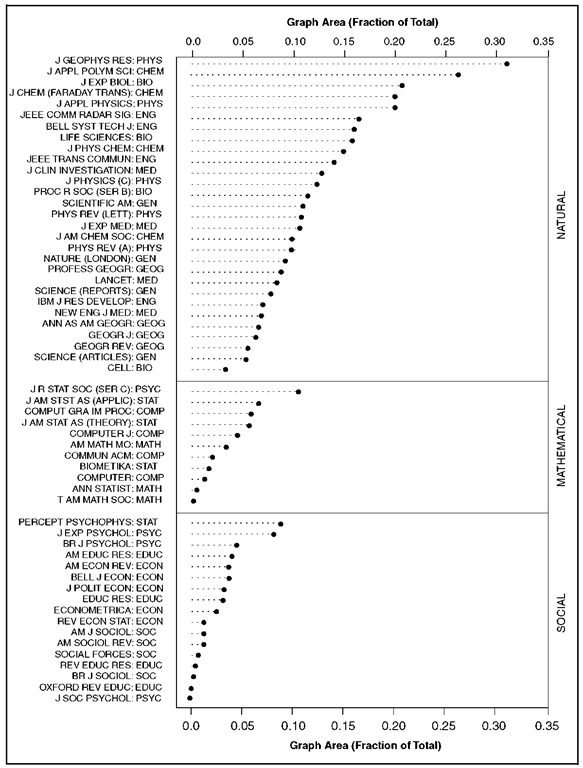
Although it generally is recognized that the pictorial representation of information is a particularly effective mode of communication, statistical graphs seldom appear in sociological publications. Figure 1, from Cleveland (1984), shows the relative space devoted to graphs in leading scientific publications, including four sociology journals. Sociology, of course, is not a wholly quantitative discipline. Nevertheless, even a cursory examination of publications in the field reveals that sociologists much more frequently report numerical information in tabular than in graphical form. Informal observation also suggests that sociologists usually analyze numerical data without the assistance of statistical graphs, a situation that may be changing.
Figure 1. Dot graph showing the fractional area devoted to graphs in fifty-seven journals in the natural, mathematical, and social sciences. Four sociology journals appear near the bottom of the graph. To construct the graph, fifty articles were sampled from each journal in 1980 and 1981.
HISTORY
Broadly construed, graphic communication dates to the cave paintings of human prehistory and to the earliest forms of writing, which were pictorial or semipictorial. The first diagrams to communicate quantitative information—about location and distance—were maps: Egyptian cartographers employed coordinate systems in maps prepared 5,000 years ago, and cartography remains a relatively well developed area of graphical representation. Musical notation, which charts pitch as a function of time, also has an ancient origin and illustrates the spatial display of essentially nonspatial information. Rectilinear coordinate graphs are so familiar that it is easy to lose sight of the radical abstraction required to represent diverse quantities, such as pitch, as distances along an axis.
In the seventeenth century, the French mathematician and philosopher Rene Descartes established the relationship between algebraic equations and curves in a rectilinear coordinate space. The graphical representation of functions is not logically necessary for the display of empirical data as points in space, and there are isolated examples before Descartes of statistical graphs that employ abstract coordinate systems. Nevertheless, Des-cartes’s analytic geometry no doubt provided the impetus for the development of statistical graphics, and the most common forms of statistical graphs evolved slowly over the subsequent three and a half centuries.
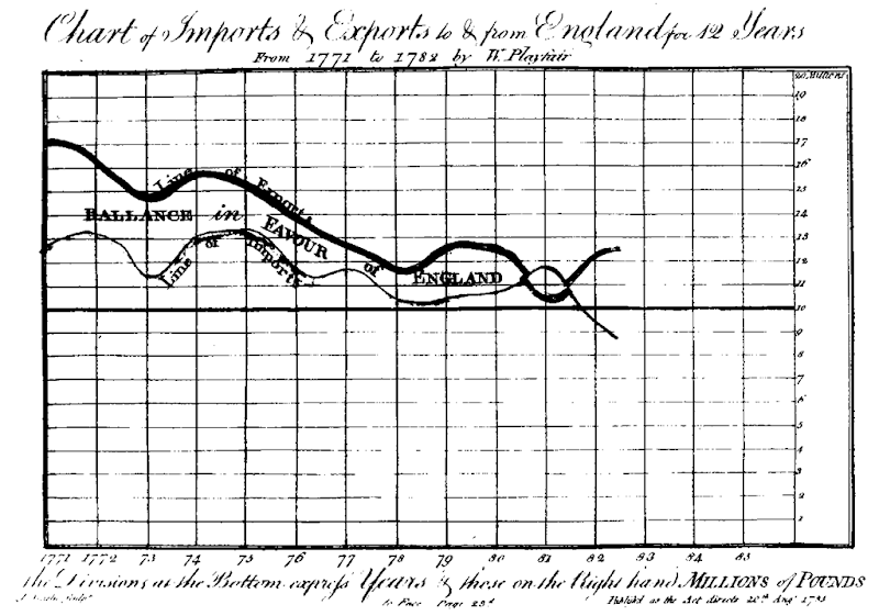
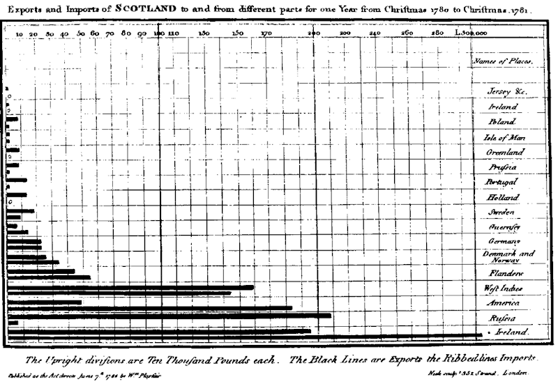
Among many individuals’ contributions to this evolution, the work of William Playfair at the turn of the nineteenth century is of particular importance. First, Playfair either invented or popularized several common graphical forms, including the line graph, the bar graph, the pie chart, and the circle chart (in which areas of circles represent quantities). Second, Playfair employed statistical graphs to display social and economic data. Figure 2a, from Playfair’s 1786 Commercial and Political Atlas, is a time series line graph of imports to and exports from England in the period 1771-1782. In the original graph, the space between the two curves is colored green when the balance of trade favors England (i.e., when the curve for exports is above that for imports) and red when the balance favors England’s trading partners. Of the forty-two graphs in Playfair’s atlas, all but one depict time series. The sole exception is a bar graph of imports to and exports from Scotland (Figure 2b), the data for which were available only for the year 17801781, precluding the construction of time series plots. Playfair’s 1801 Statistical Breviary included a wider variety of graphical forms.
The first half of the nineteenth century was a period of innovation in and dissemination of statistical graphics, particularly in England and France. The ogive (cumulative frequency curve), the histogram, the contour map, and graphs employing logarithmic and polar coordinates all appeared before 1850. Later in the century, the British scientist Sir Francis Galton exploited an analogy to contour maps in his determination of the bivari-ate-normal correlation surface, illustrating the role of graphs in discovery.
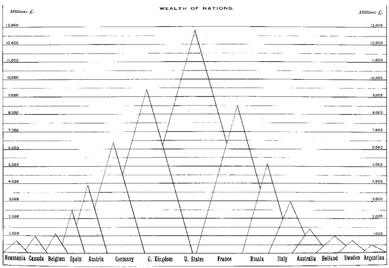
The nineteenth-century enthusiasm for graphic representation of data produced many memorable and high-quality statistical graphs, such as those of Playfair, Florence Nightingale, E. J. Marey, and CharlesJoseph Minard (several of which are reproduced in Tufte 1983). The same enthusiasm produced early abuses, however, including the graph from M. G. Mulhall’s 1892 Dictionary of Statistics shown in Figure 3: The heights of the triangles indicate the accumulated wealth of each country, but their areas are wildly disproportionate to the quantities represented, conveying a misleading impression of the data. Furthermore, the horizontal arrangement of the countries bears no relationship to the purpose of the graph and apparently was done for artistic effect: It would be more natural to order the countries by wealth. Many modern graphs have similar problems, a situation that has motivated a substantial literature of graphic criticism (such as the works by Schmidt, Tufte, and Wainer discussed below).
Figure 2a
The evolution of statistical graphics paralleled the general growth of statistical science well into the twentieth century. This relationship changed radically in the 1930s as statisticians such as R. A.
Fisher emphasized the development of procedures for statistical inference. Fisher’s influential Statistical Methods for Research Workers, first published in 1925, includes a brief topic on ”diagrams”; this topic incorporates line graphs, scatterplots, and a histogram with a superimposed normal-density curve.Fisher’s 1935 The Design of Experiments includes just three graphs, all of which are theoretical.
The rebirth of interest in statistical graphics may be traced to John W. Tukey’s work on exploratory data analysis, beginning in the 1960s and culminating in the publication of his text on this subject in 1977. Tukey’s coworkers and students, most importantly the group at Bell Laboratories and its successors associated with William S. Cleveland, continue to contribute to the modern development of statistical graphics (see, in particular, Chambers et al. 1983; Cleveland 1993, 1994). Further information on the history of statistical graphics can be found in Funkhouser (1937), Tufte (1983), and Beninger and Robyn (1978), the last of which contains a useful chronology and bibliography.
Figure 2b. Two graphs from Playfair’s 1786 Commercial and Political Atlas: (a) A time series line graph showing imports to and exports from England, 1771-1782. (b) A bar graph showing imports to and exports from Scotland for the year 1780-1781. The originals are in color.
GRAPHIC STANDARDS
After several abortive efforts, the International Statistical Congresses held in Europe in the nineteenth century abandoned the attempt to formulate graphical standards. Since that time, many authors have proposed standards and principles for the construction of statistical graphs, but consensus on these matters remains elusive. Schmidt (1983, p. 17), for example, suggests that grid lines should always appear on rectilinear line graphs, while Tufte (1983, p. 112) maintains that grids ”should usually be muted or completely suppressed,” an instance of his more general principle that good graphs maximize the ”dataink ratio” (the amount of ink devoted to the display of data as a proportion of all the ink used to draw the graph) and eliminate ”chartjunk” (extraneous graphical elements).
Disagreements such as this are due partly to the lack of systematic data on graphical perception (a situation that is improving), partly to differences in style and taste, and partly to the absence of adequate general theories of graph construction and perception (although there have been attempts, such as Bertin 1973). Also, good graphical display depends on the purposes for which a graph is drawn and on particular characteristics of the data, factors that are difficult to specify in advance and in a general manner.
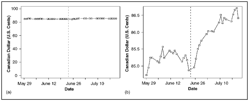
Huff (1954, chap. 5), for example, argues that scales displaying ratio quantities should always start at zero to avoid exaggerating the magnitude of differences between data values. This principle, however, often disguises patterns in data that are revealed clearly by graphical magnification. Consider Figure 4, a and b, which shows the relative value of the Canadian and U.S. dollars in the eight weeks surrounding the June 23, 1990, deadline for the ratification of the ill-fated ”Meech Lake” amendment to the Canadian constitution. This period was widely interpreted, both domestically and abroad, as one of constitutional crisis and uncertainty for Canada. Because in the short term the Canadian dollar traditionally trades in a narrow range against the U.S. dollar, Figure 4a is essentially uninformative, while Figure 4b reveals that the Canadian dollar fell slightly as the Meech deadline approached and rose afterward.
Figure 3. A modified bar graph from Mulhall’s 1892 Dictionary of Statistics, substituting triangles with unequal bases for equal-width rectangular bars. The height of each triangle represents accumulated national wealth in 1888. The original is in color.
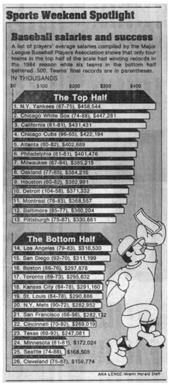
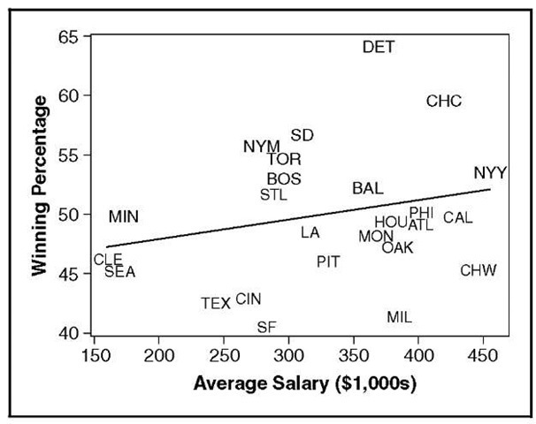
Despite some areas of disagreement, commentators on the design of statistical graphs, such as Tufte (1983, 1990, 1997), Schmidt, and Wainer, offer a great deal of uncontroversially sound advice. In a tongue-in-cheek essay (reprinted in Wainer 1997: chap. 1), Wainer enumerates twelve rules to help the reader ”display data badly.” Several of these rules are illustrated in Figure 5 a, which appeared in the Miami Herald in 1984: ”Rule 7, Emphasize the trivial (ignore the important)”; ”Rule 11, More is murkier: (a) more decimal places and (b) more dimensions”; and ”Rule 12, If it has been done well in the past, think of a new way to do it.” The graph in Figure 5a is meant to show the presumably negative relationship between the success of the twenty-six major league baseball teams in the 1984 season and the average salaries paid to the players on those teams. The lengths of the bars represent average players’ salaries, while the teams’ records of wins and losses are hidden in parentheses within the bars, making it essentially impossible to tell whether the two variables are related—os-tensibly the point of the graph. The bars are drawn in three-dimensional perspective, apparently for artistic effect, but the result is that the quantities represented are slightly distorted: For example, the average salary of the New York Yankees, $458,544, appears to be about $410,000. A standard representation of these data appears in the scatterplot in Figure 5b, revealing a slight positive relationship between salary and success.
Figure 4. The relative value of the Canadian and U.S. dollar in an eight-week period in 1990 surrounding the failure of the Meech Lake amendment to the Canadian constitution. (a) Beginning the vertical axis at zero. Note that the upper end point of one is arbitrary, since the Canadian dollar can (at least in theory) trade above par with the U.S. dollar. (b) Scaling the vertical axis to accommodate the range of the data. The vertical line in each graph is drawn at the June 23 deadline for ratifying the Meech Lake accord.
RESEARCH ON GRAPHIC PERCEPTION
The earliest psychophysical research on perception of graphs, conducted in the 1920s, focused on the relative merits of pie charts and bar charts for displaying percentage data and was inconclusive. More recently, statisticians and psychologists have undertaken systematic experimentation on graphical perception. Spence and Lewandowsky (1990) review the literature in this area up to 1990.
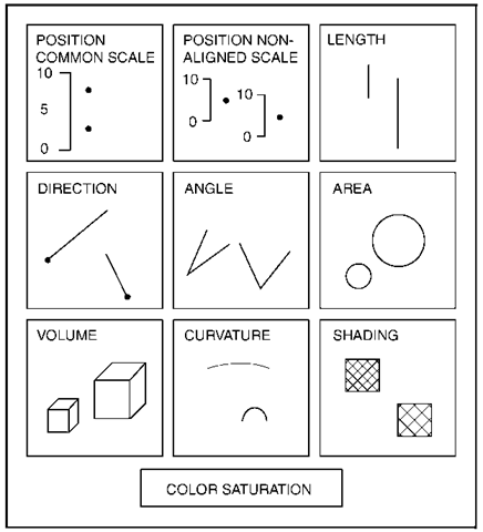
Cleveland and McGill (1984), for example, conducted a series of experiments to ascertain the relative accuracy of ten elementary perceptual tasks that extract quantitative information from graphs, as represented schematically in Figure 6. Ranked in order of decreasing average accuracy, these tasks involve judgment of position along a common scale; position along nonaligned scales; length, direction, or angle; area; volume or curvature; and shading or color saturation. Similarly, Spence (reported in Spence and Lewandowsky 1990) has shown in an experiment that categorical information differentiating points on a scatterplot is encoded most effectively by colors and least effectively by confusable letters (e.g., E, F, H); other coding devices, such as different shapes (circles, squares, triangles), degrees of fill, and discriminable letters (H, Q, X), were intermediate in effectiveness.
Cleveland (1993) demonstrates that slope judgments are most accurate for angles close to forty-five degrees and least accurate for angles near zero or ninety degrees. Cleveland therefore suggests that the aspect ratio of graphs (the relative lengths of the axes) be set so that average slopes are close to forty-five degrees, a procedure he terms ”banking to forty-five degrees.” This process is illustrated in Figure 7. Both graphs in this figure plot the same data, but the periodic pattern of the data is nearly impossible to discern in Figure 7a because the average slope of the curve is too steep.
Figure 5a
Cleveland and his colleagues have designed new graphical forms that apply these and similar findings by encoding important information through the employment of accurately judged graphic elements. One such form is the dot graph, an example of which appears in Figure 1. Similarly, Cleveland and McGill (1984) suggest the replacement of quantitative statistical maps that use shading or hue (e.g., Figure 8a) with maps that employ framed rectangles (Figure 8b), which exploit the more accurate judgment of position along nonaligned scales. Despite the inferiority of Figure 8a for judging differences in murder rates among the states, however, this map more clearly reveals regional variations in rates, illustrating the principle that the purpose for which a graph is drawn should influence its design.
Figure 5b. Major League Baseball salaries and team success in the 1984 season. (a) As depicted in the Miami Herald. The lengths of the bars (slightly distorted) represent the average salaries paid to players from each team; the teams’ won-lost records appear in parentheses within the bars. The apparent point of the graph is that there is a negative relationship between salaries and success. (b) The same data in standard scatterplot. The line on the plot, derived from a logistic regression of wins on average salaries, indicates a weak positive relationship between salaries and success.
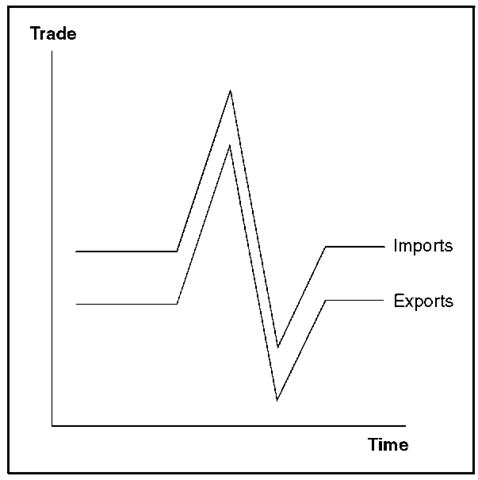
The effectiveness of statistical graphs is rooted in the remarkable ability of people to apprehend, process, and remember pictorial information. The human visual system, however, is subject to distortion and illusion, processes that can affect the perception of graphs. Good graphical design can minimize and counteract the limitations of human vision. In Figure 9, for example, it appears that the difference between the hypothetical import and export series is changing when this difference actually is constant (cf., Playfair’s time series graph in Figure 2 a). The source of the illusion is the tendency to attend to the least distance between the two curves rather than to the vertical distance. Thus, an alternative is to graph the difference between the two curves—the balance of trade— directly (cf. Figure 12, b and c, below), exploiting the relatively accurate judgment of position along a common scale, or to show vertical lines between the import and export curves, employing the somewhat less accurate judgment of position along nonaligned scales.
Figure 6. Ten elementary perceptual tasks for decoding quantitative information from statistical graphs.
GRAPHS IN DATA ANALYSIS
Statistical graphs should play a central role in the analysis of data, a common prescription that is most often honored in the breach. Graphs, unlike numerical summaries of data, facilitate the perception of general patterns and often reveal unusual, anomalous, or unexpected features of the data—characteristics that might compromise a numerical summary.
Figure 7. Two scatterplots of the same data. Five hundred X-values were randomly generated in the interval [0,25n], and Y=sin X. The periodic pattern of the data is clear in (b), where the aspect ratio of the plot is adjusted so that the average slope of the curve is not too steep, but not in panel (a).
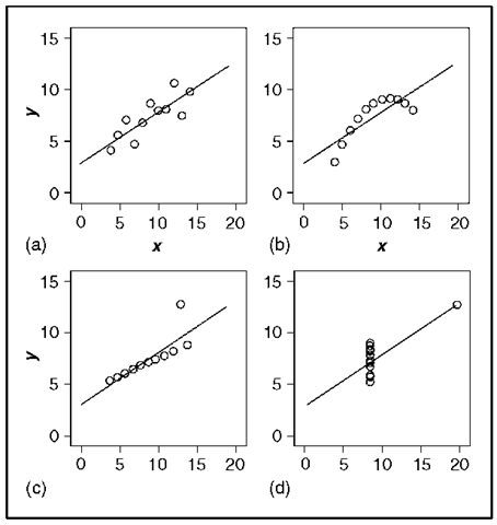
The four simple data sets in Figure 10, from Anscombe (1973) and dubbed ”Anscombe’s quartet” by Tufte (1983), illustrate this point well. All four data sets yield the same linear least-squares outputs when regression lines are fitted to the data, including the regression intercept and slope, coefficient standard errors, the standard error of the regression (i.e., the standard deviation of the residuals), and the correlation, but—significantly—not residuals. Although the data are contrived, the four graphs tell very different imaginary stories: The least-squares regression line accurately summarizes the tendency of y to increase with x in Figure 10a. In contrast, the data in Figure 10b clearly indicate a curvilinear relationship between y and x, a relationship the linear regression does not capture. In Figure 10c, one point is out of line with the rest and distorts the regression. Perhaps the outlying point represents an error in recording the data or a y-value that is influenced by factors other than x. In Figure 10d, the ability to fit a line and the line’s specific location depend on the presence of a single point.
Figure 8. Statistical maps of state murder rates in 1978 employing (a) shading and (b) framed rectangles.
Figure 9. Despite appearances, the vertical separation between the curves for imports and exports is constant. The ”data” are contrived.
Diverse graphical forms are adapted to different purposes in data analysis. Many important applications appear in the figures below, roughly in order of increasing complexity, including graphs for displaying univariate distributions, bivariate relationships, diagnostic quantities in regression analysis, and multivariate data.
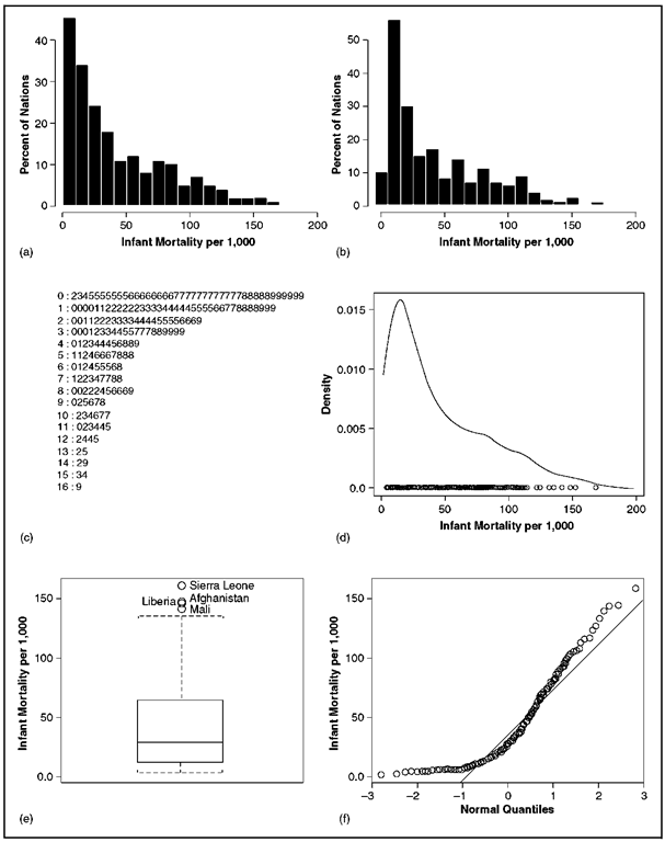
Particularly useful for graphically screening data are methods for displaying the distributions of quantitative variables. Several univariate displays of the distribution of infant mortality rates for 201 countries are shown in Figure 11, using data compiled by the United Nations.
Figure 11a is a traditional histogram of the infant mortality data, a frequency bar graph formed by dissecting the range of infant mortality into class intervals or ”bins” and then counting the number of observations in each bin; the vertical axis of the histogram is scaled in percent. Figure 11b shows an alternative histogram that differs from Figure 11a only in the origin of the bin system (the bars are shifted five units to the left). These graphs demonstrate that the impression conveyed by a histogram depends partly on the arbitrary location of the bins. Figure 11c is a stem-and-leaf display, a type of histogram (from Tukey) that records the data values directly in the bars of the graph, thus permitting the recovery of the original data. Here, for example, the values given as 1:2 represent infant mortality rates of 12 per 1,000.
Figure 10. The four data sets have the same linear least-squares regression, including the regression coefficients, their standard errors, the correlation between the variables, and the standard error of the regression.
Figure 11d is a kernel density estimate, or smoothed histogram, a display that corrects both the roughness of the traditional histogram and its dependence on the arbitrary choice of bin location. For any value x of infant mortality, the height of the kernel estimate is
where n is the number of observations (here, 201); the observations themselves are %1, %2, . . ,%n, h is the ”window” half-width for the kernel estimate, analogous to bin width for a histogram; and K is some probability-density function, such as the unit-normal density, ensuring that the total area under the kernel estimate is one. A univariate scatterplot — another form of distributional display giving the location of each observation — is shown at the bottom of Figure 11d.
Figure 11. Six univariate displays of the distribution of infant mortality rates in 201 nations. The histograms (a) and (b) both have bins of width ten, but the bars of (b) are five units to the left of those of (a). A stem-and-leaf display is shown in (c), a kernel density estimate in (d), a boxplot in (e), and a normal quantile comparision plot in (f).
Figure 11e, a ”boxplot” of the infant mortality data (a graphic form also from Tukey), summarizes a variety of important distributional information. The box is drawn between the first and third quartiles and therefore encloses the central half of the data. A line within the box marks the position of the median. The whiskers extend either to the most extreme data value (as on the bottom) or to the most extreme nonoutlying data value (as on the top). Four outlying data values are represented individually. The compactness of the boxplot suggests its use as a component of more complex displays; boxplots may be drawn in the margins of a scatterplot to show the distribution of each variable, for example.
Figure 11f shows a normal quantile comparison plot for the infant mortality data. As the name implies, this graph compares the ordered data with corresponding quantiles of the unit-normal distribution. By convention, the ith largest infant mortality rate, denoted %w, has P\ = (i – 1/2)/n proportion of the data below it. The corresponding normal quantile is z, located so that Pr (Z < z.) = P, where Z follows the unit-normal distribution. If X is normally distributed with mean | and standard deviation o, then within the bounds of sampling error, xw > | + oz.. Departure from a linear pattern therefore indicates nonnormality. The line shown in Figure 11f passes through the quartiles of X and Z. The positive skew of the infant mortality rates is reflected in the tendency of the plotted points to lie above the fitted line in both tails of the distribution.
While the skewness of the infant mortality data is apparent in all the displays, the possibly multimodal grouping of the data is clearest in the kernel density estimate. The normal quantile comparison plot, in contrast, retains the greatest resolution in the tails of the distribution, where data are sparse; these are the regions that often are problematic for numerical summaries of data such as means and regression surfaces.
Many useful graphs display relationships between variables, including several forms that appeared earlier in this article: bar graphs (Figure 2b), dot graphs (Figure 1), and line graphs such as time series plots (Figures 2a and 4). Parallel boxplots are often informative in comparing the distribution of a quantitative variable across several categories. Scatterplots (as in Figure 10) are invaluable for examining the relationship between two quantitative variables. Other data-analytic graphs adapt these forms.
In graphing quantitative data, it is sometimes advantageous to transform variables. Logarithms, the most common form of transformation, often clarify data that extend over two or more orders of magnitude (i.e., a factor of 100 or more) and are natural for problems in which ratios of data values, rather than their differences, are of central interest.
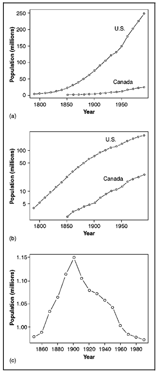
Consider Figure 12, which shows the size of the Canadian and U.S. populations for census years between 1790 and 1990 in the United States and between 1851 and 1991 in Canada. The data are graphed on the original scale in Figure 12a and on the log scale in Figure 12b. Because the Canadian population is much smaller than that of the United States, it is difficult to discern the Canadian data in Figure 12a. Moreover, Figure 12b shows more clearly departures from a constant rate of population growth, represented by linear increase on the log scale, and permits a direct comparison of the growth rates in the two countries. These rates were quite similar, with the U.S. population roughly ten times as large as the Canadian population throughout the past century and a half. Figure 10c, however, which graphs the difference between the two curves in Figure 10b (i.e., the log population ratio), reveals that the United States was growing more rapidly than Canada was before 1900 and more slowly afterward.
Graphs also can assist in statistical modeling. Least-squares regression analysis, for example, which fits the model
makes strong assumptions about the structure of the data, including assumptions of linearity, equal error variance, normality of errors, and independence. Here Y is the dependent variable score for the ith of n observations; Xi, Xr2». . . >%u, are independent variables; e;, is an unobserved error that is assumed to be normally distributed with zero expectation and constant variance a2, independent of the x’s and the other errors; and the B’s are regression parameters, which are to be estimated along with the error variance from the data.
Figure 12. Canadian and U.S. population figures are plotted directly in (a) and on a log scale in (b). The difference between the two log series is shown in (c).
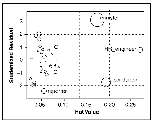
Graphs of quantities derived from the fitted regression model often prove crucial in determining the adequacy of the model. Figure 13, for example, plots a measure of leverage in the regression (the ”hat values” h) against a measure of discrepancy (the ”studentized residuals” t). Leverage represents the degree to which individual observations can affect the fitted regression, while discrepancy represents the degree to which each observation departs from the pattern suggested by the rest of the data. Actual influence on the estimated regression coefficients is a product of leverage and discrepancy and is displayed on the graph by Cook’s Di, represented by the areas of the plotted circles. The data for this graph are drawn from Duncan’s (1961) regression of the rated prestige of forty-five occupations on the educational and income levels of the occupations. The plot suggests that two of the data points (the occupations ”minister” and ”conductor”) may unduly affect the fitted regression.
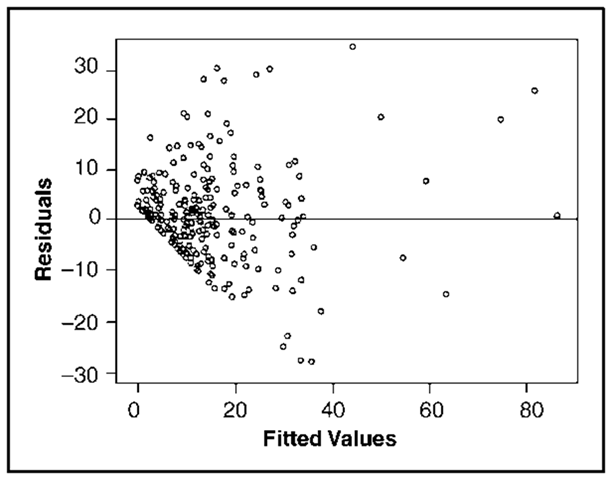
Figure 14 is a scatterplot of residuals against fitted F-values,
where the b’s are sample estimates of the corresponding B’s. If the error variance is constant as assumed, the variation of the residuals should not change systematically with the fitted values. The data for Figure 14 are drawn from work by Ornstein (1976) relating the number of interlocking directorate and executive positions maintained by 248 dominant Canadian corporations to characteristics of the firms. The plot reveals that the variation of the residuals appears to increase with the level of the fitted values, casting doubt on the assumption of constant error variance.
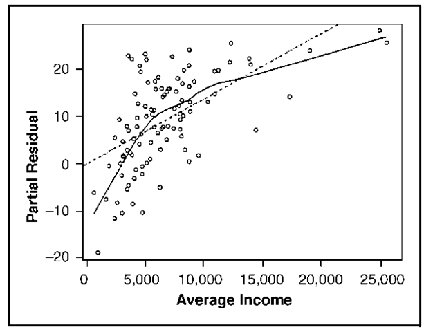
Figure 15 shows a partial residual (also called a component plus residual) plot for the relationship between occupational prestige and income, a diagnostic useful for detecting nonlinearity in regression. The plot is for a regression of the rated prestige of 102 Canadian occupations on the gender composition, income level, and educational level of the occupations (see Fox and Suschnigg 1989). The partial residuals are formed as eXi = b1%1i + e,, where b1 is the fitted income coefficient in the linear regression, X1i is the average income of incumbents of occupation i, and ei is the regression residual. The nonlinear pattern of the data, which is apparent in the graph, suggests modification of the regression model. Similar displays are available for generalized linear models such as logistic regression. Further information on the role of graphics in regression diagnostics can be found in Atkinson (1985), Fox (1991, 1997), and Cook and Weisberg (1994).
Figure 13. Influence plot for Duncan’s regression of the rated prestige of forty-five occupations on their income and educational levels. The hat values measure the leverage of the observations in the regression, while the studentized residuals measure their discrepancy. The plotted circles have area proportional to Cook’s D, a summary measure of influence on the regression coefficients. Horizontal lines are drawn at plus and minus 2; in well-behaved data, only about 5 percent of studentized residuals should be outside these lines. Vertical lines are drawn at two and three times the average hat value; hat values greater than two or three times the average are noteworthy. Observations that have relatively large residuals or leverages are identified on the plot.
Scatterplots are sometimes difficult to interpret because of visual noise, uneven distribution of the data, or discreteness of the data values. Visually ambiguous plots often can be enhanced by smoothing the relationship between the variables, as in Figure 15. The curve drawn through this plot was determined by a procedure from Cleveland (1994) called locally weighted scatterplot smoothing (”lowess”). Lowess (also called ”loess,” for local regression) fits n robust regression lines to the data, with the ith such line emphasizing observations whose %-values are closest to x,. The lowess fitted value for the ith observation, y,, comes from the ith such regression. Here x and y simply denote the horizontal and vertical variables in the plot. The curve plotted on Figure 15 connects the points (xi,yi). Lowess is one of many methods of nonparametric regression analysis, including methods for multiple regression, described, for example, in Hastie and Tibshirani (1990) and Fox (forthcoming a and b). Because there is no explicit equation for a nonparametric regression, the results are most naturally displayed graphically.
Figure 14. Plot of residuals by fiitted values for Ornstein’s regression on interlocks maintained by 248 dominant Canadian corporations on the characteristics of the firms. The manner in which the points line up diagonally at the lower left of the graph is due to the lower limit of zero for the dependent variable.
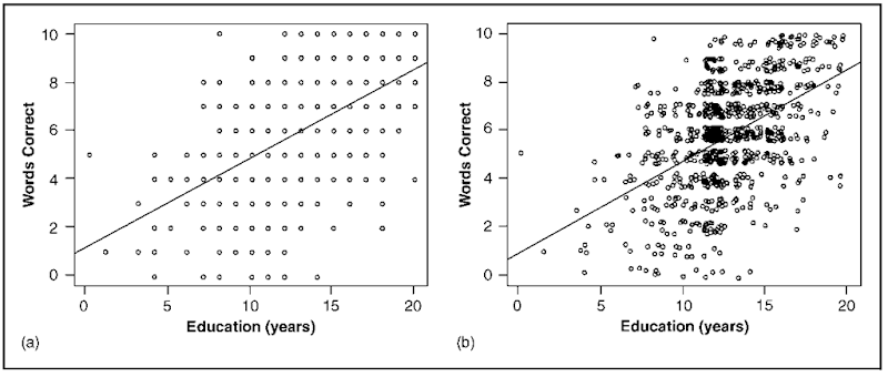
Scatterplots for discrete data may be enhanced by paradoxically adding a small amount of random noise to the data to separate the points in the plot. Cleveland (1994) calls this process ”jittering.” An example is shown in Figure 16a, which plots scores on a vocabulary test against years of education; the corresponding jittered plot (Figure 16b) reduces the overplotting of points, making the relationship much clearer and revealing other characteristics of the data, such as the concentration of points at twelve years of education.
Figure 15. Partial residual (component+residual) plot for income in the regression of occupational prestige on the gender composition and income and education levels of 102 Canadian occupations in 1971. The broken line gives the linear least-squares fit, while the solid line shows the lowess (nonparametric regression) fit to the data.
Because graphs commonly are drawn on two-dimensional media such as paper and computer screens, the display of multivariate data is intrinsically more difficult than that of univariate or bi-variate data. One solution to the problems posed by multivariate graphic representation is to record additional information on a two-dimensional plot. Symbols such as letters, shapes, degrees of fill, and color may be used to encode categorical information on a scatterplot, for example (see Figure 19, below). Similarly, there are many schemes for representing additional quantitative information, as shown in Figures 8 and 13.
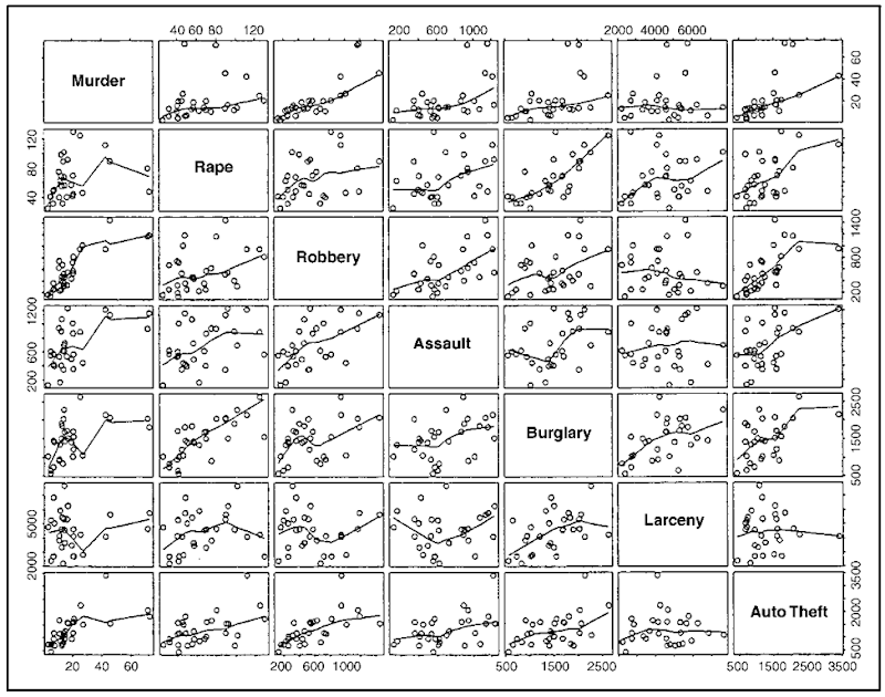
A scatterplot matrix is the direct graphic analogue of a correlation matrix, displaying the bivari-ate relationship between each pair of a set of quantitative variables and thus providing a quick overview of the data. In contrast to a correlation matrix, however, a scatterplot matrix can reveal nonlinear relationships, outlying data, and so on. The scatterpiot matrix in Figure 17 is for rates of seven different categories of crime in the thirty largest U.S. cities (excluding Chicago) in 1996.
The regression curve shown in each scatterplot was determined by the lowess procedure described above.
A limitation of the scatterplot matrix is that it displays only the marginal relationships between the variables, while conditional (or partial) relationships are more often the focus of multivariate statistical analysis. This limitation sometimes can be overcome, however, by highlighting individual observations or groups of observations and following them across the several plots (see the discussion of ”brushing” in Cleveland 1994). These methods are most effective when they are implemented as part of an interactive computer system for graphic data analysis.
One approach to displaying conditional relationships is to focus on the relationship between the dependent variable and each independent variable fixing the other independent variable (or variables) to particular, possibly overlapping ranges of values. A nonparametric regression smooth then can be fitted to each partial scatterplot. Cleveland (1993) calls this kind of display a ”conditioning plot” or ”coplot.” The strategy breaks down, however, when there are more than two or three independent variables, or when the number of observations is small.
Many of the most useful graphical techniques for multivariate data rely on two-dimensional projections of the multivariate scatterplot of the data. A statistical model fitted to the data often determines these projections. An example of a display employing projection of higher-dimensional data is the partial residual plot shown in Figure 15. Another common application of this principle is the similarly named but distinct partial regression (or added-variable) plot. Here the dependent variable (F) and one independent variable in the multiple regression model (say, x1) are each regressed on the other independent variables in the model (i.e., x2, … , Xk), producing two sets of residuals (which may be denoted y(1) and X(1)). A scatterplot of the residuals (that is, yw versus X(1)) is frequently useful in revealing high-leverage and influential observations. Implementation on modern desktop computers, which can exploit color, shading, perspective, motion, and interactivity, permits the effective extension of projections to three dimensions (see Monette 1990; Cook and Weisberg 1994; Cook 1998).
Figure 16. Randomly “jittering” a scatterplot to clarify discrete data. The original plot in (a) shows the relationship between score on a ten-item vocabulary test and years of education. The same data are graphed in (b) with a small random quantity added the each horizontal and vertical coordinate. Both graphs show the least-squares regression line.
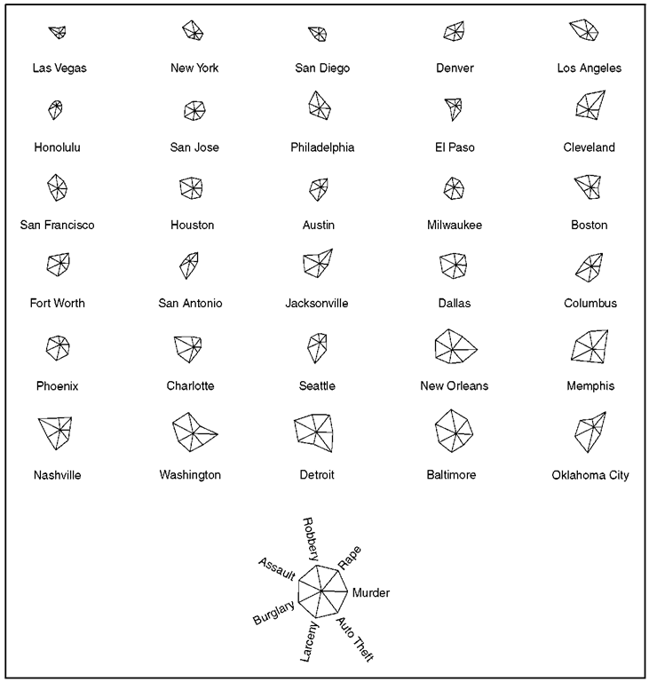
When there are relatively few observations and each is of separate interest, it is possible to display multivariate data by constructing parallel geometric figures for the individual observations. Some feature of the figure encodes the value of each variable. One such display, called a ”star plot,” is shown in Figure 18 for the U.S. cities crime rate data. The cities are arranged in order of increasing general crime rate.
Other common and essentially similar schemes include ”trees” (the branches of which represent the variables), faces (whose features encode the variables), and small bar graphs (in which each bar displays a variable). None of these graphs is particularly easy to read, but judicious ordering of observations and encoding of variables sometimes can suggest natural clusterings of the data or similarities between observations. Note in Figure 18, for example, that Oklahoma City and Jacksonville have roughly similar ”patterns” of crime, even though the rates for Oklahoma City are generally higher. If similarities among the observations are of central interest, however, it may be better to address the issue directly by means of clustering or ordination (also called multidimensional scaling); see, e.g., Hartigan (1975), and Kruskal and Wish (1978).
THE PRESENT AND FUTURE OF STATISTICAL GRAPHICS
Computers have revolutionized the practice of statistical graphics much as they earlier revolutionized numerical statistics. Computers relieve the data analyst of the tedium of drawing graphs by hand and make possible displays—such as lowess scatterplot smoothing, kernel density estimation, and dynamic graphs—that previously were impractical or impossible. All the graphs in this article, with the exception of several from other sources, were prepared with widely available statistical software (most with S-Plus, the graphical and other capabilities of which are ably described by Venables and Ripley 1997). Virtually all general statistical computer packages provide facilities for drawing standard statistical graphs, and many provide specialized forms as well.
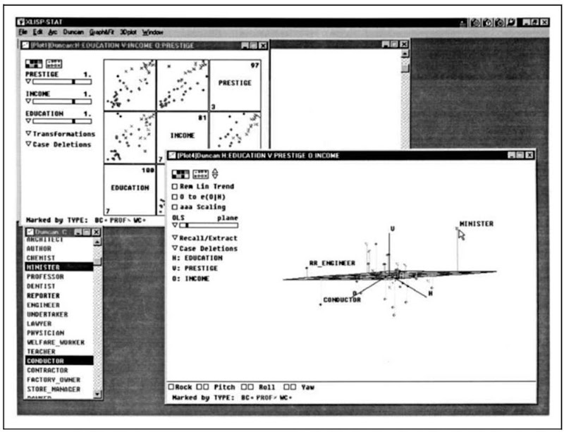
Dynamic and interactive statistical graphics, only a decade ago the province of high-performance graphics workstations and specialized software, are now available on inexpensive desktop computers. Figure 19 illustrates the application of Cook and Weisberg’s (1999) state-of-the-art Arc package to Duncan’s occupational prestige data.
Figure 17. Scatterplot matrix for the rates of seven categories of crime in the thirty largest U.S. cities in 1996 (Chicago is omitted because of missing data). The rate labeled “Murder” represents both murder and manslaughter. The line shown in each panel is a lowess scatterplot smooth.
Arc, programmed in Tierney’s (1990) Lisp-Stat statistical computing environment, is freely available software that runs on Windows computers,
Macintoshes, and Unix workstations. Standard statistical packages such as SAS and SPSS are gradually acquiring these capabilities as well.
The other edge of the computing sword cuts in the direction of ugly, poorly constructed graphs that obfuscate rather than clarify data: Modern software facilitates the production of competent (if not beautiful) statistical graphs. Nevertheless, a data analyst armed with a ”presentation graphics” package can, with little effort or thought and less taste, produce elaborate, difficult to read, and misleading graphs.
Figure 18. Star plot of rates of seven categories of crime in the thirty largest U.S. cities (Chicago is omitted because of missing data). The plot employs polar coordinates to represent each observation: Angles (the “points” of the star) encode variables, while distance from the origin (the center of the star) encodes the value of each variable. The crime rates were scaled (by range) before the graph was constructed. A key to the points of the star is shown at the bottom of the graph: ”Murder” represents both murder and manslaughter.
Figure 19. Modern statistical computer graphics: Cook and Weisberg’s Arc. The window in the foreground contains a rotating three-dimensional scatterplot of Duncan’s occupational prestige data. The points in the plot are marked by type of occupation; a regression plane and residuals to the plane also are shown. Several occupations have been identified with a mouse. (The mouse cursor currently points at the occupation “minister.”) To the left and bottom of the window, a variety of controls for manipulating the plot appear. The small window at the bottom left of the screen contains the names of the observations; note that this window is linked to the three-dimensional scatterplot. At the upper left, partly hidden, is a window containing a scatterplot matrix of the data, which also is linked to the other windows. Plot controls for this graph include power-transformation sidebars at the left of the window.
![Two scatterplots of the same data. Five hundred X-values were randomly generated in the interval [0,25n], and Y=sin X. The periodic pattern of the data is clear in (b), where the aspect ratio of the plot is adjusted so that the average slope of the curve is not too steep, but not in panel (a). Two scatterplots of the same data. Five hundred X-values were randomly generated in the interval [0,25n], and Y=sin X. The periodic pattern of the data is clear in (b), where the aspect ratio of the plot is adjusted so that the average slope of the curve is not too steep, but not in panel (a).](http://lh3.ggpht.com/_LenCZlyza20/TR8yWCm3EBI/AAAAAAAAJR0/mKaEhR6eUo4/tmp14815_thumb1_thumb1.png?imgmax=800)

