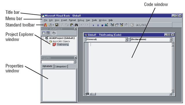
The Visual Basic Editor is the integrated environment in which you develop all your VBA code. As you can see from Figure 1.1, the IDE has its own graphical user interface. Its windows provide all the tools required for creating, editing, debugging, and running your macros and applications. With this much functionality, the IDE is almost a standalone application, except that it can only be opened from the AutoCAD window and does not remain open after AutoCAD has been closed.
The term VBA Editor is often used synonymously with the IDE even though the IDE provides more than just editing features.
The VBA IDE can be opened from the AutoCAD window in a variety of ways:
• Type vbaide next to the command prompt in the command line.
• Choose Tools ^ Macro ^ Visual Basic Editor.
• Use the key-combination (shortcut) Alt+F11.
In the examples throughout this topic, I’ve used menu commands in instructions. Most commands can also be accessed through a toolbar button or a key-combination, so occasionally I give an alternative access method as a reminder that there are other ways to invoke commands. The access method you use is up to your personal preference.
Figure 1.1 AutoCAD’s VBA environment
Creating UserForm Modules
A module is just a container for VBA code, and a UserForm module is a window (or dialog box) that can be considered a powerful extension to the AutoCAD GUI. You decide what controls to place on your UserForm in order to perform the tasks required by your application. You can place labels and text boxes in which users can enter the information that your program needs in order to run. You can use option buttons and check boxes to give users the chance to select the items they require. In fact, just about any control you’ve seen in the applications running under Windows is available for use in the VBA IDE.
Adding a UserForm Module to Your Application
To add a UserForm module to your application:
1. Start AutoCAD and choose Tools ^ Macro ^ Visual Basic Editor. The VBA IDE opens.
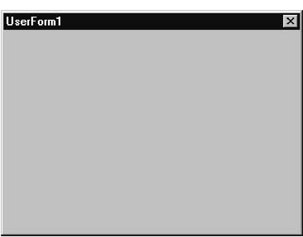
2. Choose Insert ^ UserForm. UserForm1 appears, containing a title bar with a Close button, as shown in Figure 1.2.
Figure 1.2 A brand-new UserForm
A UserForm is the only module that can be viewed from the IDE in two different ways:
• Graphically, by choosing View ^ Object to open up the UserForm window (see Figure 1.2).
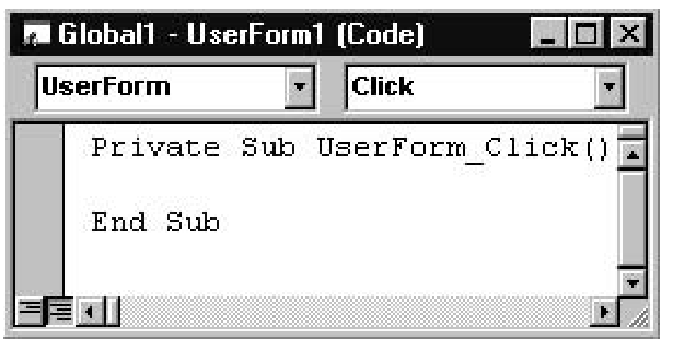
• With code, by choosing View ^ Code to open up the Code window as shown here:
Opening the Code window displays the event procedure that will run if the UserForm is clicked. There are many events to choose from, but double-clicking any control automatically displays the primary event that you’ll most likely want to respond to. You’ll see how to access the other events later in this topic, in the section “Coding Event Procedures.”
Puttering Around in the Toolbox
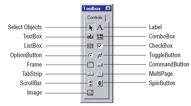
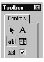
VBA provides a set of common controls in a Toolbox window (see Figure 1.3). You can simply drag and drop individual controls onto a UserForm to develop GUI features for your application.
Figure 1.3 Controls in the standard Toolbox
If the Toolbox isn’t on display, select the Toolbox command from the View menu or click the Toolbox icon (shown in the margin) at the end of the Standard toolbar. Both of these actions will be available for selection only when a UserForm has been added to a project and it is being viewed in its graphical form rather than as a Code window. To view a UserForm graphically, simply choose View ^ Object.
These controls are all available for you to drag and drop onto your UserForm, making AutoCAD VBA a powerful visual programming system that’s extremely efficient at quickly developing the GUI for a project—you can virtually design your whole GUI using only the mouse!
You will recognize most of the controls in the Toolbox because you have already experienced using them in other applications. Following are brief descriptions of what each control does:
Select Objects The Select Objects control is used to resize and move a control after it has been drawn on a UserForm. If you’ve double-clicked another control to insert multiple instances of it on the UserForm without returning to the Toolbox, you can click the Select Objects control to stop.
Label The Label control displays text that you’ve assigned to its Caption property at design time or in code. A Label control is often used to display information or indicate to a user what data should be entered into a TextBox control. The text displayed by the Label control is strictly read-only and cannot be changed by the user during run time.
TextBox The TextBox control allows users to input textual information during run time. It is common practice to assign the empty string (11) to this control’s Text property to initialize it or to clear out any data that’s no longer required.
ComboBox The ComboBox control combines the functionality of the TextBox control with that of the ListBox control to provide the user with the option of entering text into the TextBox, or clicking the down-arrow button and selecting an item from a drop-down list. When an item is selected from the list, it is automatically displayed in the text box at the top of the ComboBox. You can set the Style property of this control in order to restrict the user to selecting an item from the ListBox. This eliminates the need to test whether the user has entered a valid value.
ListBox The ListBox control enables the user to select one or more items from a list. If there are too many items to be displayed at once, a scroll bar will automatically appear. Even so, this control generally takes up more space than a ComboBox control, which needs only the same amount of space on the UserForm as a TextBox control.
CheckBox The CheckBox control enables the user to “check” (select) zero or more boxes from a group of CheckBoxes. This control is often used to indicate whether items are true or false, or to answer yes or no to questions. CheckBoxes are similar in function to OptionButtons, except that they allow more than one item to be selected at the same time.
OptionButton OptionButton controls are used in groups of options to allow selection of one option from the group. When only one group of OptionButtons is required, it can be placed directly onto the UserForm. When there is more than one group, Frame controls (described just below) are used to separate groups, to enable one OptionButton per group to be selected. You determine the OptionButton that will be the default selection. If the user selects another OptionButton from the same group, the old one is automatically deselected.
ToggleButton The ToggleButton control toggles between on or off, true or false, and yes or no. When clicked, its appearance changes to match its value; it toggles between a raised button appearance (off) to a pushed-in appearance (on). The Picture property of this control allows you to display a selection of options to the user in a graphical way.
Frame The Frame control allows a UserForm to be divided into areas where you can group other controls, such as OptionButtons and CheckBoxes. The Frame control and the controls inside it then behave collectively as a single entity. When you move the Frame, all the controls inside it move, too; when you disable the Frame, all its controls become disabled. Frames are typically used to create groups of OptionButtons on a UserForm, so that an option from each group can be selected rather than just a single option.
CommandButton The CommandButton control is used when you want something to happen as soon as the button is clicked. It is often used in dialog boxes with the caption “OK” for users to click when they’ve finished reading the message displayed to them. This control is useful for running macros by calling the macro in response to the control being clicked.
TabStrip The TabStrip control contains several pages, each displaying an identical set of controls. Adding a control to any page of the TabStrip control makes it appear on all pages. This control is used to enable viewing of several sets of data containing the same kind of information, one set per page. You provide the code to update the information in the controls according to the tab selected by the user.
For example, you could display the name, address, and telephone number of your clients, one client per page.
MultiPage The MultiPage control is similar to the TabStrip control in that it has several pages that can be accessed by clicking their tabs. Each page from the MultiPage control has its own individual set of controls to enable the display of different kinds of information on each page, although the information would typically be related in some way. For example, you could display the name and address of a client on the first page, and information about the client’s orders on other pages. In such a scheme, you would need to create a MultiPage control for each client.
ScrollBar The ScrollBar control allows you to place a scroll bar on a UserForm. The scroll bar can be either vertical or horizontal depending on its width and height. This control provides scrolling for controls that do not have scroll bars added automatically. Appropriate values are set for the control’s Min and Max properties to define the limits for the Value property of the ScrollBar. The control’s Value property will be set to a value dependent on the position of the slider bar in relation to each end of the scroll bar.
SpinButton The SpinButton control functions similarly to a ScrollBar control but doesn’t have a slider bar. Up- or down-arrow buttons are displayed for the user to click in order to increment or decrement the number assigned to the control’s Value property. The Value is typically displayed in another control, such as a TextBox or a Label.
Image The Image control is used to display graphics stored in the major graphical formats, such as bitmaps ( .bmp), GIFs ( .gif ), JPEGs ( .jpg), metafiles ( .wmf ), and icons ( .ico). The image can be cropped, sized, or zoomed as required to fit the control’s size. Image controls can be used as fancy command buttons or as toolbar buttons and can even display simple animations.
You can place as many instances of each control as you like onto the same UserForm. Visual Basic gives each instance a default name based on the name of the class it belongs to, appended to a sequential number—this enables each object to be uniquely identified. Visual Basic also assigns the properties of the control’s position and dimensions on the UserForm based on where you’ve placed it and what size you’ve made it. All other properties are assigned a default setting.
Placing a Toolbox Control in a UserForm
This tutorial shows you how to drag and drop a TextBox control from the Toolbox onto a UserForm. The same technique is used to place any of the other controls onto a UserForm.
1. Click the TextBox icon (shown here) in the Toolbox and, without pressing the mouse button, move the mouse cursor over the UserForm.
After you click the TextBox icon, the Toolbar button changes its appearance to look pressed in, as shown here:
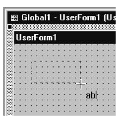
And the mouse cursor changes, too, as it moves over the boundary of the UserForm. It becomes a cross alongside the TextBox control’s icon.
2. Move the mouse cursor to the position where you want one of the corners of your text box to be, and press the left mouse button. While holding the mouse button down, move the cursor around and watch a rectangle with dashed lines follow the cursor, with one corner anchored at the position you’ve just selected. This rectangle indicates the size and position for the new text box that will be created when you release the mouse button.
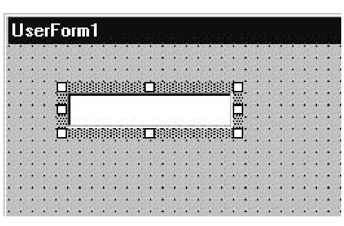
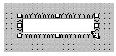
3. Still holding down the mouse button, move the cursor to the corner diagonal to the initial (anchored) one and release the mouse button. The new text box object replaces the dashed rectangle on the screen:
This becomes the new active control, as indicated by the handles and thick border that now appear around the rectangle. These can be used to make further adjustments to the size and position of the text box.
Changing the Dimensions and Position of a Toolbox Control
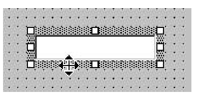
Click any control on a UserForm to make it the active control.Once active, the control is enclosed by a thick border with eight handles placed around it.You can click and drag these handles to change the position and dimensions of the control, as follows:
• If you move the cursor directly over the thick border but not on top of a handle,the cursor changes to a cross with two double-headed arrows (shown here) to allow you to reposition the whole control without changing its size. Simply click and hold down the mouse button and drag the control to its new position.
• If you move the cursor directly over any handle, the cursor changes to a double-headed arrow (shown here). This allows you to drag and drop the handle to change the size of the control while maintaining its position.
Now that you have an understanding of how to place components on your GUI, it’s time to use these skills to develop your first simple application—I’m sure you’re revved up ready to go.
