Geoscience Reference
In-Depth Information
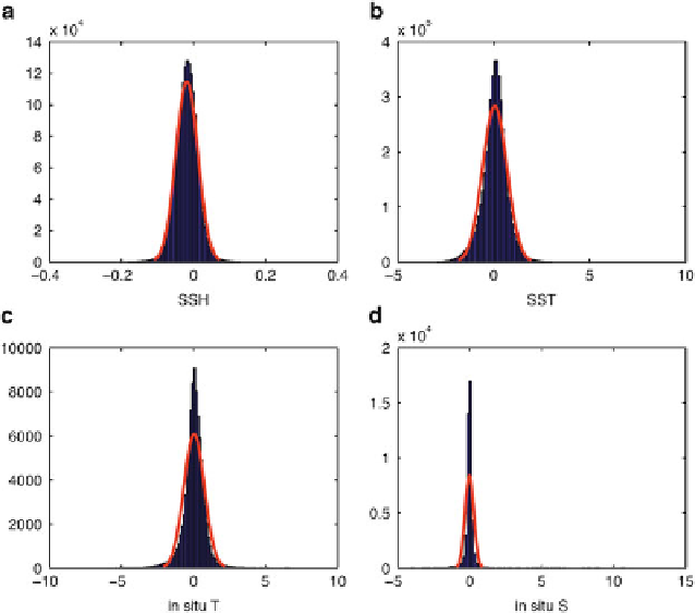
Fig. 14.4
of the elements of the innovation vector
d
for (
a
)SSH
observations (m), (
b
) SST observations (K), (
c
) in situ temperature observations (K), and (
d
)in
situ observations of salinity. The distributions are computed from 1 year of 7 day 4D-Var cycles
during 1999. The
red curves
show the best fit Gaussian distribution in each case
Frequency distributions
f
distribution of the elements of the innovation vector
d
computed from historical
analyses. In our case, no sequence of historical analyses is available, so instead
we examined the innovations from a randomly chosen year (1999) during which all
observations were assimilated into the model. The frequency distributions,
,ofthe
innovation elements for each observation platform, and the transformed distribution
f
D
p
2
f
Œf=
.f /
were computed for the random year following
Andersson
and Jarvinen
(
1999
), where
ln
max
f
is the number of data in each bin of the histogram. The
resulting histogram distributions of
f
f
for satellite SST (AVHRR/Pathfinder),
SSH (Aviso), in situ temperature and in situ salinity (both from EN3) are shown in
Figs.
14.4
and
14.5
respectively. Also shown in Fig.
14.4
is the best fit Gaussian
distribution for each histogram. The transformed distribution
and
f
highlights the
tails of the distribution and is therefore more convenient for viewing the outlier
innovations. The slopes of the lines superimposed on the transformed distributions
in Fig.
14.5
represent the standard deviation for the best fit Gaussian distributions in
Fig.
14.4
, and are estimates of
.
b
C
o
/
1=2
. Figure
14.5
a, b indicate that for satellite
SST and SSH, there are relatively few outliers in the elements of
d
.Conversely,
Search WWH ::

Custom Search