Geoscience Reference
In-Depth Information
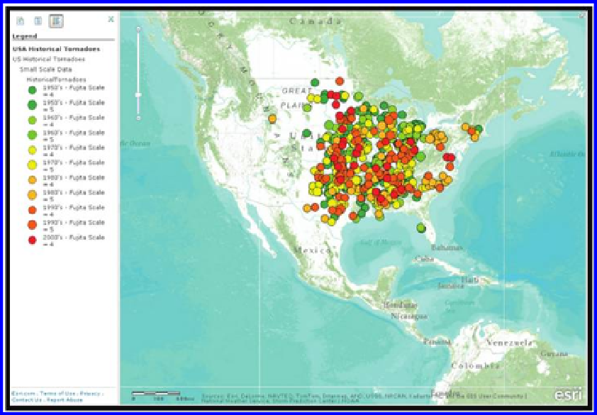
Figure 8.3 Tornado touchdown distribution colored by Fujita scale, 1950-2004.
Source of base map: Esri software.
(SPC). The SPC data originate from the Severe Thunderstorm Database and
the National Oceanic and Atmospheric Administration (NOAA) Storm Data
publication. This map shows the distribution of tornadoes of Fujita (inten-
sity) Scale 4 and 5. The predominant pattern of tornadoes in the central and
eastern United States is evident, with gaps in the Appalachians, the Gulf and
Atlantic Coasts, and New England. At this scale, it does not appear that any
tornadoes occur in the mountain west. But upon zooming into a larger scale,
the scale-dependent map shows Fujita 2 and 3 tornadoes, and it becomes evi-
dent that mountain west areas, such as Colorado, that have not been visited
by a higher-intensity tornado have been visited by a lower-intensity tornado,
not only once, but numerous times (
Figure 8.4
)
.
This map provides an excellent illustration of the issues of spatial data qual-
ity that we have been discussing throughout this topic. Doppler radar did
not come into widespread use until the 1980s. Most of the tornado touch-
down data points from the 1950s through the 1970s, therefore, were placed
where they are as a result of local observations and damage reports. Thus,
those locations are approximate and based on local stories. Furthermore, if
a tornado occurred far from a road or house where people could observe it,
chances are that it is not in the data set. Therefore, can you detect any predis-
position of tornadoes from the 1950s through the 1970s to be close to roads,
towns, and other locations where people are typically found?
Search WWH ::

Custom Search