Database Reference
In-Depth Information
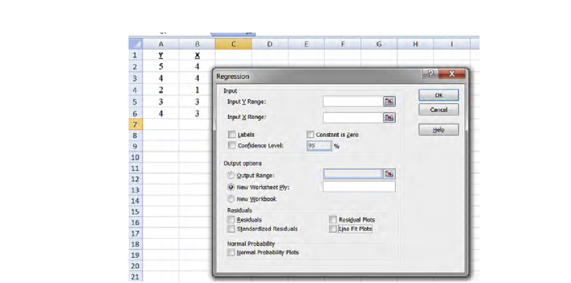
FIGURE 9.17
Regression dialog box; Excel with illustrative data.
We click on “Regression,” and get the dialog box shown in
Figure 9.17
.
We enter the location of the Y variable data and the location of the X variable
data, and enter an arbitrary name of a new worksheet: “JARED.” That brings us to
Figure 9.18
.
Note that we checked “Labels” and listed the data as (a1:a6) and (b1:b6), even
though there are no data values in row 1.
We now click “OK,” and ind the output in
Figure 9.19
.
There is a lot to digest in
Figure 9.19
. But let's take it step-by-step, and you'll
be ine.
First, we note the least-square (best-itting) line by examining the circled column
in the bottom left of the igure; the intercept is 1.1 and the slope is 0.833. (The inter-
cept is labeled “intercept” and the slope is labeled by “X” [row 18 in
Figure 9.19
],
which is standard notation in all statistical software. Since there can be more than
one X, the label is to indicate which X the slope pertains to.) It is understood that the
value (in this case: 0.833) is the slope of the X listed. Our line, thus, is:
Yc=1.1+0.833*X.
The slope of 0.833 means that for each unit increase in X (i.e., X goes up by 1),
we predict that Y goes up by 0.833. If X is 0, then our prediction for Y is 1.1, since
that's our intercept.
Search WWH ::

Custom Search