HTML and CSS Reference
In-Depth Information
Form Elements
Now that you have a basic wrapper for the app, you can start putting together the look and feel of the user interface.
Because this app is all about interaction, it relies heavily on forms to send information between the attendees and the
presenter.
Because this app will be leaning on its form elements for most of its aesthetic, let's start by designing the inputs
and buttons styles that we can use on all views in the application.
Text and E-mail Inputs
Text inputs will be used for nearly all the interaction on this app, so they're a logical starting point. I tend to keep
all the elements on different layers in Photoshop and then group them into folders. Feel free to use whatever
organizational method works for you.
1.
Playing off the roundness of our headline font, grab the rounded rectangle tool and set
the border radius to
6px
. Draw a rectangle
430px
wide by
40px
tall and make it white
(
#FFFFFF
). This will serve as the base for the input (see Figure
6-8
).
Figure 6-8.
A white rectangle with 6px rounded corners
2.
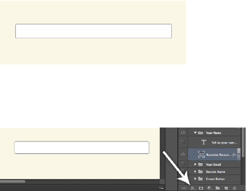
Next, we need to make it look a little more like an input. To start, let's give it a border. Bring
up the Layer Style panel by clicking the Layer Style (fx) button at the bottom of your layers
panel while the rectangle layer is active (see Figure
6-9
).
Figure 6-9.
The Layer Style button in Photoshop
3.
After the Layer Style button is clicked, several options will be listed. Click Stroke and the
Effects dialog will open.
Search WWH ::

Custom Search