Graphics Reference
In-Depth Information
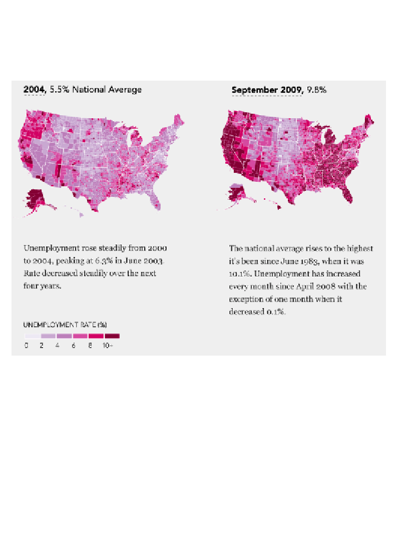
As we can see clearly in this next display, we inherently and automatically attach a
sense of order to such sequential scales. Of course, without a key it might be difficult
for us to precisely pick out the absolute values that each color band represents, but
we can certainly determine major patterns that lead to judgments of data order
within and across both sample maps:
Image (cropped) from "Unemployment, 2004 to present" (
http://projects.flowingdata.com/
america/unemployment/raw.html
), by Nathan Yau.
That idea, of surfacing the general patterns of the highest and lowest values, is really
what the main purpose of color is when used to represent quantitative variables.
There are other types of color scheme used for situations that require us to represent
two quantitative variables or to highlight two extremes of a single variable. These are
known as diverging schemes.
While there is a variety of different ways to construct diverging color schemes,
typically, the extreme ends of the spectrum are presented as darker and
distinguished by strongly contrasting color hues. Alternative approaches might
involve exploiting established color metaphors or might already be intuitively
understood or easily learned.
Search WWH ::

Custom Search