Graphics Reference
In-Depth Information
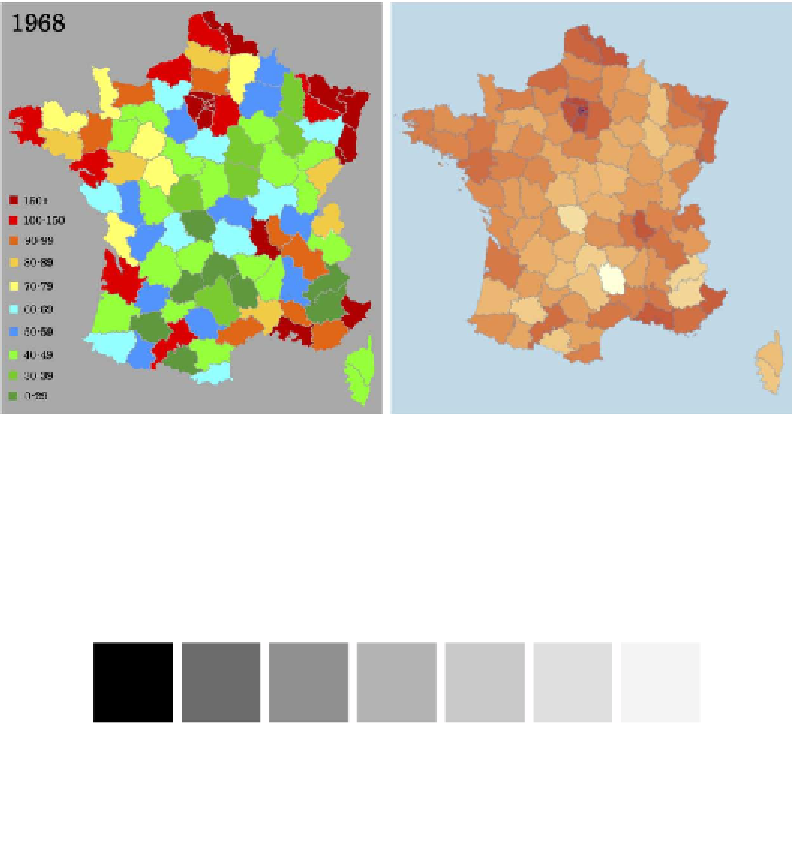
In the following pair of images, on the left-hand side, even with a color legend
explaining the value bands being depicted by the different colors, there is no
preattentive association that allows us to efficiently determine the values being
represented on the map. Referring back to Bertin's interpretive acts, we can't even
easily establish a general sense of big, medium, and small values without having
to constantly move to-and-fro the map and the legend. By contrast, the map on the
right-hand side uses a single hue and uses a sequential color scheme that represents
the highest values (dark) to lowest values (light) in a logical and immediately
understandable way:
Image (left) republished from the freely licensed media file repository Wikimedia Commons, source:
http://en.wikipedia.org/wiki/File:FrancePopulationDensity1968.png
Image (right) from "The Good and The Bad [2012]" (
http://www.theusrus.de/blog/
the-good-the-bad-22012/
) by Martin Theus
What we can see demonstrated in this example is that, for quantitative data, one of the
best ways to effectively depict a range of quantitative values is through the lightness
property of color: that is, a scheme which goes from the most intense color through to
increasing amounts of white. This is sometimes called a sequential color scheme:

Search WWH ::

Custom Search