Graphics Reference
In-Depth Information
exact, that is, as with blue and orange; skewing this relationship can create interesting
combinations but retain their inherent contrast: a blue-violet and orange, for example.
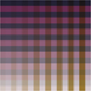
Most printing inks are translucent, so a designer has the option not only to print each ink
at full strength—or “tinting” them to lighten their values—but also to print the inks on
top of each other, either at full strength or in combinations of tints. Printing one ink on
top of another is called “surprinting,” and creates new colors because of their overlap.
Such new colors will vary in hue, saturation, and value, depending on the base ink col-
ors selected; usually the resulting third color (and tinted variations) will be darker and
less saturated. If the base inks are very intense or pure, however, the surprint color will
also be relatively intense. Photographic images, or illustrations with varied tonality,
are excellent material with which to explore ink coloration: an image might be printed
in one, two, three, or more spot colors, with different portions of the image's tonal range
acted upon by the inks at different levels. Such options give the designer an opportunity
to customize images for a client, enrich the dialogue of color among images, type, and
other graphic elements, and to bring images into closer visual alignment with brand-re-
lated color messages.
Simply replacing black ink with ink of another color—even in a one-color job—can give an extra
punch to an otherwise mundane project.
Choose two (or three) colors with value and saturation as considerations. The deeper, overall, and
the closer the inks are in value, as well as saturation, the wider the range of possible combinations,
and the greater their potential contrast.