Graphics Reference
In-Depth Information
Subsets ofvariables mayreveal features farmoreclearly than usingall variables at
once. In interactive mosaicplots one can add/drop or change variables displayed
in a plot. his is very e
cient when looking for potential interactions between
variables.
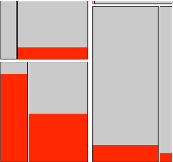
Response Models
6.2.2
In many data sets there is a single dependent categorical outcome and several cat-
egorical influencing factors. he best graphical representation of such a situation is
to put all influencing factors in a mosaicplot and link the dependent variable with
a barchart. his setup is shown in Fig.
.
for the Caesarean data set (cf. Fahrmeir
and Tutz,
). he data set consists of three influencing factors - Antibiotics, Risk
Factor,andPlanned and one dependent categorical outcome, Infection,for
cae-
sarean births. he question of interest is to find out which factors, or combination of
factors, have a higher probability of leading to an infection.
Atthispointitisimportanttorethinkwhatthehighlightedareasinthemosaicplot
actually show us. Let us look at the cases were no caesarean was planned, a risk fac-
tor was present, and no antibiotics were administered (the lower let cell in Fig.
.
,
which is highlighted to a high degree). In this combination,
of the
cases got an
infection, making almost
.
%. hat is
P
(
Infection
Antibiotics
Risk Factor
Planned
)=
.
.
But there is more we can learn from the plot. he infection probability is highest
for cases with risk factors and no antibiotics administered. here is also one oddity
Figure
.
.
he categorical response model for the caesarean birth data is visualized using a mosaicplot
for the influencing factors and a barchart for the response variable. Infection cases have been
highlighted