Graphics Programs Reference
In-Depth Information
Helvetica in Bold and Regular—that's it.
Be careful not to use two (or more) different typefaces that are similar but not the same.
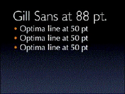
Using Gill Sans and Optima in the same slide is a good example of a subtle clash. Both
typefaces look sort of similar in that they are sans serifs with a calligraphic look and
variations between the thick and thin parts of their letterforms. They are both great on
their own, but used together they are the typographic equivalent of wearing a navy blazer
with pants that are almost—but not quite—the same color.
Title is set in Gill Sans Light, bullets in Optima. They are different, but not different enough.