Information Technology Reference
In-Depth Information
The only mandatory fields are the report name (metric or dimension) and the
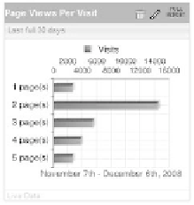
reporting Period. The result of the values in Figure 9.19 appears in Figure 9.20.
When looking at similar data, choose a bar graph, as it makes comparison easy
across dashboard items. Think about how you size and stack these items on the actual
dashboard.
You cannot choose stacked bar charts; however, if you choose reports like First
Time Visits vs. returning Visits, this metric comparison is provided automatically and
without you applying anything.
238
Figure 9.20
The row chart of
the values in Figure 9.19
Key Performance Indicators (KPIs)
The Yahoo! Web analytics KPi dashboard item displays key performance indicators
(KPis) such as revenue, return on advertising spending (roas), and unique actions.
Choosing the right KPis to display and how to display them is challenging; KPis are
one of the most important dashboard items that you have in your arsenal. as i stated
earlier, you will be able to get by with bar graphs and KPis alone.
i believe, however naive it might sound, that one of the best visualization meth-
ods is just showing the number. i don't need any magic applied to a metric such as rev-
enue so Far This Month. Just show me the number!
almost any of the tracked metrics can be promoted, from a logical point of
view, to KPis and presented in a KPi dashboard item box.
When adding your first KPi (see Figure 9.21), you are presented with a number
of options, which change a bit depending on the metric you choose. Most of the other
dashboard visualization types provide a presorted and selected list of metrics, whereas
the KPi list is essentially making all of the metrics in the system available.
When you select action as a reporting metric, you get another mandatory field:
which action you want to display.
Figure 9.22 shows the result of adding a sale action KPi in a KPi item box for
this week compared to the same partial period four weeks ago.