Information Technology Reference
In-Depth Information
bar and row charts are similar to traditional line graphs, called trend charts in
Yahoo!. however, rather than using a point on a plane to define a value, bar and row
charts use a horizontal or vertical rectangular bar that levels off at the appropriate level.
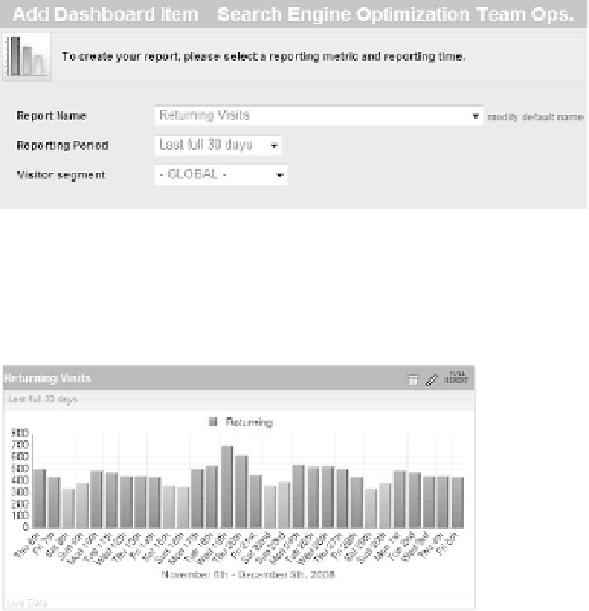
adding a bar chart is straightforward, and you can see an example in Figure 9.17.
Figure 9.17
Adding a bar chart dashboard item
The only mandatory fields are the report name (metric or dimension) and the
reporting Period. The result of the values in Figure 9.17 appears in Figure 9.18.
237
Figure 9.18
The bar chart of the values in Figure 9.17
You can monitor the chart shown in Figure 9.18 and be alerted when you are
moving into a downward negative spiral. You might have an increase in traffic due to
aggressive campaign strategies or a poor review on a site. if you see a decline in return-
ing visitors, it is time to figure out what's wrong with your business—no company can
survive on first-time visitors only.
You add the row chart in a similar way, as you can see in Figure 9.19.
Figure 9.19
Adding a row chart dashboard item