Graphics Reference
In-Depth Information
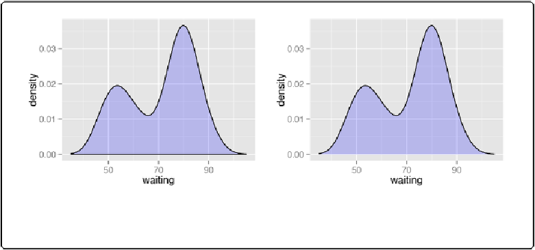
Figure 6-9. Left: density curve with wider x limits and a semitransparent fill; right: in two parts,
with geom_density() and geom_line()
If this edge-clipping happens with your data, it might mean that your curve is too smooth—if the
curve is wider than your data, it might not be the best model of your data. Or it could be because
you have a small data set.
To compare the theoretical and observed distributions, you can overlay the density curve with
the histogram. Since the yvalues for the density curve are small (the area under the curve al-
ways sums to 1), it would be barely visible if you overlaid it on a histogram without any trans-
formation. To solve this problem, you can scale down the histogram to match the density curve
with the mapping
y=..density..
. Here we'll add
geom_histogram()
first, and then layer
geom_density()
on top (
Figure 6-10
):
ggplot(faithful, aes(x
=
waiting, y
=
..
density..))
+
geom_histogram(fill
=
"cornsilk"
, colour
=
"grey60"
, size
=
.2
)
+
geom_density()
+
xlim(
35
,
105
)