Graphics Reference
In-Depth Information
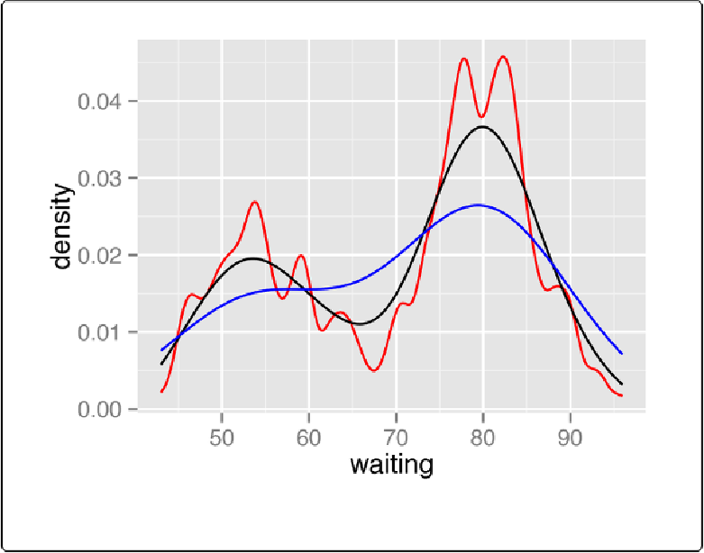
Figure 6-8. Density curves with adjust set to .25 (red), default value of 1 (black), and 2 (blue)
In this example, the xrange is automatically set so that it contains the data, but this results in the
edge of the curve getting clipped. To show more of the curve, set the xlimits (
Figure 6-9
). We'll
also add an 80% transparent fill with
alpha=.2
:
ggplot(faithful, aes(x
=
waiting))
+
geom_density(fill
=
"blue"
, alpha
=
.2
)
+
xlim(
35
,
105
)
# This draws a blue polygon with geom_density(), then adds a line on top
ggplot(faithful, aes(x
=
waiting))
+
geom_density(fill
=
"blue"
, colour
=
NNA
, alpha
=
.2
)
+
geom_line(stat
=
"density"
)
+
xlim(
35
,
105
)