Graphics Reference
In-Depth Information
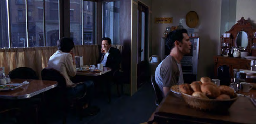
Fig. 4.6
The “Ghost_Diner” final correction. The print image may look a little saturated. This image is definitely more balanced, though
the original intent of the director of photography may have been to maintain the cooler look.
Fig. 4.7
The RGB Parade, showing the balanced image. Note the three diamond-shaped sections of
trace about midway up on the right side of each color channel. In this image, those diamond shapes have
matching vertical position. In the original (
Figure 4.2
)
, the red channel was the weakest and the blue chan-
nel was the strongest. Refer back to
Figure 4.2
on page 112 to compare.

Search WWH ::

Custom Search