Database Reference
In-Depth Information
12.3.4 How to Clean Up a Graphic
Many times software packages generate a graphic for a dataset, but the software
adds too many things to the graphic. These added visual distractions can make the
visual appear busy or otherwise obscure the main points that are to be made with
the graphic. In general, it is a best practice to strive for simplicity when creating
graphics and data visualization graphs. Knowing how to simplify graphics or clean
up a messy chart is helpful for conveying the key message as clearly as possible.
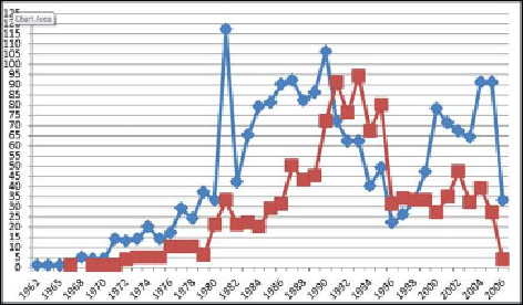
Figure 12.28
portrays a line chart with several design problems.
Figure 12.28
How to clean up a graphic, example 1 (before)
How to Clean Up a Graphic
The line chart shown in
Figure 12.28
compares two trends over time. The chart
looks busy and contains a lot of chart junk that distracts the viewer from the
main message.
Chart junk
refers to elements of data visualization that provide
additional materials but do not contribute to the data portion of the graphic. If
chart junk were removed, the meaning and understanding of the graphic would
not be diminished; it would instead be made clearer. There are five main kinds of
“chart junk” in
Figure 12.28
:
•
Horizontal grid lines:
These serve no purpose in this graphic. They do
not provide additional information for the chart.
•
Chunky data points:
These data points represented as large square
blocks draw the viewer's attention to them but do not represent any
specific meaning aside from the data points themselves.