Database Reference
In-Depth Information
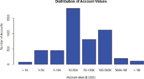
Figure 3.21
Histograms are better to show to stakeholders
Note that the bin sizes should be carefully chosen to avoid distortion of the data.
In this example, the bins in
Figure 3.21
are chosen based on observations from the
density plot in
Figure 3.20
. Without the density plot, the peak concentration might
be just due to the somewhat arbitrary appearing choices for the bin sizes.
This simple example addresses the different needs of two groups of audience:
analysts and stakeholders. Chapter 12, “The Endgame, or Putting It All Together,”
further discusses the best practices of delivering presentations to these two groups.
Following is the R code to generate the plots in
Figure 3.20
and
Figure 3.21
.
# Generate random log normal income data
income = rlnorm(5000, meanlog=log(40000), sdlog=log(5))
# Part I: Create the density plot
plot(density(log10(income), adjust=0.5),
main="Distribution of Account Values (log10 scale)")
# Add rug to the density plot
rug(log10(income))
# Part II: Make the histogram
# Create "log-like bins"
breaks = c(0, 1000, 5000, 10000, 50000, 100000, 5e5, 1e6,
2e7)
# Create bins and label the data
bins = cut(income, breaks, include.lowest=T,
labels = c("< 1K", "1-5K", "5-10K", "10-50K",
"50-100K", "100-500K", "500K-1M", "> 1M"))
# Plot the bins