Database Reference
In-Depth Information
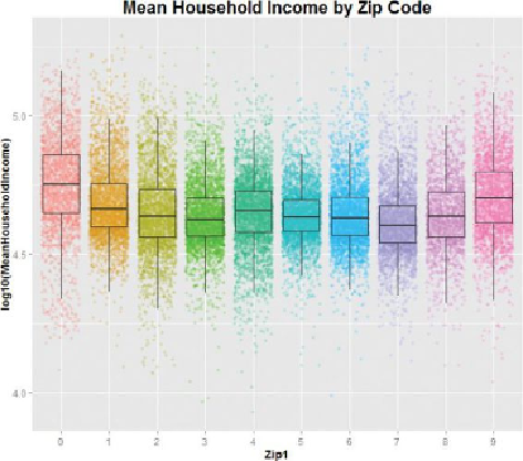
Figure 3.16
A box-and-whisker plot of mean household income and
geographical region
In this figure, the scatterplot is displayed beneath the box-and-whisker plot, with
some jittering for the overlap points so that each line of points widens into a strip.
The “box” of the box-and-whisker shows the range that contains the central 50% of
the data, and the line inside the box is the location of the median value. The upper
and lower hinges of the boxes correspond to the first and third quartiles of the
data. The upper whisker extends from the hinge to the highest value that is within
1.5 * IQR of the hinge. The lower whisker extends from the hinge to the lowest
value within 1.5 * IQR of the hinge. IQR is the inter-quartile range, as discussed in
Section 3.1.4. The points outside the whiskers can be considered possible outliers.
The graph shows how household income varies by region. The highest median
incomes are in region 0 and region 9. Region 0 is slightly higher, but the boxes
for the two regions overlap enough that the difference between the two regions
probably is not significant. The lowest household incomes tend to be in region 7,
which includes states such as Louisiana, Arkansas, and Oklahoma.
Assuming a data frame called
DF
contains two columns (
MeanHouseholdIncome
and
Zip1
), the following R script uses the
ggplot2
library [11] to plot a graph that
is similar to
Figure 3.16
.