Graphics Reference
In-Depth Information
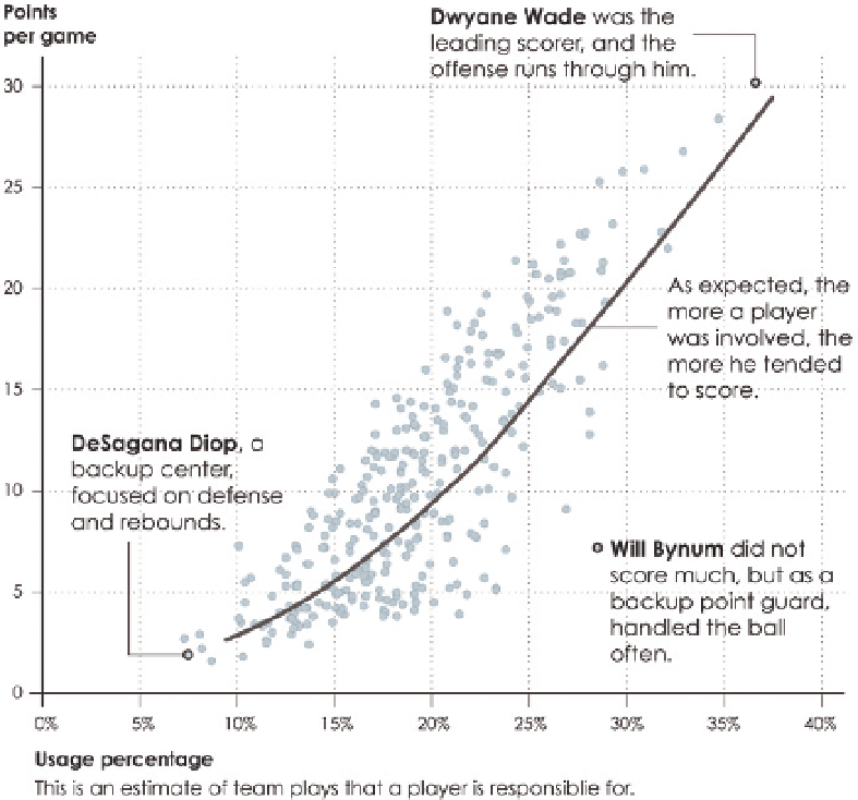
For example, returning to the scatter plot in Figure 5-4, a layer of annotation is
added, in addition to highlighting of specific points, as shown in Figure 5-33. Dark
circles and pointers highlight specific players, and lines connect annotation to
dots for the lowest scoring player with the lowest usage percentage, DeSagana
Diop, and the highest scoring player with the highest usage percentage, Dwyane
Wade. The point for Will Bynum, who somewhat strays from the trend, is also
highlighted and annotated. There is also a pointer for the trend line and an
explanation of usage percentage, which isn't common knowledge for most.
The key to useful annotation is to explain or highlight a chart as it relates
to the data (and your audience). For example, the explanation for the trend
line could be, “There is a positive correlation between points per game and
usage percentage.” This is true, but the generic statistical description doesn't
relate to the context of the data. Similarly, you could describe Dwyane Wade
as the player with the highest usage percentage and points per game, but
FIGURE 5-33
Annotation added
to scatter plot
Search WWH ::

Custom Search