Graphics Reference
In-Depth Information
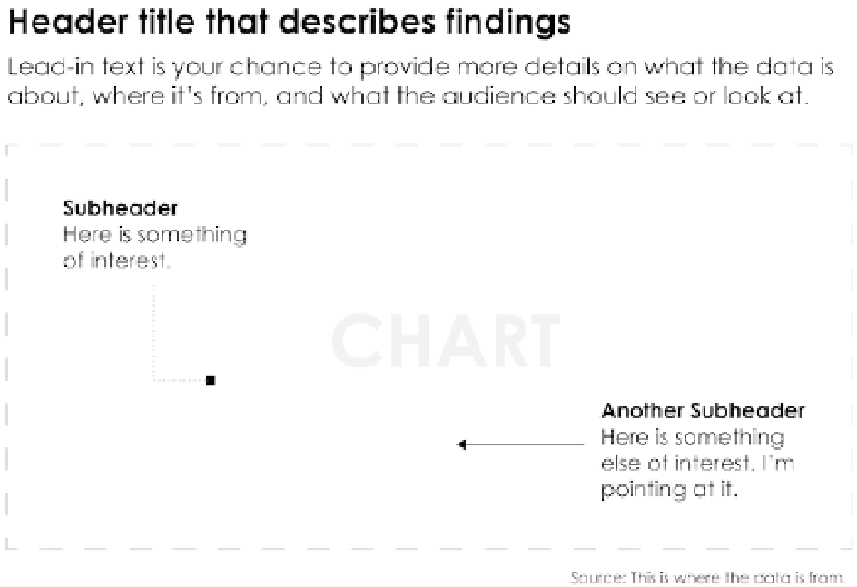
in Figure 5-32, size, color, and placement dictate how much attention anno-
tations receive.
FIGURE 5-32
Annotation for
a chart
The header is typically printed with larger and bolder fonts to set the stage
or to describe what people should see or look for in the data. If the header is
small and blends with everything else, people might skip it and look straight
to the more visual elements. A descriptive title also helps. For example, “Rising
Gas Prices” says more about a chart than just “Gas Prices.” The former presents
a conclusion immediately, and readers will look to the chart to verify and see
details. The latter leaves data interpretation to readers and places them in the
exploration phase. Then again, this might be your goal, so describe accordingly.
Lead-in text, like the header, is used to prepare readers for what a chart shows,
but in further detail. The text is typically smaller than the header and expands
on what the header declares, where the data is from, how it was derived, or
what it means. Basically, it's information that might help others understand
the data better but often doesn't directly point to specific elements.
To explain specific points or areas, you can use lines and arrows and use
annotation as a layer on top of a chart. This places descriptions directly in the
context of the data so that a reader doesn't have to look outside a graph for
additional information to fully understand what you show.
Search WWH ::

Custom Search