HTML and CSS Reference
In-Depth Information
The sample page that Kevin has chosen contains biographical information about and
photos of Kevin's great-grandfather, Stanislaw Dubcek, an immigrant to the United States
who settled and raised a family in the Midwest. Kevin feels that the current appearance
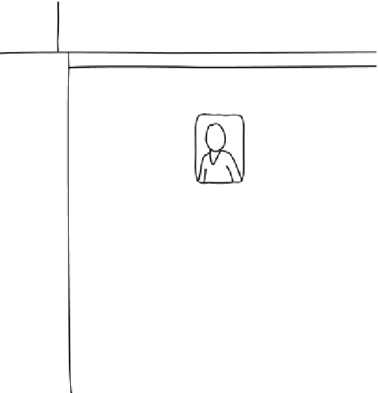
of the page is dull and uninteresting, and he sketches out some ideas to give the page
more visual appeal (see Figure 8-2).
figure 8-2
Kevin's proposed design changes
Tree And Book
text shadow used
to create an
embossed effect
Stanislaw Dubcek (1903-1981)
torn paper
graphic
border
around main
photo
beveled edges
around m
a
in section
drop shadow
behind the
photos
solid green
background
color
fading to
transparency
drop shadow
behind the
table
rotated photos with
rounded corners
and drop shadows
Kevin wants you to add the following visual effects to the cover page:
• drop shadows around the page heading, Web table, and page photos
• a green background around the main article that gradually fades out in the vertical
direction
• the two family portrait photos rotated 30° clockwise and counter-clockwise from their
default orientations
• a semi-transparent filter added to the photos of Stanislaw Dubcek
• a torn page border around the main photo
To create these visual effects, you'll use some CSS3 and browser-specific styles. You'll
start by using CSS3 to create drop shadows around the page heading, Web table, and
page photos.
Creating a Text Shadow
Kevin wants to augment the appearance of the
h1
heading
Stanislaw Dubcek (1903 -
1981)
by adding a drop shadow around each of the letters. Drop shadows can be added
using the
text-shadow
style
text-shadow:
color offsetX offsetY blur
;
where
color
is the color of the shadow, and
offsetX
and
offsetY
are the distance of
the shadow from the text in the horizontal and vertical directions, respectively. Positive
values for
offsetX
and
offsetY
move the shadow to the right and down from the text,
while negative values move the shadow to the left and up.


