Graphics Programs Reference
In-Depth Information
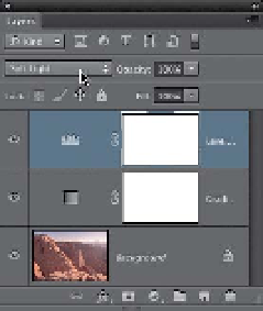
Step Three:
Now you're going to add some con-
trast the easy way. Click on the Levels
adjustment layer icon in the Adjustments
panel (it's the second icon on the top
row). Here's the good news: when the
Levels options appear in the Properties
panel, you're not actually going to adjust
the Levels. All you need to do is change
the layer blend mode of this adjustment
layer from Normal to
Soft Light
(at the
top of the Layers panel, as shown here)
and look how much more contrasty, and
just generally yummy, this photo looks
now. If choosing Soft Light for the particu-
lar photo you're working on doesn't add
enough contrast, then try Overlay mode
instead (it's more contrasty). Okay, that's
it—three clicks and you're done. Now, if
you're feeling “clicky,” there is a way to
tweak your conversion if you really feel
like it (not necessary usually, but in case
you want to, I'll show ya).
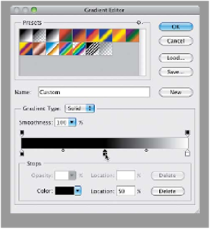
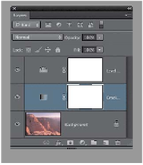
Step Four:
In the Layers panel, click on the Gradient
Map adjustment layer (the middle layer)
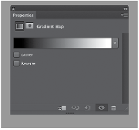
to make it active. Now, click directly on
the gradient in the Properties panel,
which brings up the Gradient Editor dia-
log. Once it appears, click once directly
in the center, right below the gradient
ramp (as shown circled here) to add a
color stop (it looks like a little house)
right below your gradient. Don't click OK
yet. At this point, your image will look re-
ally dark, but that's okay—we're not
done yet.
(Continued)