Graphics Programs Reference
In-Depth Information
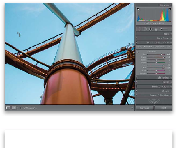
Step Three:
Now, these eight sliders control just
the saturation of colors in your image.
Drag the Orange slider way over to the
right, and the Red perhaps not quite as far,
and the orange in the pole (and the track)
become much more vibrant (as seen here).
If you know exactly which color you want
to affect, you can just drag the sliders. But
if you're not sure exactly which colors
make up the area you want to adjust, then
you can use the TAT (the same Targeted
Adjustment tool you used back in the Tone
Curve panel). For example, if you want to
make the sky bluer, click on the TAT, then
click it on the sky (as I did here on the top
left), and drag it upward to make it bluer
(downward to make it less blue). You'll no-
tice that it doesn't just move the Blue slider,
but it also increases the Aqua Saturation
slider, as well. You probably wouldn't have
realized that there was any aqua in the sky,
and this is exactly why this tool is so handy
here. In fact, I rarely use the HSL panel
without using the TAT!
Step Four:
To change the brightness of the colors ,
click on Luminance at the top of the panel.
To darken the color of the sky, just take the
TAT, then click-and-drag straight downward
on the sky, and its color gets deeper and
richer (the Luminance for both Aqua and
Blue decreased). Now, click-and-drag the
TAT upward on the orange pole to make
it brighter (and notice that it moves the
Red up, not the Orange (but it did in-
crease the Magenta just a bit. It's smart
that way). Two last things: Clicking the All
button (at the top of the panel) puts all
three panels in one scrolling list and the
Color panel breaks them all into sets of
three for each color—a layout more like
Photoshop's Hue/Saturation. But, regardless
of which layout you choose, they all work
the same way. A before/after is shown here,
after we changed and brightened the pole
and track color and darkened the sky and
made it more blue.