HTML and CSS Reference
In-Depth Information
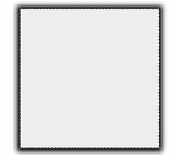
Here the shadow grows by
six pixels on every side:
box-shadow: rgb(0,0,0)
0px 0px 12px 6px;
This creates a shadow that
extends evenly all around
the element.
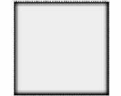
This example shows a
spread-radius
combined with
an
offset-y
:
box-shadow: rgb(0,0,0)
0px 12px 12px 12px;
Using
inset
, you can achieve
bevel-like effects:
box-shadow: inset rgb(0,0,0)
0px 0px 12px 6px;
Or you can make an element
appear to drop into the page,
in this case by using the
:hover
pseudo-class:
div:hover {
box-shadow:
inset rgb(0,0,0)
3px 3px 5px;
}