HTML and CSS Reference
In-Depth Information
Text shadows
Text shadows work exactly the same as box shadows. They're defined
by the same four values:
<color> <offset-x> <offset-y> <blur-radius>
We won't look at these values again;
instead, let's look at some examples.
Standard
Prefixed
4.0
-
3.5
-
-
5.5*
10.0
-
2.0
-
*
IE can create text-shadow effects using its
proprietary
filter
property, but only on
elements that have a transparent back-
ground.
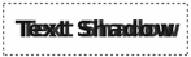
Here's a simple
offset-x
:
text-shadow:
rgb(51,51,51) 6px 0px;
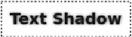
And here's an
offset-y
:
text-shadow:
rgb(51,51,51) 0px 6px;
As with box shadows, things
become more interesting when you
invoke
blur-radius
:
text-shadow:
rgb(51,51,51) 0px 0px 6px;