Database Reference
In-Depth Information
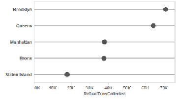
Figure 3-11. The formatted dot chart
The dot chart could have also been created by starting with the horizontal bar chart and chan-
ging the
Marks
type from
Automatic
or
Bars
to
Circle
(for closed dots) or
Shape
(for open
dots or other shapes). Whichever way you make it, the dot chart is a great way to show
quantities as it leverages the strength of the human visual system to compare quantities based
on a symbol's position.
We've considered a very basic case of communicating
how much
involving collection of
garbage in New York boroughs. We'll come back to this data set in later chapters as we seek
to answer more interesting questions, like which borough yields the most garbage per person,
and which recycles the most.
For now, let's move on to learn how to communicate counts with a highly related topic—rat
sightings in New York City.
Communicating “How Many”
Recall that communicating “how many” is pertinent to
countable
nouns like people and
events. The previous example used a very simple and highly summarized data set—garbage
tons per community district and borough for a whole month. But data sets don't start that
way very often, at least not in today's world. Data is captured at the transaction level in busi-
ness (e.g., sales orders) or at the incident level in government (e.g., arrests).
Communicating “how many” is very common and useful for data at the most granular pos-
sible level. For example, perhaps you want to show how many sales orders involved custom-
ers who are retired, or maybe you're interested in presenting how many arrests were DUIs.
Customers and arrests are not things you
measure
, like tons of refuse in the previous section,