Database Reference
In-Depth Information
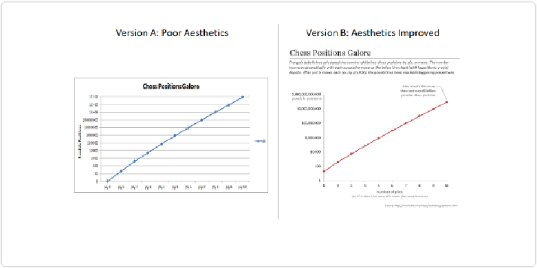
Figure 1-7. Two versions of the same line plot
In both cases, it's just a line on a log-linear scale, but which are you more likely to pay atten-
tion to? Aesthetics matters.
Figure 1-8
shows another example of poor design and improved design, this time showing
the growth of employment at Apple after the return of Steve Jobs in 1997.
A little design goes a long way. If you know a good graphic artist, take her out for coffee and
get her input. Design is a whole separate discipline that you could spend a lifetime learning
about and perfecting, but paying even a small amount of attention to how your data visualiz-
ations look can mean the difference between being ignored and arousing interest, or between
being quickly forgotten and being remembered for a while to come.
In this topic, we'll cover how to address the aesthetics of visualizations created in Tableau.