Database Reference
In-Depth Information
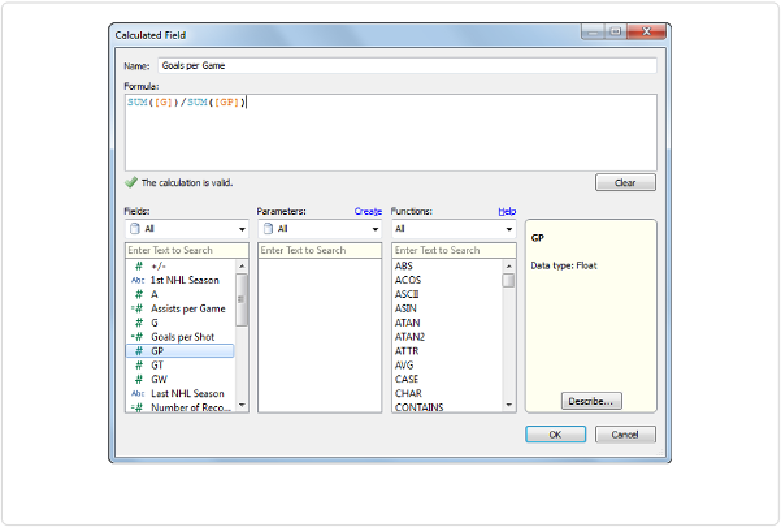
Figure 8-12. Creating per game rates with Calculated Fields
Now that we have these three new calculated fields in our Measures area, we can use them to
visualize the rate of point production as a stacked bar plot. The way we'll need to create the
stacked bar plot isn't straightforward in this case, because the values we want to stack are
different Measures. Here are the steps:
1. Drag
Player
to the Rows shelf, creating an alphabetical list of player names.
2. Drag
Measure Values
from the Measures area to the Columns shelf, creating bars
that are the sum of all Measures for each player.
3. Drag
Measure Names
from the Dimensions area to the Colors shelf, breaking up the
bars by color.
4. Drag everything except
AGG(Assists per Game)
and
AGG(Goals per Game)
out of
the Measure Values area below the Marks card, which leaves only two corresponding
bars for each player.