Graphics Reference
In-Depth Information
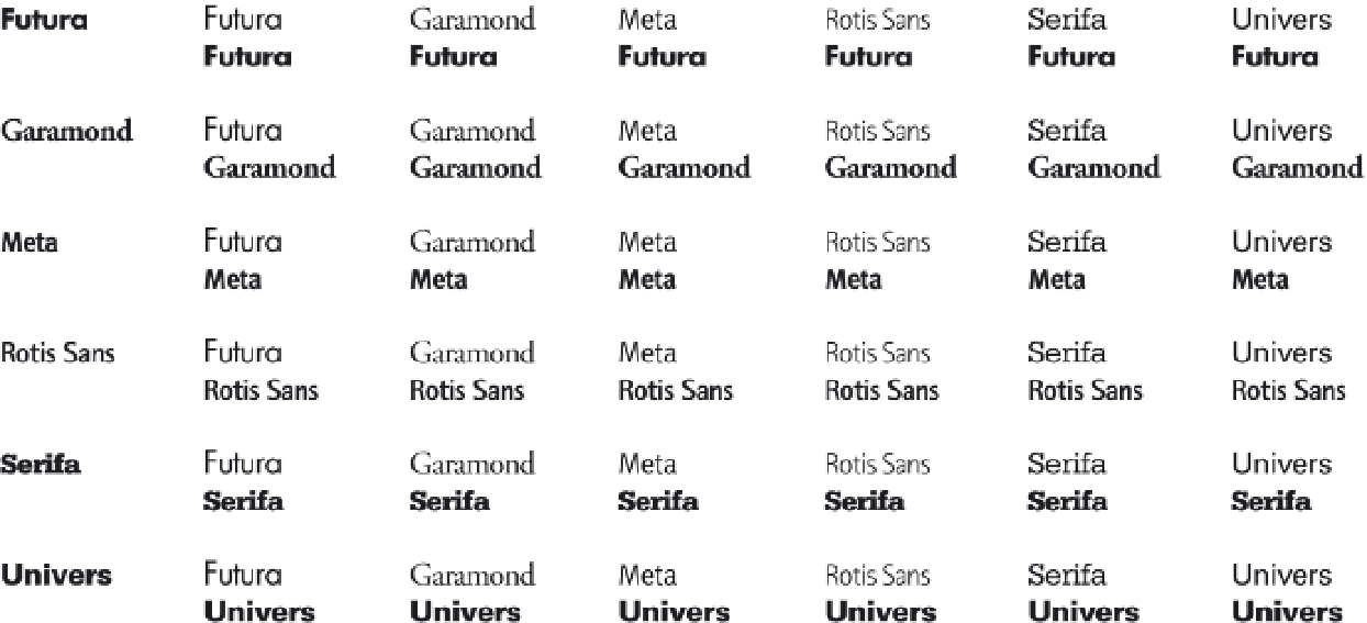
Combining typefaces
With rare exception, effective web pages utilize no more than two or
three different typefaces. Using more than this number compromises
hierarchical clarity. The most important consideration for selecting
multiple typefaces is contrast, and variations in contrast are abundant:
serif/sans serif, roman/script, bold/light, thick/thin, simple/complex,
and functional/decorative. Plenty of contrast between typefaces ensures
that each will effectively fulfill its task. Effective contrasts can also be
achieved when using different typefaces within the same family, or
using all capital letters in relationship to capitals and lowercase. The
process of selecting typefaces is one of comparing several combinations
on screen until the best possibilities emerge (Fig.
8-17
).
Contrast
The subtlety of typographic variation that can be achieved in print
goes unnoticed when viewed on screen. Antialiasing, lower resolution,
and a backlit presentation dull typographic detail, which in turn
lowers contrast. Because of this, all shifts in typesetting and typeface
selection must be further emphasized to promote proper clarity,
texture, and hierarchy.
Make at least two typographic shifts for contrasting text items on
screen. These properties can include typeface, size, weight, posture,
orientation, margin, and color. As an example, bold or strong text in a
paragraph is emphasized by being set two weights heavier (changing
from regular to black instead of bold) or by changing to a heavier
weight of a contrasting typeface (changing from Chaparral Regular to
Futura Bold) (Fig.
8-18
). In-line changes to typeface, weight, or posture
may require resizing the text to keep a consistent x-height.
8-17
Working with a type selection matrix can be
an effective and time-saving method for selecting
typeface combinations. Contrast between paired
typefaces is the most important principle to consider.