Graphics Reference
In-Depth Information
LEGIBILITY FACTORS FOR ON-SCREEN TYPOGRAPHY
Making type legible on screen requires the utmost attention to how
type is translated into pixels and how it works spatially on the page.
It also requires attention to typographic syntax: the connecting of
typographic signs to form words and sentences on the electronic
page. Cohesive and readable pages establish a visual gestalt through
typographic space and visual hierarchy.
Interletter and interword spacing
Especially at smaller sizes, interletter spacing should be increased to
compensate for the spread of antialiased type and the illumination of
the screen. Otherwise, pixels from one letterform appear to visually
“flood” into the next, causing overly tight interletter spacing Interword
spacing should be proportionally adjusted to interletter spacing so
that, as in print, letters flow rhythmically and gracefully into words,
and words into lines. Essentially, typographic elements living on a
web page require slightly more spatial separation than do those on the
printed page.
Capital and lowercase letters
As in print, using only capital letters for extensive text settings
severely slows reading. Using capital and lowercase letters provides
rhythmic word sequences and characteristic word images that
promote readability. However, use of all capitals in heads or small
amounts of text can be effective in creating emphasis and visual
elegance when sensitively spaced. (Fig.
8-19
). When displaying text
with all capital letters on screen, a minimum letterspace value of
110-120 percent is recommended.
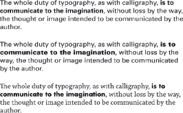
8-18
Lower resolution and backlighting require
greater typographic shifts to create appropriate
on-screen contrast.
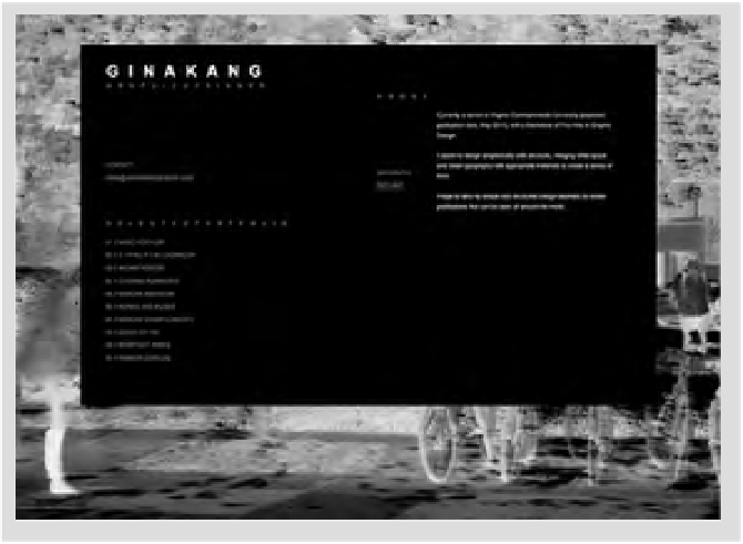
8-19
This home page is typeset in all capital letters.
Varied interletter spacing imbues the site with classic
elegance and textural beauty. (Designer: Gina Kang)