Graphics Reference
In-Depth Information
RENDERING TYPE ON SCREEN
The Internet provides a challenging environment for good typography,
especially with text sizes. Its problems are inherent in all on-screen
font displays, whether designing typography for a laptop, tablet,
smartphone, interactive kiosk, or website. When designing on a
computer screen—even when the final production will take another
form, such as offset printing—the same legibility issues apply to
on-screen type. Screen fonts are bitmaps, which are digitized images
made up of tiny dots.
To render an outline letterform stored as a Bézier curve on a
computer screen, it must be rasterized, or converted into tiny dots
called pixels, which is short for picture elements. The relatively low
resolution of many contemporary computer screens, which typically
have a bitmap matrix of 72 or 96 pixels per inch, cannot display the
subtle nuances of a beautifully designed font. When a type's outline
is rendered on a screen, details such as stroke weight, subtle curves,
and serif detail are reduced to a coarse approximation of the refined
forms found in the original design. This occurs because curved and
diagonal edges rendered as pixels on a raster-scan display have a
jagged stairstep quality, called “the jaggies.” The more pixels used
to generate the letterform, the higher the resolution (Fig.
8-1
). When
small type appears on-screen with too few pixels to accurately display
the subtle forms of the letter, a catastrophic decrease in legibility can
occur (Fig.
8-2
).
Satisfactory on-screen typographic display blends many factors.
These include font enhancement methods such as anti-aliasing, hinting,
the use of pixel fonts, and capturing type as image. Computer operating
systems and a user's choice of web browser also play vital roles. These
aspects must be considered to achieve optimum typographic outcomes
on screen. Operating systems and a user's choice of web browser also
play vital roles.
8-1
Digital letterforms have decreasing resolution
as the number of pixels is reduced.
8-2
This enlargement
of an
a
, displayed on a
computer screen at a
five-pixel height, shows
the resulting distortion.
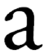
8-3
Enlargement of
a screen display of an
a
shows the “jaggies”
caused by pixels.
8-4
Antialiasing
smooths out the hard,
stair-stepped diagonal
and curved edges.
8-5
An enlarged
antialiased letter
a
demonstrates how
colors blend to achieve
a smoother look at
smaller sizes.
36 point
24 point
18 point
12 point
8-6
Four sizes of a hinted letter
a
are shown
enlarged and at on-screen reproduction sizes.
(Designer: Matt Woolman)