Graphics Reference
In-Depth Information
Antialiasing
This technique is used to replace the jagged stairstep edges (Fig.
8-3
)
created by pixels with an illusion of the smooth curves found in
well-designed typefaces. Pixels around the edges of curved or angled
letterforms are rendered in an intermediate tone or color. These pixels
are displayed in a blend of the type color and the background color,
resulting in an appearance of smoother, more refined letterforms (Fig.
8-4
). The drawbacks of antialiased type are that the smaller type gets,
the fuzzier it appears, which can significantly degrade the original
design of the typeface on low pixel-density displays (Fig.
8-5
).
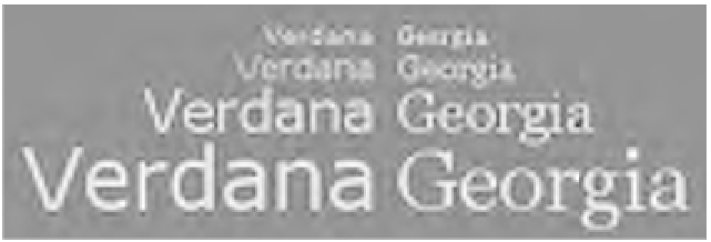
8-7
Verdana (left) and Georgia (right) are shown at 9-,
14-, 24-, and 36-point on-screen sizes. Hinting improves
legibility by adjusting the design for each size. Note
that the 9-point type is bitmapped, while the computer
applied antialiasing to the larger sizes. (Font designer:
Matthew Carter, hinted by Thomas Rickner)
Hinting
A major factor influencing the legibility of on-screen type is resolution.
Where fewer pixels are available to describe letters, resolution
decreases. To compensate for this problem, type designers reshape
the outlines of characters, a process called
hinting
, to create the best
possible image at various point sizes. Hints alter the actual outlines
of letters by selectively activating pixels, thus improving the legibility
of letters on the screen and from low-resolution output devices. An
unhinted typeface will typically instruct the computer to turn on a
pixel if more than half of its area is covered by the letterform. A hinted
typeface has the pixels activated to display each letter adjusted to more
accurately display it at various sizes (Fig.
8-6
). Hinting information is
built into the software that generates the typeface on the screen and
automatically occurs when the type is displayed.
Two widely used on-screen typefaces were specifically created
for use as web page text. These are Verdana and Georgia (Fig.
8-7
),
designed by Matthew Carter and hinted by Thomas Rickner. Most
digital typefaces are designed as outline fonts that are used to generate
bitmapped screen fonts. Verdana and Georgia were first designed as
bitmaps of pixels (Fig.
8-8
), then they were translated into outline fonts.
As a result, they have better on-screen fidelity than most typefaces
originally designed for high-resolution output.
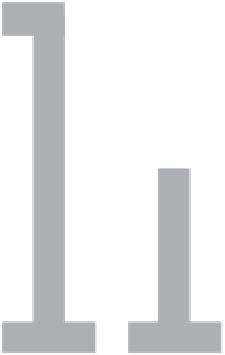
8-8
This illustration
shows a text-size
Georgia
h
as a
bitmapped letterform
and as an outline
letterform. (Designer:
Matthew Carter)