Graphics Reference
In-Depth Information
When creating a visual hierarchy in
typographic space, a designer balances the
need for harmony, which unifies a design,
with the need for contrast, which lends
vitality and emphasis. As in music, elements
can have a counterpart or a counterpoint
relationship. Typographic counterparts are
elements with similar qualities that bring
harmony to their spatial relationship (Figs.
5-47
and
5-48
). Elements have a counterpoint
relationship when they have contrasting
characteristics, such as size, weight, color,
tone, or texture. Counterpoint relationships
bring opposition and dissonance to the design
(Fig.
5-49
).
Typographic elements can have both
counterpart and counterpoint relationships. In
Figure
5-50
, extreme scale contrasts create a
counterpoint relationship, while the modular
letters, constructed from parallel horizontal
and vertical elements, become typographic
counterparts. Because the forms correspond,
the
A
's (Fig.
5-51
) are counterparts, but their
extreme scale contrast permits them to have
a dissonant counterpoint relationship in the
space. When organizing typographic elements
into a visual hierarchy, it is useful to consider
counterpart and counterpoint relationships.
Often, typographic elements in a visual
hierarchy can be designated as questioning
forms and answering forms (Fig.
5-52
). The
typographic unit assigned the questioning
role invites or calls for an answer. In a
sense, the answering form has a counterpart
relationship to the questioning form because
it completes the communication. The most
prominent visual element of a typographic
hierarchy is frequently a questioning form.
Consider the role of both typographic form
and pictorial form: do individual components
of a composition suggest a question or
an answer? The questioning component
expresses dissonance (unrelieved tension),
while the answering component expresses
consonance (relieved tension).
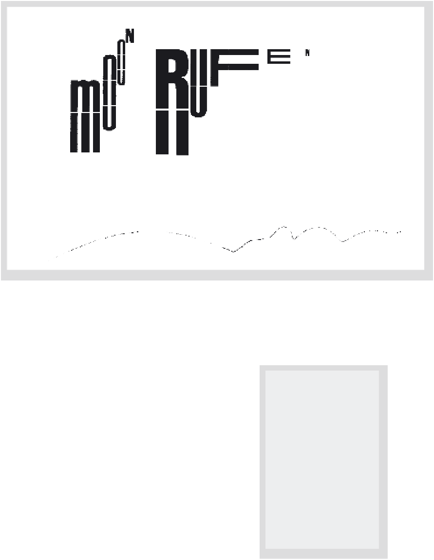
5-50
A hierarchy of size gains unity and rhythm
through the modular construction of letterforms.
Rufen
means “to call.” (Designer: Wolfgang Weingart)
5-51
The repetition of the letter
A
in two different
point sizes creates a dynamic hierarchical structure.
(Designer: Paul Rand)
5-52
The word
sassafras
calls for a response, and
the phrase a flavoring agent provides the reply.
(Designer: Ivy Li)