Graphics Reference
In-Depth Information
A typographic arrangement is partly governed by visual
punctuation. As a writer uses standard punctuation marks to separate
words and clarify meaning, a designer introduces visual punctuation
(space intervals, rules, or pictorial elements) to separate, group, or
emphasize words or lines. Visual punctuation (Figs.
5-53
and
5-54
)
clarifies the reader/viewer's understanding of the content and structure
of a typographic arrangement. Visual punctuation helps to clarify
the meaning of the typographic message, while visual emphasis or
accentuation is used to make one element more important. Emphasis
is relative to the contrasting properties of elements.
Visual accentuation is giving emphasis or stress to properties
(round and straight, thick and thin, geometric and organic, etc.)
of typographic and pictorial signs, usually through contrast with
dissimilar elements. The bold and compelling mark combining the
letter
A
and the scroll of a violin in Figure
5-55
is an example of visual
accentuation through contrast. The geometric properties of the letter
A
are accentuated in opposition to the organic properties of the musical
instrument. In this example, details in both the letter and pictorial form
are accentuated or deleted, yet the legibility of the original letter and
object has been retained. The letter
A
and the violin are incomplete, yet
each retains its essence.
Typographic joinery is the visual linking and connecting of
elements in a typographic composition through structural relationships
and form repetition. The assembly of separate typographic elements
to form a unified sign is seen in the logotype for the American
Broadcasting Corporation (Fig.
5-56
). The pronounced geometry and
emphasis given to the circular forms joins the forms through the use of
the repetition. The shape of the circle is common to every part of this
mark. The three letterforms and their circular container are blended to
become one sign.
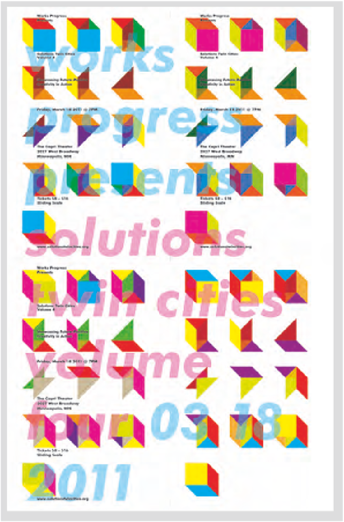
5-54
In this poster, the system of shapes and colors
provide visual punctuation and suggest the idea that
multiple solutions can spring from the same parts.
(Designer: Erik Brandt)