HTML and CSS Reference
In-Depth Information
25
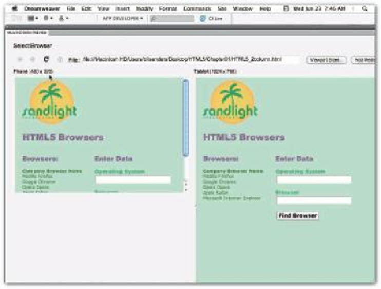
Phone set for iPhone: 480 x 320
Table set for iPad: 1024 x 768
Figure 1-11: Multiscreen preview in Adobe Dreamweaver.
You can change the device dimensions. For example, a Motorola Droid displays an 854 x 480
screen and a Sony VAIO UX displays a 1024 x 600 screen. h e multiscreen preview helps you
decide how to set up your page to optimize it for your viewers. Finding the best compromise
is an art and one that can be made less onerous by knowing as much as possible about your
audience and the devices they're likely to use to view your materials.
TAKE THE WHEEL
To get started, this i rst example lets you add some information about yourself. Don't worry
about understanding everything (or anything!) unless you have some background in HTML.
Just substitute things about yourself in the areas marked with double equal signs. Save the
page to your computer using the name
wheel1.html
. (You can i nd
wheel1.html
in this
chapter's folder at
www.wiley.com/go/smashinghtml5
.)
<!
DOCTYPE HTML
>
<
html
>
<
meta
http-equiv
=
”Content-Type”
content
=
”text/html; charset=UTF-8”
>