HTML and CSS Reference
In-Depth Information
Adapting the page for mobile viewing
To make it more practical for mobile users, I made some program adjustments to change the
orientation of the map by changing the
<iframe>
to the following:
<section>
<
iframe
id
=
“mapHolder”
width
=
“
240
”
height
=
“
320
”
>
</
iframe
>
</section>
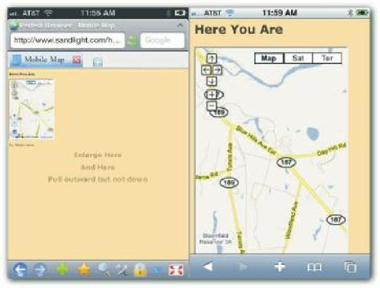
Now on a vertical orientation, the map was easier to read. Figure 15-2 shows the program on
an iPhone in the Perfect (let ) and Safari (right) browsers. Near the bottom of the page,
directions provide mobile users with instructions for enlarging the image without dragging
the map out of the
iframe
.
310
Figure 15-2: The map in a mobile environment.
Figure 15-2 illustrates that by pulling the page outward and away from the map (let panel),
mobile users can adjust the map so that they can easily read it (right panel).
WORKING WITH THE GEOLOCATION PROPERTIES AND THE GOOGLE EARTH PLUG-IN
Experimenting with the geolocation object can be a lot of fun and very informative. h e
following is a full list of its properties: