HTML and CSS Reference
In-Depth Information
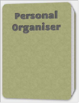
FIGURE 5.14
A rather funky
little 3D notepad.
TRANSFORM-STYLE
transform-style
is used when you have multiple 3D transformed elements that
appear next to or on top of one another. It has two possible values:
flat
, the default,
and
preserve-3d
.
When the default value is in effect, 3D transforms will be rendered, but they
will all be rendered in the same flat 2D plane. This means that when multiple 3D
transforms appear in the same space, some of the detail may get lost because they
all appear at the same position along the Z axis.
If you use
transform-style: preserve-3d;
, the different positions of the ele-
ments will be preserved along the Z axis. To see this property in action, look at the
preserve-3d.html example file.
In this example I've created a rather nifty little 3D notepad (
Figure 5.14
) that
rotates toward you when moused over and allows you to pull out the first page to
read it when you mouse over the edge of it.


